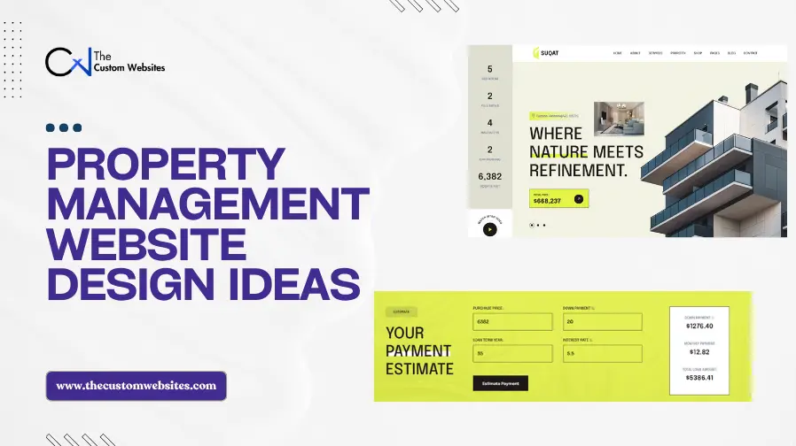
A property management website has to serve several audiences without making any of them work too hard. Property owners want evidence that a company can protect an asset. Prospective tenants want available rentals and application details. Current residents need fast access to payments, maintenance, and support. Commercial clients may need portfolio, leasing, and asset service information.
That is why effective property management website design goes beyond an attractive homepage. It must organize property information, build trust, generate management inquiries, and create distinct routes for owners and tenants. It must also work properly on desktop, tablet, and mobile screens.
Companies planning a new site often need both design and technical implementation. Property Management Website Design and Development can include page layouts, navigation, inquiry forms, property or community pages, owner and tenant resources, portal links, and responsive development. The examples below show how real businesses combine these elements in different ways.
15 Property Management Website Design Examples
1. Nomadic Real Estate
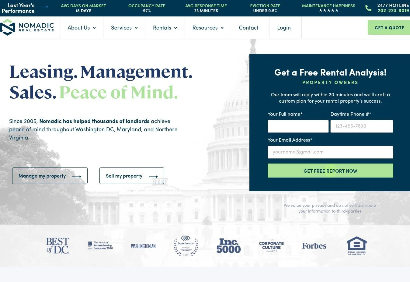
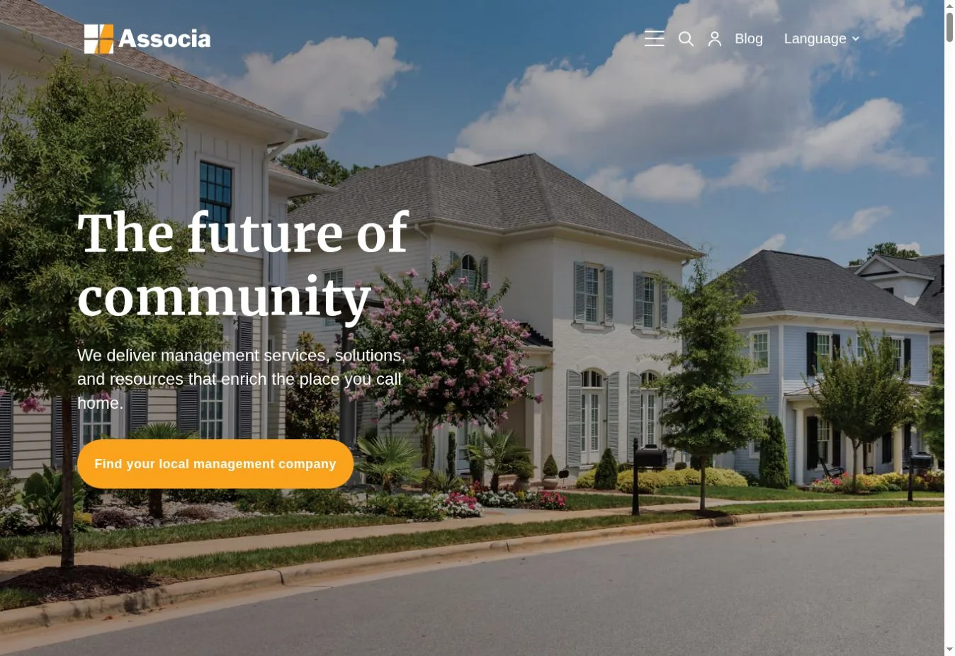
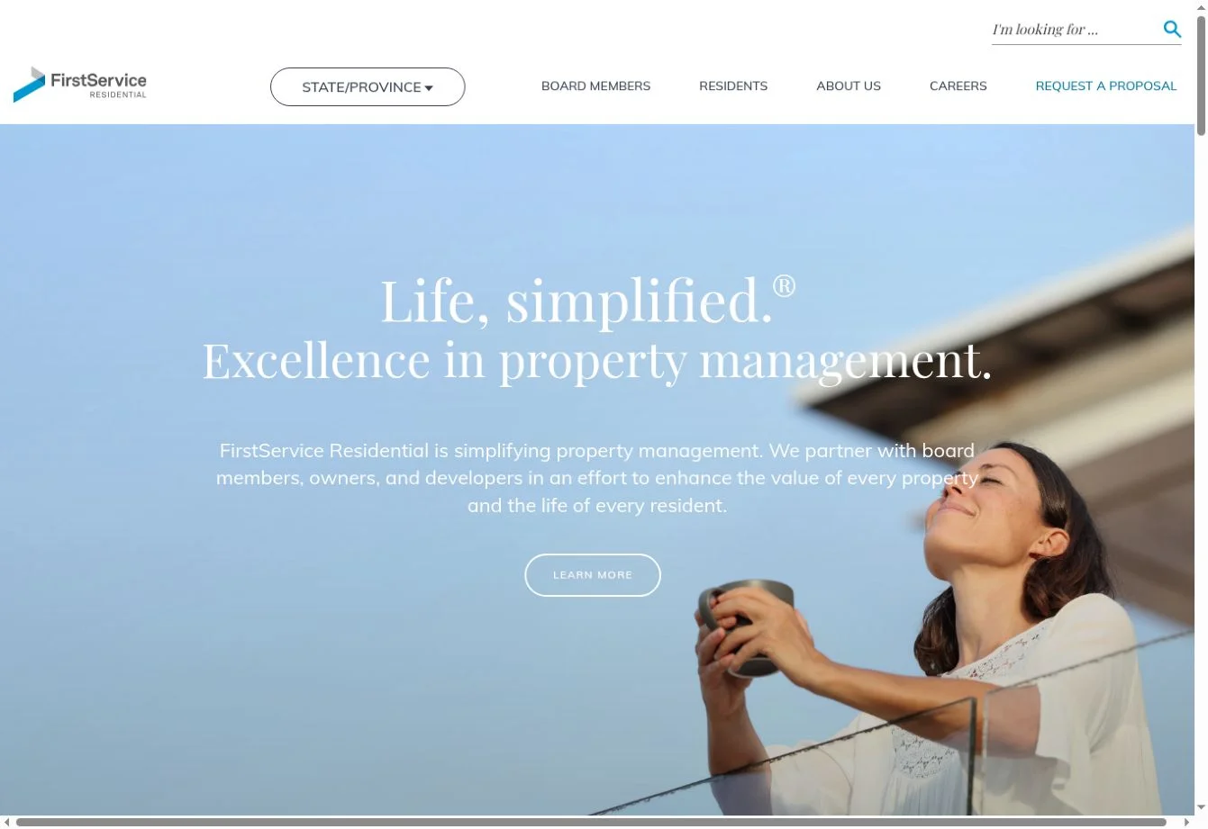
Design overview: Nomadic uses strong photography, generous spacing, and direct language to present its Washington, DC area services. The page quickly separates property leasing, property management, and property sales. This creates a clear visual hierarchy for visitors who may arrive with different goals.
Key design elements: The homepage includes a free rental analysis CTA, three service paths, a rental property section with price and bedroom details, core values, testimonials, market content, service-area links, and a detailed footer. Its available-rental cards turn the homepage into a useful renter entry point rather than a brochure for owners only.
What property management businesses can learn: Put the highest-value owner action near the top, then give renters a visible route of their own. Service choices work best when each card names both the task and the next step.
Best for: Residential property management firms that combine leasing, management, and brokerage in one regional market.
2. Green Residential
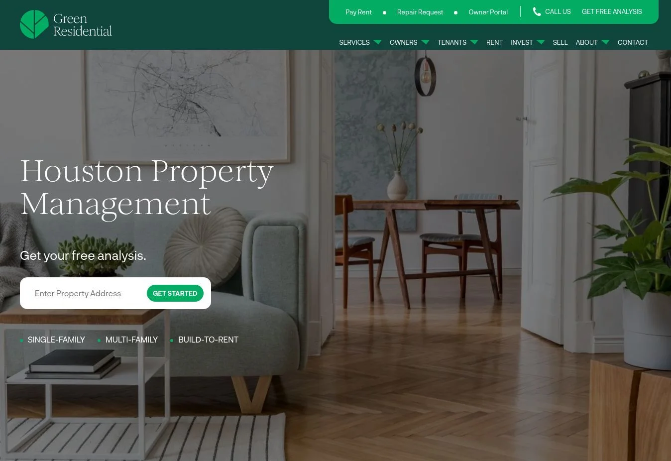
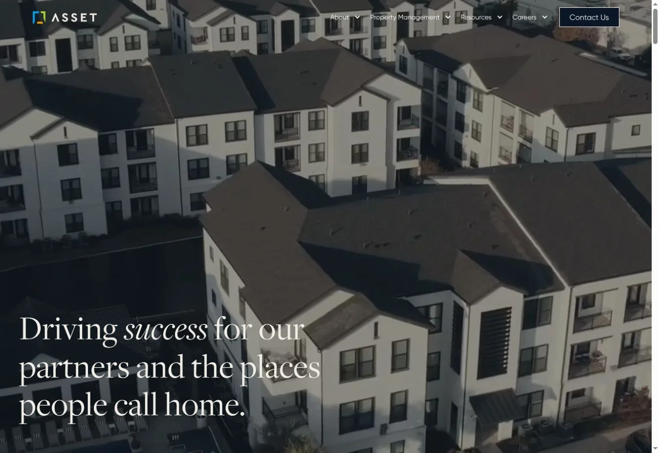
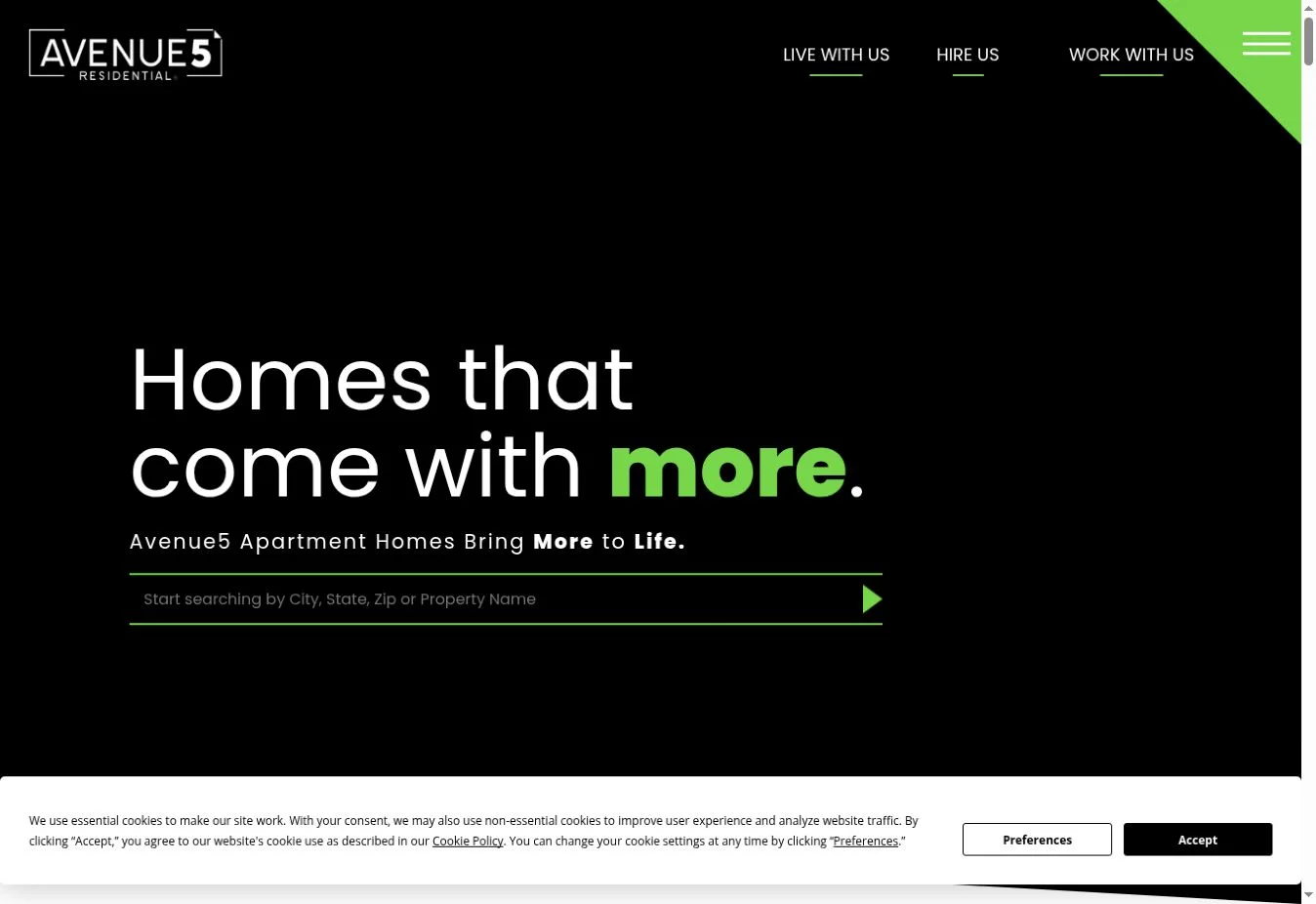
Design overview: Green Residential places a short property-address form in the opening area. The design then moves from portfolio types and company figures to services, reviews, owner benefits, and service areas. Green accents support the brand without overwhelming the content.
Key design elements: Visible features include the analysis form, single-family, multifamily, and build-to-rent labels, company figures, service cards, customer reviews, owner trust points, location coverage, and repeated contact prompts.
What property management businesses can learn: A low-friction form can start with one piece of information instead of presenting a long proposal form immediately. Portfolio labels also tell owners whether the company handles their type of asset before they read detailed service pages.
Best for: Residential managers serving single-family, multifamily, and build-to-rent owners across several metro areas.
3. Belong
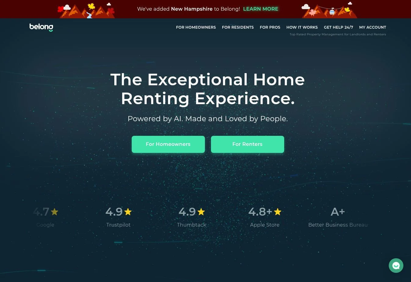
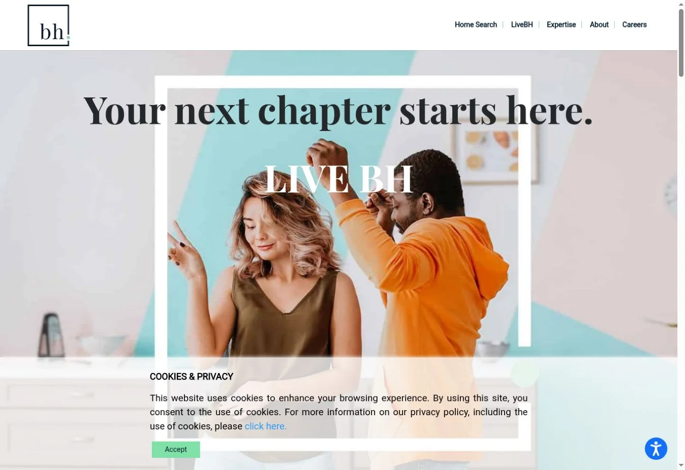
Design overview: Belong uses warm language, lifestyle-led imagery, and a polished digital-service style. The visual approach feels less institutional than a traditional management company site while still explaining the service. Content is organized around the experiences of homeowners and residents.
Key design elements: The live site presents separate information for homeowners and residents, explains its membership approach, and describes online or app access to rent payments, documents, and maintenance requests. Clear action buttons keep the user moving toward the relevant path.
What property management businesses can learn: A human visual tone can differentiate a management brand, but the design still needs specific operational information. Pair emotional positioning with clear descriptions of what users can do online.
Best for: Technology-led residential property management brands that want to appeal equally to owners and renters.
4. Greystar
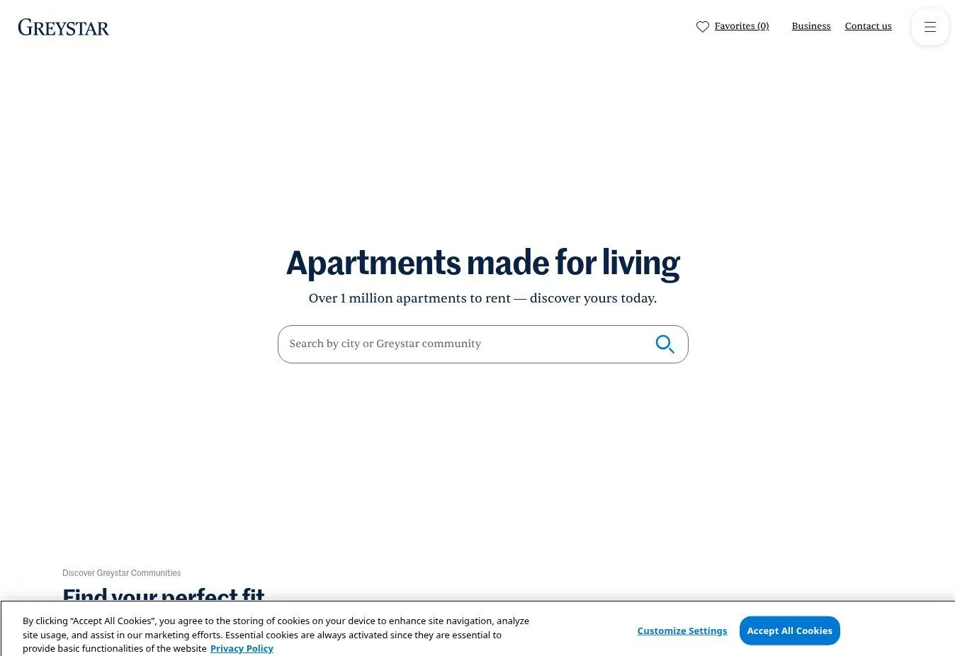
Design overview: Greystar balances two large tasks: helping people find apartments and presenting the company as a global property management and investment partner. Large imagery and restrained typography give the site an established portfolio-level appearance.
Key design elements: The homepage provides apartment discovery, city links, company and service information, and corporate content. Navigation supports both consumer rental searches and business visitors exploring management, development, and investment capabilities.
What property management businesses can learn: When a company serves both renters and institutional clients, the interface should expose both journeys early. Apartment search can remain prominent without hiding the corporate service story.
Best for: Multifamily property managers, apartment operators, and large residential portfolios.
5. Mynd
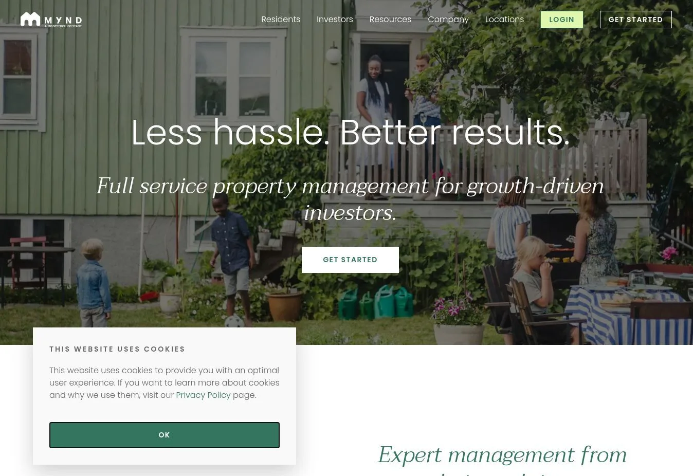
Design overview: Mynd opens with a short promise and a direct “Get Started” action. The page uses bold type, controlled color, and alternating content blocks to explain full-service management, technology, leasing, and institutional services.
Key design elements: Verified homepage content includes full-service management information, an investor portal explanation, leasing and maintenance content, separate owner and resident actions, institutional portfolio services, reviews, location links, and a newsletter signup.
What property management businesses can learn: Use page sections to answer one owner concern at a time. Mynd separates operational support, transparency, leasing, and scale instead of placing every benefit in a single dense block.
Best for: Single-family rental managers and firms serving growth-focused or institutional investors.
6. Evernest
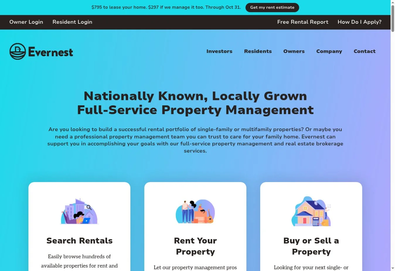
Design overview: Evernest uses a broad but orderly homepage for its national operation. Three large paths—search rentals, rent a property, and buy or sell—help visitors identify the right service. Supporting sections then explain onboarding, screening, guarantees, cities, and reviews.
Key design elements: The site visibly includes rental search, management and brokerage cards, a free rental report CTA, featured cities, owner process information, service guarantees, testimonials, blog content, market navigation, owner login, resident login, maintenance, and pay-rent links.
What property management businesses can learn: A national site needs both task-based and location-based navigation. Keep the main choices simple, then use city pages and footer links to handle geographic depth.
Best for: Multi-market residential property management companies with single-family and small multifamily portfolios.
7. Keyrenter
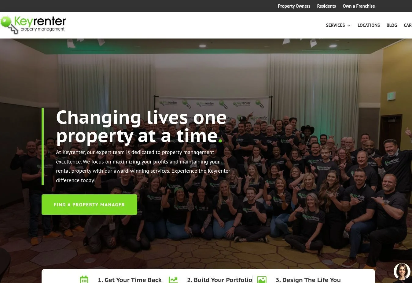
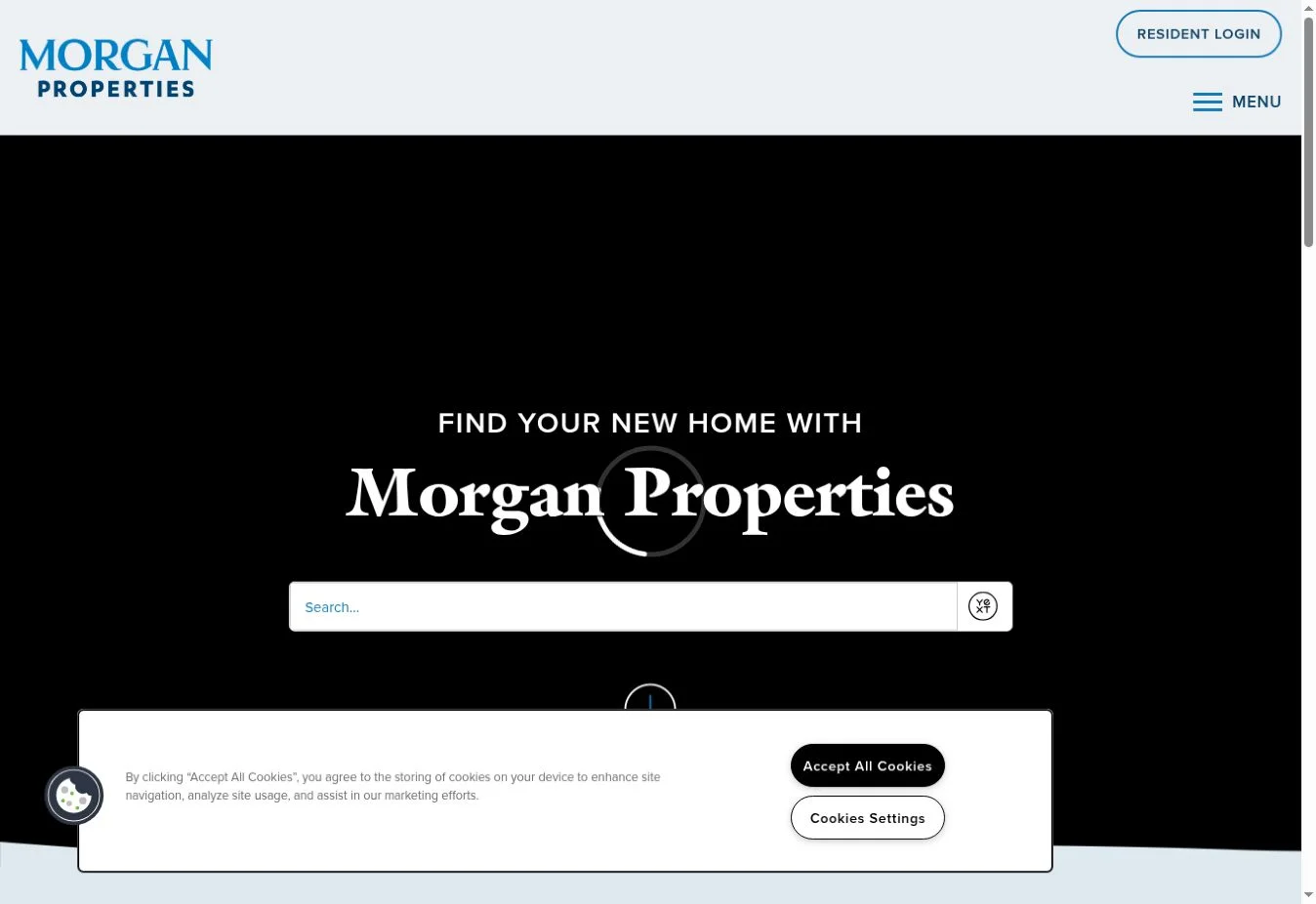
Design overview: Keyrenter organizes the homepage around outcomes first, then user choices and service details. Large headings and repeated blocks make the long page easy to scan. The design also connects the national brand with local property managers.
Key design elements: Visible content includes a property manager finder, rental search, buy or sell route, locations, management services, technology information, performance figures, owner stories, and separate action buttons for finding a manager or rental.
What property management businesses can learn: Long homepages remain usable when section headings are specific and visual patterns stay consistent. A nationwide network should make location discovery an obvious primary action.
Best for: Franchise or multi-location residential property management networks.
8. PURE Property Management
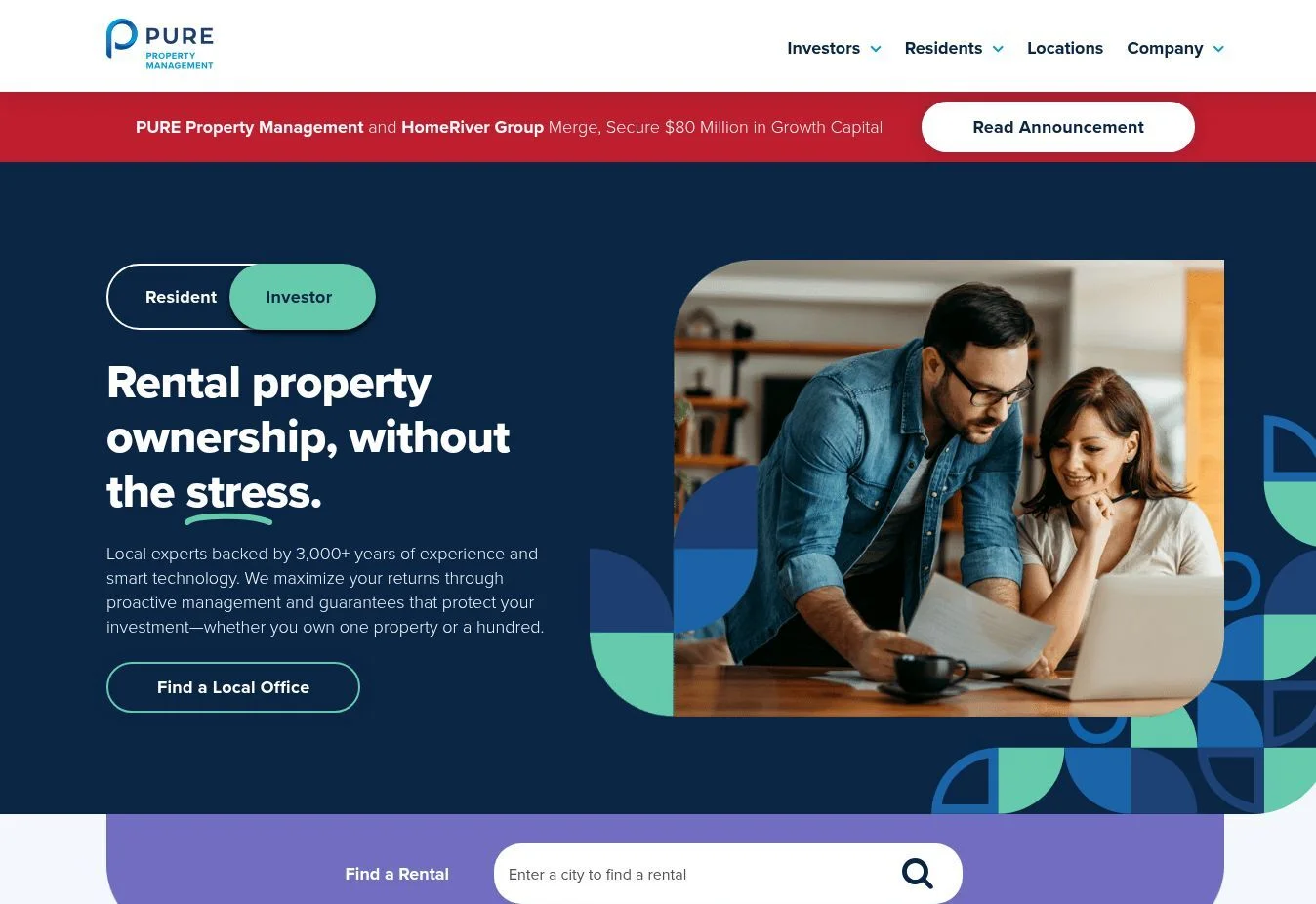
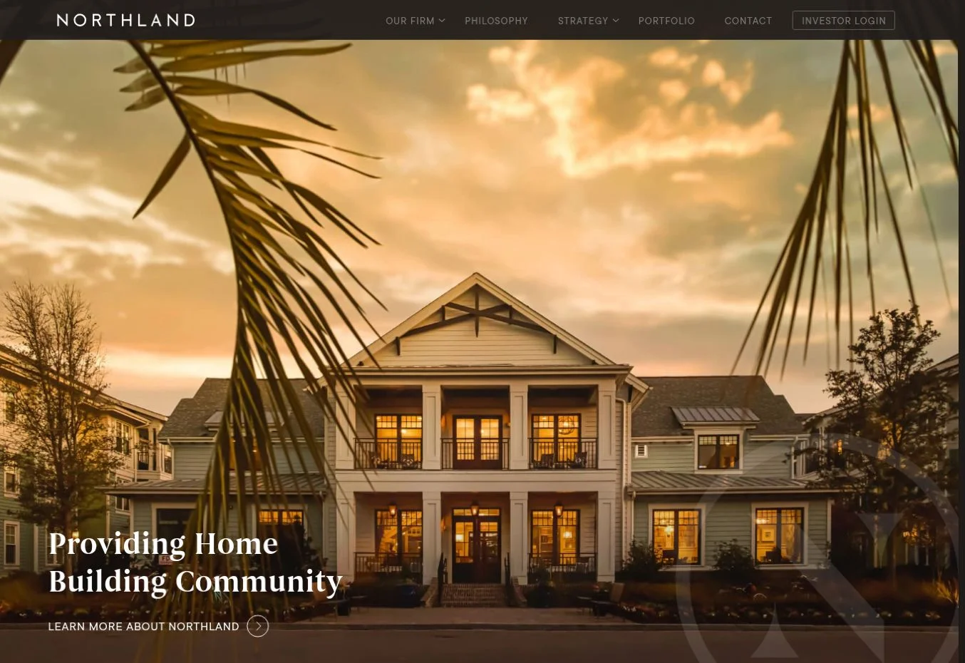

Design overview: PURE uses a strong national brand system with concise messaging and location-driven content. The design favors prominent headings, clean color blocks, and clear route selection over a crowded opening screen.
Key design elements: The company presents locations, management information, owner and resident resources, and contact routes. Its location network and portal-oriented content make the site useful for users who need to reach the correct regional operation.
What property management businesses can learn: Multi-market brands need a consistent visual system, but users also need local context. Connect national positioning to regional pages, phone details, and audience-specific resources.
Best for: Large residential management groups operating through local markets.
9. Bay Property Management Group
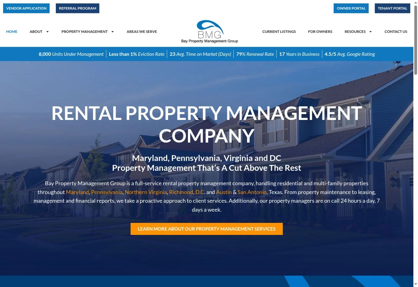
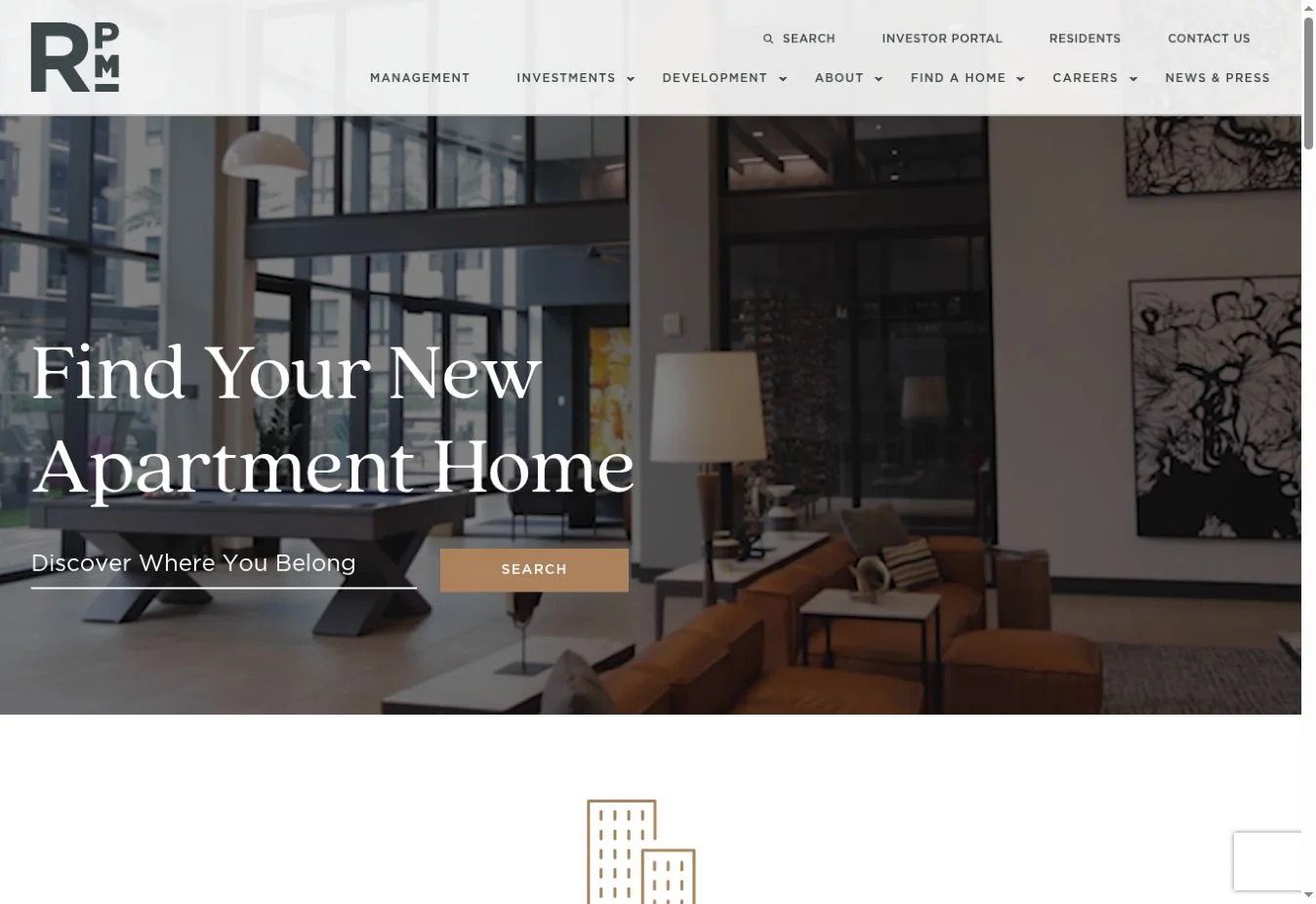
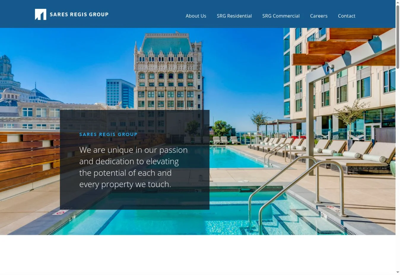
Design overview: Bay Property Management Group uses a content-rich layout suited to visitors comparing a professional manager with self-management. The design keeps core services, locations, and listing access visible while offering deeper educational information.
Key design elements: The site includes residential and multifamily positioning, location navigation, current listings, management services, fees and rates, owner and tenant resources, portal links, a blog, and contact information.
What property management businesses can learn: Pricing and process questions often matter before a prospect contacts a manager. Give those questions dedicated pages and keep them close to service and inquiry links in the navigation.
Best for: Regional residential and multifamily management businesses serving several states or metro areas.
10. Chambers Theory
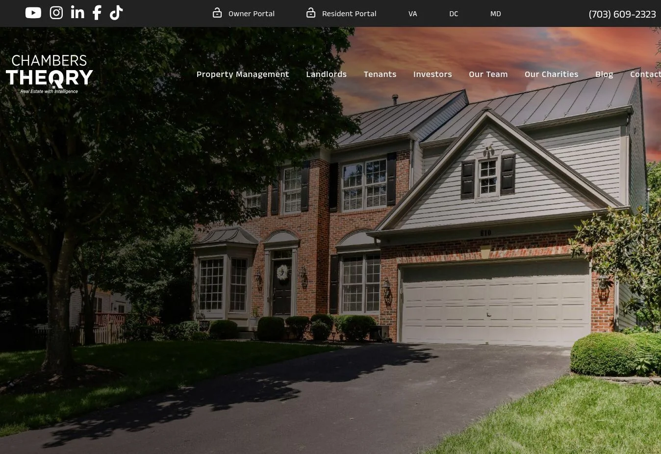
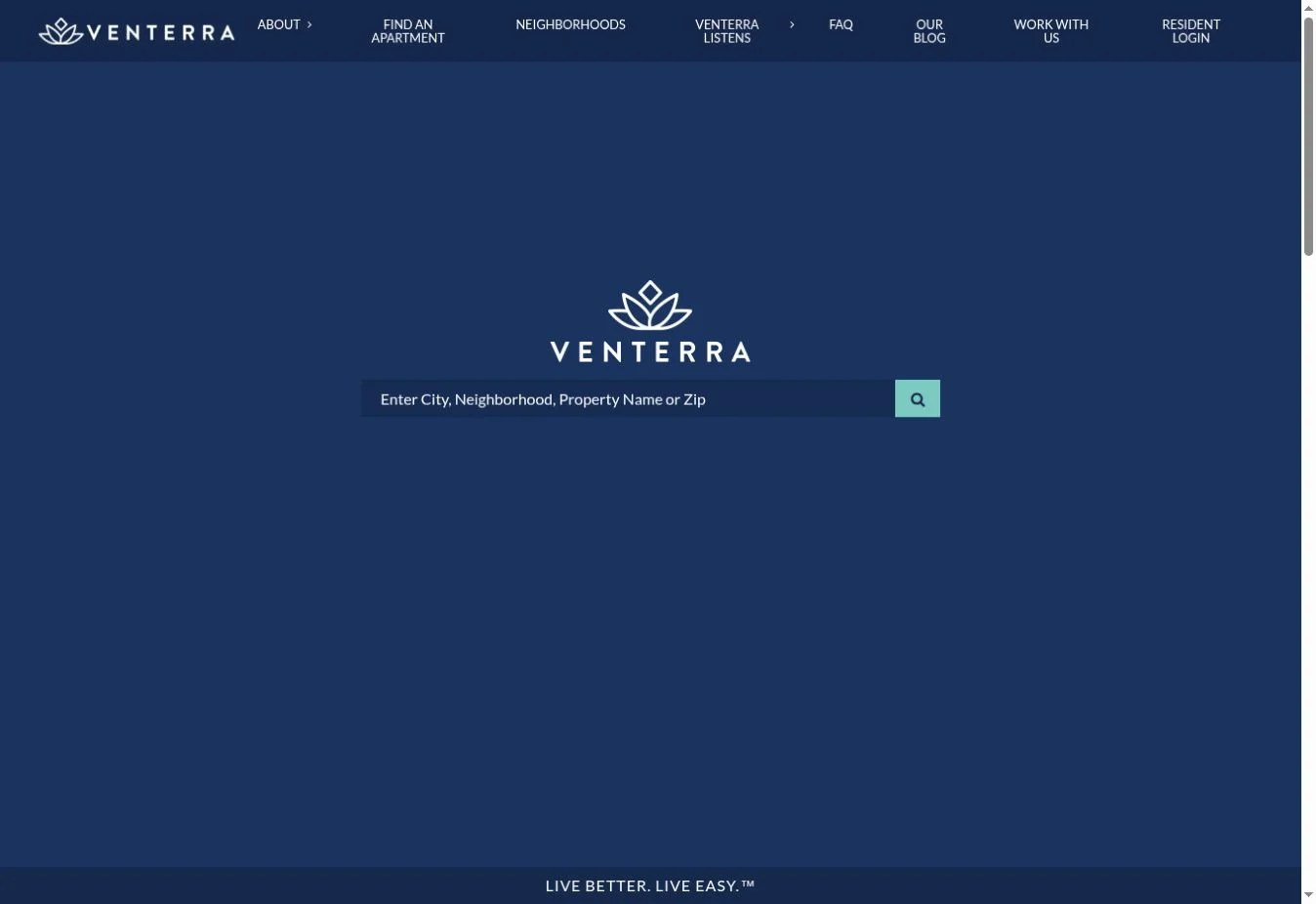
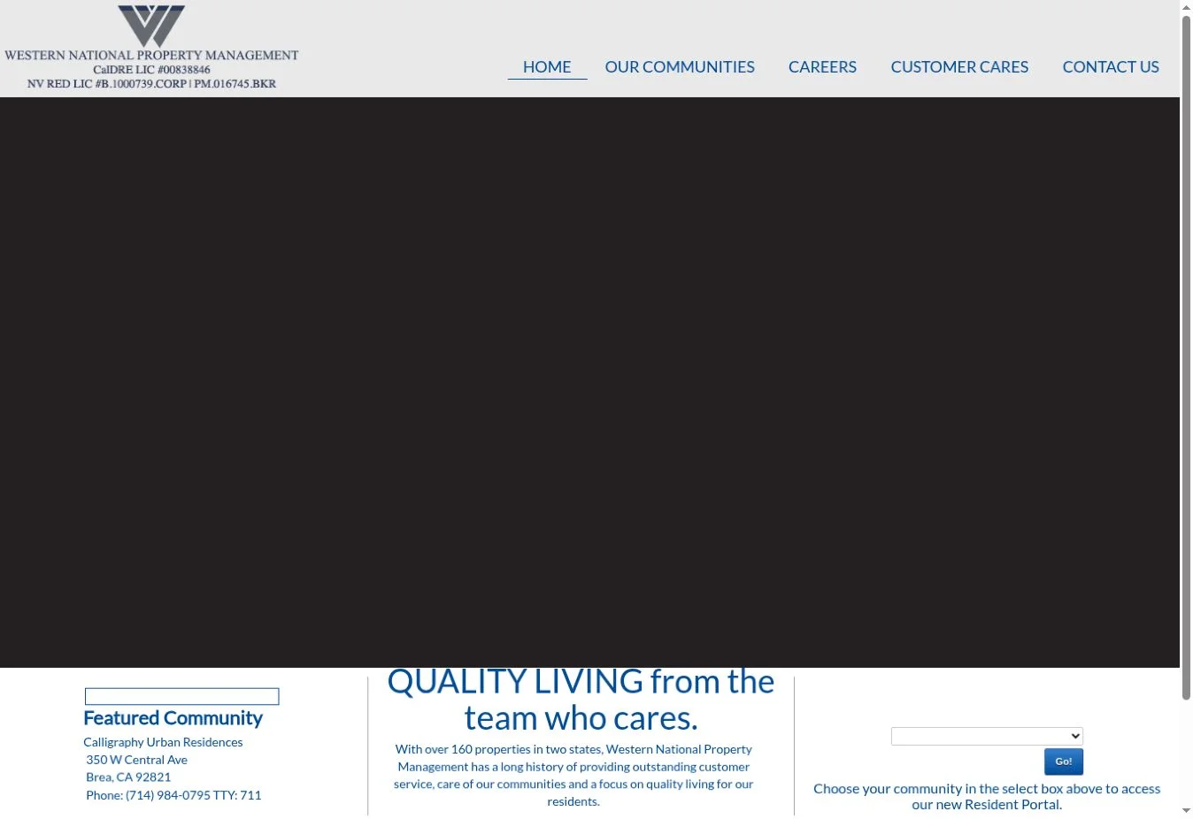
Design overview: Chambers Theory uses high-quality property visuals, spacious layouts, and a premium editorial feel. The homepage pairs the polished appearance with practical management service information for Northern Virginia, Maryland, and Washington, DC.
Key design elements: Verified elements include owner and resident portal links, regional navigation, service content for rent collection, leasing and marketing, repairs and maintenance, local expertise, and an owner-or-renter contact choice.
What property management businesses can learn: Premium visual design is most useful when operational services remain easy to identify. Persistent portal links also prevent current clients from searching through marketing pages.
Best for: Higher-end residential management, executive rentals, and firms serving competitive urban or suburban markets.
11. Doorstead
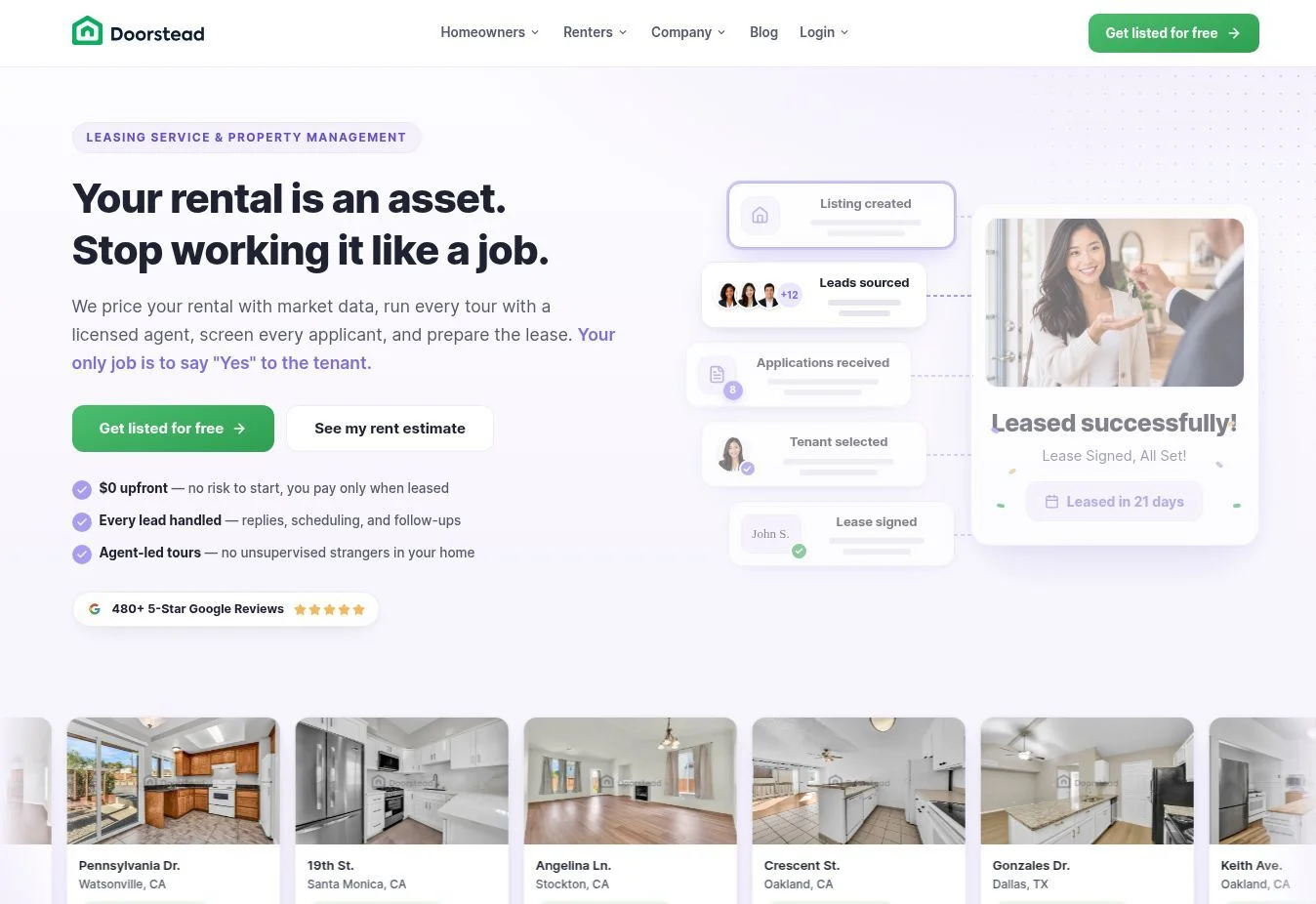
Design overview: Doorstead presents a technology-focused service through simple typography, bright accents, and concise blocks. Instead of describing one broad package, the homepage lets owners compare levels of help.
Key design elements: The live page identifies tenant placement and full-service property management as separate options. It explains marketing, showings, screening, lease signing, and ongoing management, then supports the service story with market content from its blog.
What property management businesses can learn: Service comparison should explain scope, not just package names. A side-by-side or sequential choice helps an owner decide whether they need leasing support or complete management.
Best for: Digital-first residential managers offering modular services to independent landlords.
12. Grace Property Management
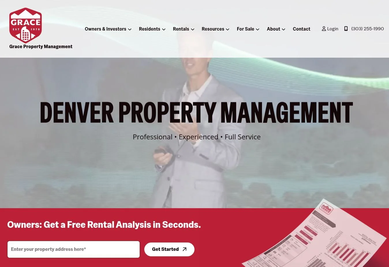
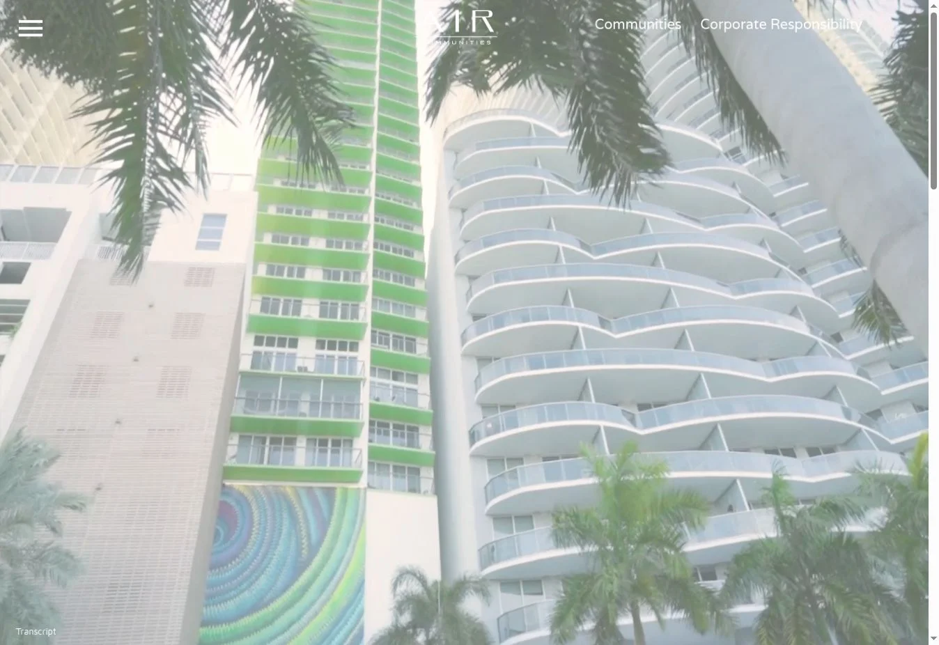
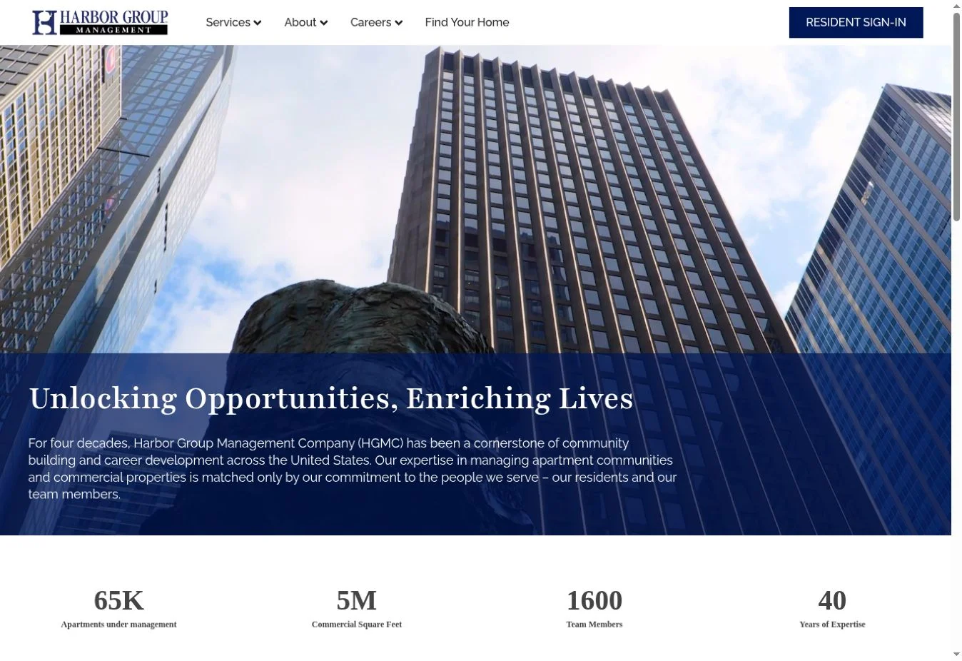
Design overview: Grace relies on credibility, personality, and education. The homepage explains the company’s long operating history and presents management as a relationship among the firm, owners, and residents. Its tone feels local and accountable.
Key design elements: The visible navigation includes owner login, tenant login, maintenance request, owner benefits, rental search, and resident benefits. The page adds company history, team credibility, educational content, FAQs, scheduling, location links, and accessibility information.
What property management businesses can learn: Trust signals become stronger when they are specific. Dates, leadership access, educational expertise, policies, and FAQs tell a more convincing story than unsupported claims such as “trusted experts.”
Best for: Established local residential managers that compete through experience and hands-on service.
13. Atlas Real Estate
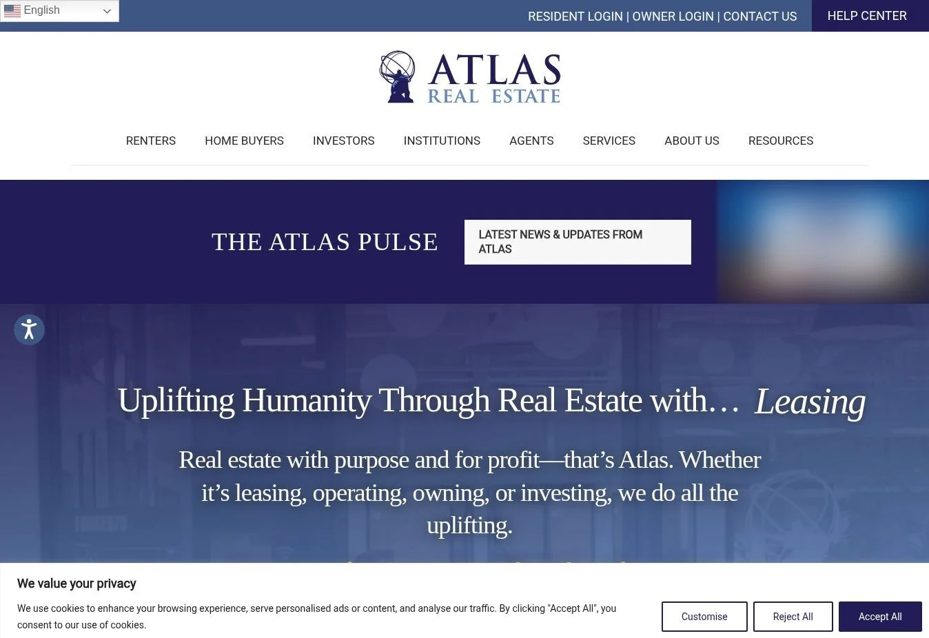
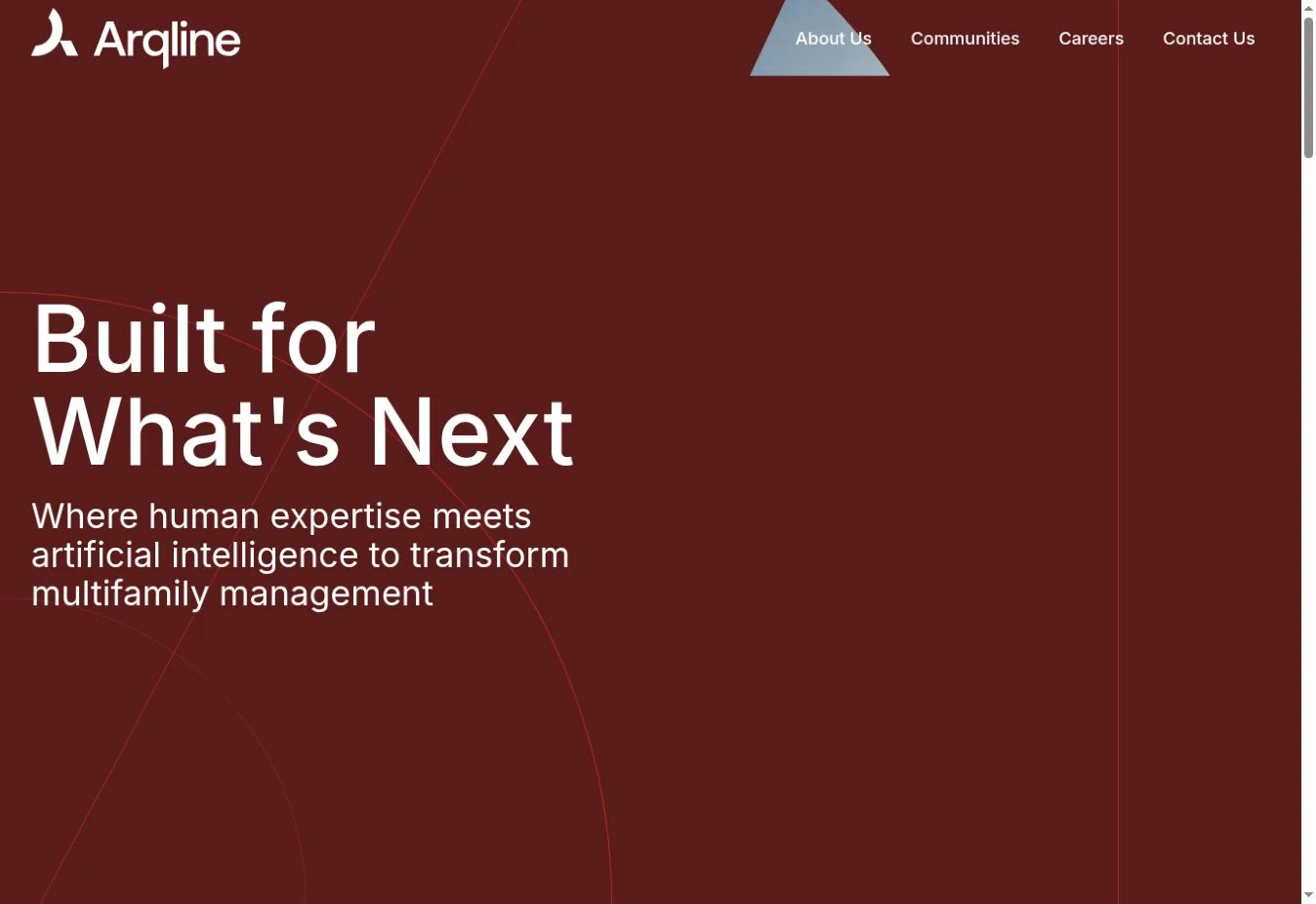
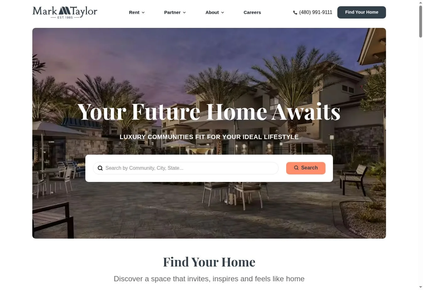
Design overview: Atlas structures its homepage as a progression from renter to homebuyer, investor, and institutional investor. This creates a distinctive narrative while still connecting users to practical pages.
Key design elements: The website includes rental search, resident resources, individual and institutional property management, brokerage, maintenance services, markets, investor resources, blog content, and separate footer groups for renters, buyers, investors, and institutions.
What property management businesses can learn: Audience segmentation can reflect a customer lifecycle rather than a basic list of services. This works when each stage links to a concrete tool or page, such as rentals, resident login, portfolio review, or management services.
Best for: Integrated firms serving renters, individual investors, and institutional residential portfolios.
14. HomeRiver Group
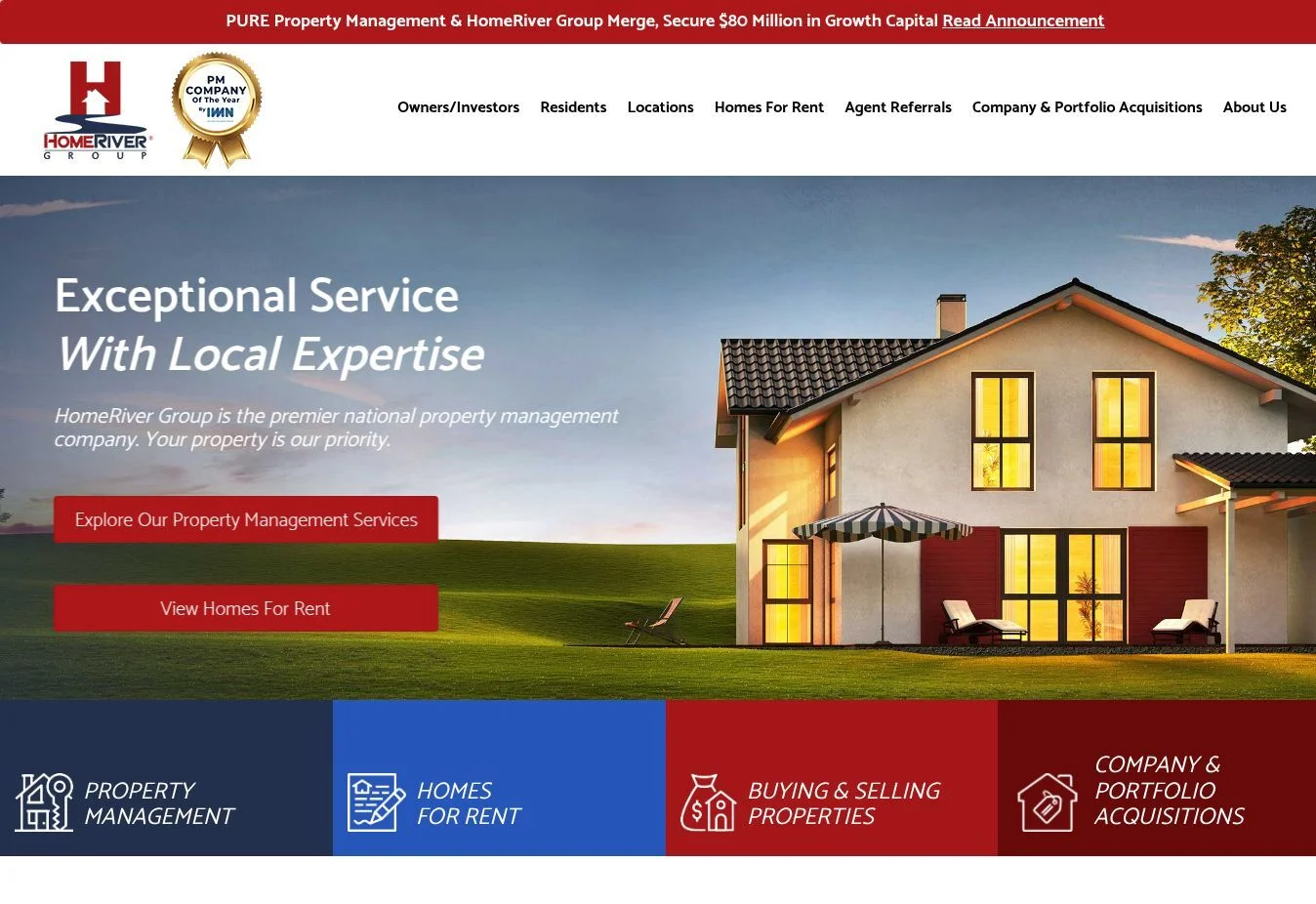
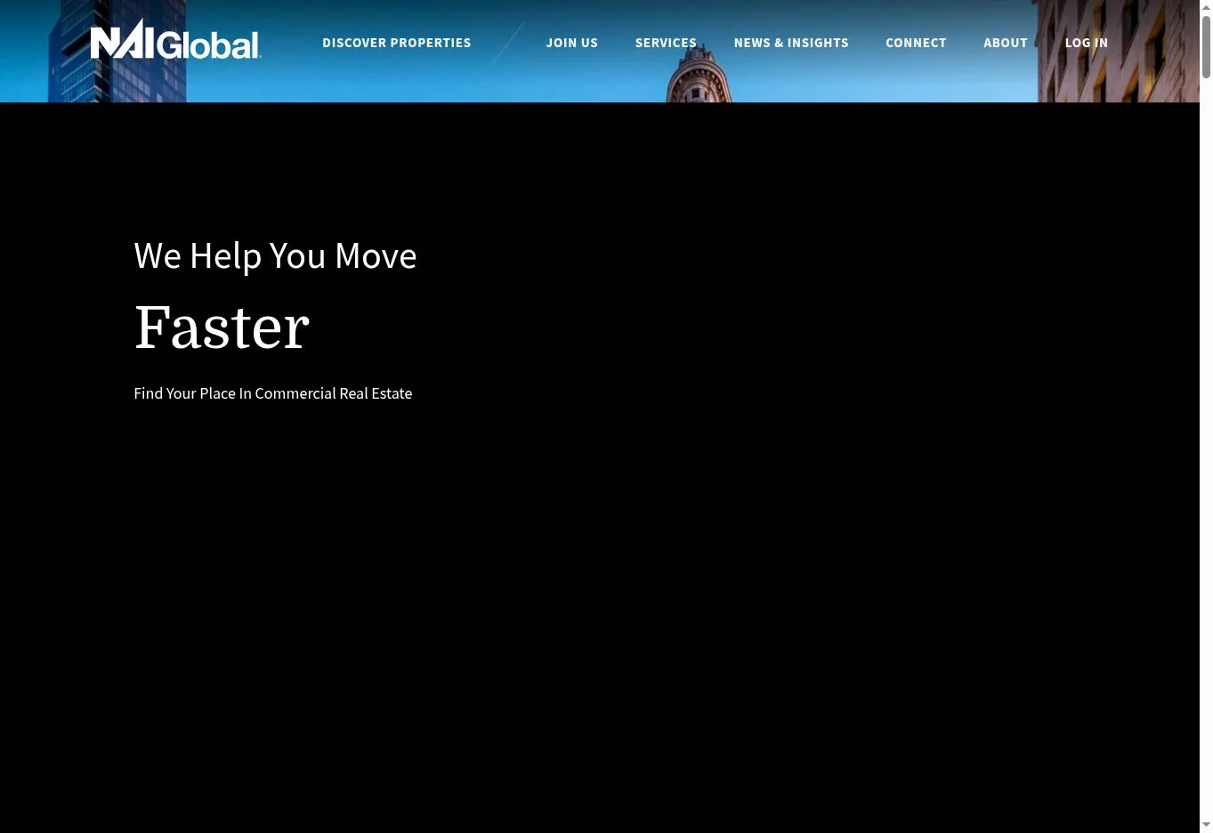
Design overview: HomeRiver uses a broad information architecture for a national service company. The menu groups owner and investor services, resident information, locations, homes for rent, and company resources.
Key design elements: Verified navigation covers property management, brokerage, renovation, leasing, maintenance, markets, resident criteria, maintenance guidance, move-in and move-out information, resident benefits, rental search, communities, acquisitions, and portal access.
What property management businesses can learn: A large service menu needs clear audience labels and logical grouping. Deep links can live inside dropdowns, but the top level should still show owners, residents, rentals, and locations as recognizable destinations.
Best for: National residential property management platforms with multiple services and markets.
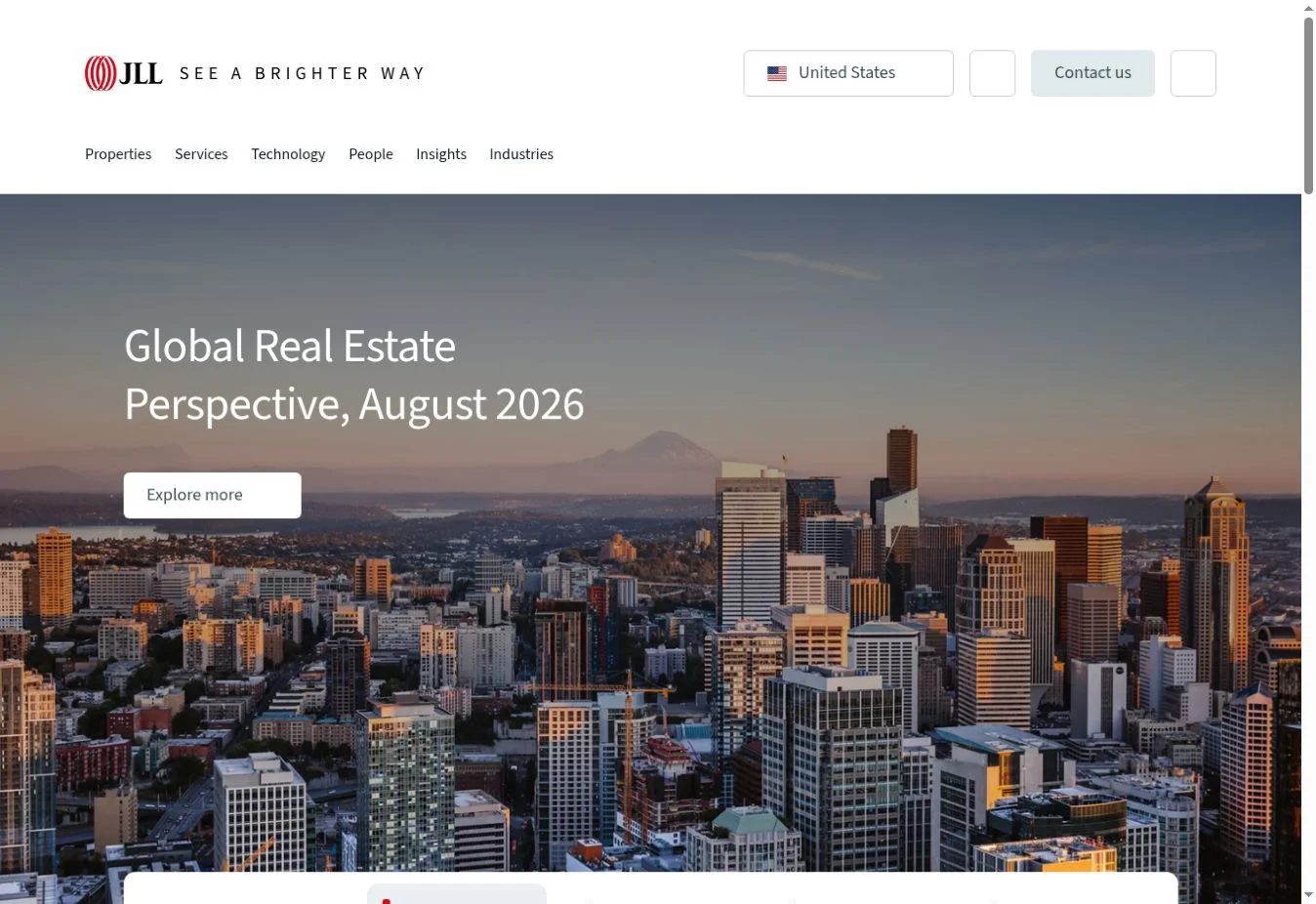
15. Cushman & Wakefield
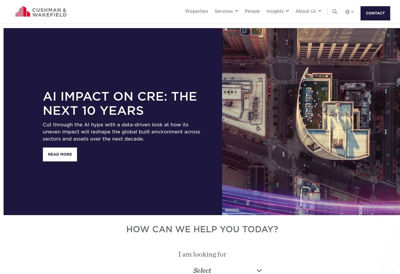
Design overview: Cushman & Wakefield uses a corporate editorial style designed for complex commercial real estate decisions. Strong photography, restrained colors, and large content modules create visual authority while the navigation handles a wide range of services and sectors.
Key design elements: The site presents commercial real estate services, industries, property types, locations, research, insights, and contact routes. Search and regional navigation help users find relevant expertise within a large global organization.
What property management businesses can learn: Commercial audiences often need to browse by service, asset type, sector, and market. The property management website structure must support those dimensions without forcing all information onto one page.
Best for: Commercial property managers, asset managers, and firms handling office, retail, industrial, and mixed portfolios.
Property Management Website Homepage Design Ideas
A useful property management website homepage design should answer four questions quickly: What does the company manage? Where does it work? Who does it serve? What should the visitor do next?
Start With A Clear Hero Area
The hero should state the management type and market. “Full-service property management for single-family rentals in Phoenix” is more informative than “Property management made easy.” Add one main owner CTA, such as “Request a Management Proposal,” and a separate rental or resident link.
Summarize Property Management Services
Use a short group of service cards for leasing, tenant screening, rent collection, maintenance, inspections, and financial reporting. Each card should link to a full service page. This gives owners a quick scope check without making the homepage carry every detail.
Present Properties Or Communities
Managers with active inventory should show selected properties or communities with consistent cards. Include the image, location, monthly rent, beds, baths, property type, and an availability or details action where applicable. If listings change frequently, connect the cards to the listing system so the website does not show stale information.
Create Separate Owner And Tenant Routes
Owners need services, fees, portfolio support, rental analysis, and proposal requests. Tenants need available properties, application criteria, payments, maintenance, and move information. Present these as visible pathways instead of mixing both audiences into one paragraph.
Add Trust Signals With Context
Useful signals include team profiles, professional memberships, fair housing information, verified review links, case studies, years in the market, and documented service processes. Avoid unexplained number counters. A figure should have a label and source or a clear business context.
Define The Service Area
List primary cities or regions and link them to useful local pages. A service-area section helps owners confirm coverage and gives the property management website layout a natural route to local service content.
Use Testimonials Selectively
Separate owner and resident feedback where possible. Display the reviewer’s relationship to the business and link to the review platform when permitted. A few relevant examples are easier to assess than an endless carousel.
End With A Focused Inquiry Section
The final homepage CTA should match the primary business goal. Ask only for the information needed to start a conversation. Name, email, phone, property address, property type, unit count, and message are often enough for an initial management inquiry.
Build A Useful Footer
Footer navigation should repeat critical owner, tenant, rental, location, company, and contact links. Add licensing, accessibility, privacy, fair housing, and portal information where relevant. These elements complete the property management website structure without overloading the main menu.
Property Management Website Layout and Structure
A practical property management site design uses a shallow hierarchy. Most visitors should reach a core task within one or two menu choices.
Page | Main purpose | Recommended content |
Home | Direct each audience | Positioning, services, properties, trust, service areas, primary CTA |
About Us | Establish credibility | Company history, team, values, licenses, memberships, local experience |
Property Management Services | Explain the full offer | Process, service scope, reporting, maintenance, leasing, FAQs |
Residential Property Management | Address residential owners | Property types, leasing, resident care, inspections, owner reporting |
Commercial Property Management | Address business assets | Asset types, operations, tenant relations, reporting, leasing support |
Available Properties | Help prospects find rentals | Search, filters, cards, availability, application link |
Property or Community Pages | Support evaluation | Gallery, price, features, location, policies, inquiry or apply action |
Owner Services | Generate management leads | Owner benefits, process, fees or proposal, portal link |
Tenant Resources | Support residents | Pay rent, maintenance, policies, FAQs, forms, emergency information |
Service Areas | Confirm geographic coverage | Market overview, local services, office contact, relevant properties |
Blog or Resources | Answer recurring questions | Owner education, resident guides, local market content, company updates |
Contact | Route inquiries | Department choices, phone, email, office, hours, short form |
Request a Proposal | Qualify owner leads | Property address, asset type, units, goals, contact information |
The main property management website navigation can use six or seven top-level items: Services, Owners, Tenants, Rentals, Locations, About, and Contact. Place portal links in a utility bar or clearly labeled menu area. Use dropdowns only when a category contains several meaningful pages. Do not hide a single page inside an unnecessary dropdown.
Property Management Website UI and UX Design
UI means the visible interface: colors, type, buttons, cards, fields, icons, and spacing. UX means the full experience of finding information and completing a task. A polished property management website UI design can still fail if users cannot locate a rental, report maintenance, or request a proposal.
Make Navigation Predictable
Use labels that visitors already understand. “Owners,” “Residents,” “Available Rentals,” and “Maintenance Request” are clearer than invented brand terms. Keep portal and emergency links consistent across relevant pages.
Use Readable Typography
Body text needs enough size, contrast, and line spacing for long service explanations and policy pages. Reserve decorative type for short headings. Rental prices, addresses, and availability should remain easy to scan.
Standardize Buttons
One visual style should represent the primary action and another can represent secondary actions. Keep wording specific: “View Available Rentals,” “Owner Portal,” and “Request a Proposal.” Consistency improves the property management website user experience because users can recognize actions quickly.
Design Useful Property Cards
A property card needs a stable image ratio and consistent data order. Show only information that helps comparison. Cards should not shift height because one listing has a much longer description.
Keep Filters Understandable
For larger inventories, use location, monthly rent, beds, baths, and property type. Display selected filters and make reset controls obvious. On mobile, place filters in a clearly labeled panel and show the number of results.
Simplify Forms
Group fields logically and explain why sensitive or detailed information is requested. Use visible labels instead of relying only on placeholder text. Provide useful error messages beside the affected field and confirm successful submission clearly.
Build A Clear Hierarchy
Each page should have one H1, a short opening explanation, distinct H2 sections, and a primary next step. This improves both accessibility and the property management website interface design.
Treat Accessibility As Part Of Design
The property management website visual design should use sufficient color contrast, keyboard-accessible controls, visible focus states, meaningful alt text, labeled fields, and headings in a logical order. Do not put essential instructions only inside an image.
Property Management Website Navigation Best Practices
Navigation should support tasks rather than mirror the company’s internal departments.
Keep the main menu focused. Use short labels and avoid placing every page at the first level.
Group services carefully. Residential, commercial, association, leasing, and maintenance pages can sit under Services when the company genuinely offers them.
Separate owner and tenant pathways. Owners should reach proposals, reporting, and service information. Tenants should reach rentals, applications, payments, maintenance, and policies.
Keep contact visible. A phone number or contact CTA should remain easy to find, especially on mobile.
Provide rental search where inventory supports it. Search belongs in the main navigation when finding a property is a central user task.
Use breadcrumbs on deep pages. They help on location, service, community, and resource pages with several hierarchy levels.
Make the footer a reliable directory. Repeat portal links, service areas, key services, contact details, legal information, and accessibility links.
Test the property management website navigation with realistic tasks. Ask someone unfamiliar with the business to find application criteria, request management pricing, locate a maintenance route, and identify whether the company serves a particular city.
Modern Property Management Website Design Ideas
Modern property management website design is less about visual trends and more about reducing decision effort.
Clean layouts: Generous spacing separates services, properties, and audiences. It also makes long pages easier to scan.
Large property imagery: Use sharp, consistent images where they help users evaluate a building or rental. Do not let a slideshow push essential actions below the fold.
Card-based displays: Cards support fast comparison of services, locations, team members, communities, and listings.
Clear CTAs: Repeat an action only at logical decision points, such as after services, fees, or proof.
Minimal clutter: Remove decorative icons, animation, and copy that do not clarify a task or message.
Strong typography: A limited type scale helps users distinguish headings, summaries, labels, and details.
Trust-focused sections: Explain processes, show the responsible team, and identify professional standards.
Interactive property information: Search, filters, maps, galleries, and availability tools are useful when they work quickly and present current data.
Mobile-first layouts: Decide the mobile order of content during design, not after the desktop page is complete.
Modern forms: Use fewer fields at the start, suitable input types, clear validation, and a specific confirmation state.
A professional property management website design uses these methods consistently. A creative property management website design may use distinctive color, illustration, motion, or storytelling, but creative choices should never hide rental and support tasks.
Responsive and Mobile Property Management Website Design
A responsive property management website design should rearrange content for a smaller screen instead of shrinking the desktop layout.
The mobile header needs a clear menu button and direct access to contact, rentals, and portals. Property cards should stack in one column with the price, address, and main action visible. Images should preserve their aspect ratio and use appropriately sized files so large galleries do not slow the page unnecessarily.
Forms need full-width fields, correct mobile keyboards, clear labels, and enough space between controls. Buttons and linked phone numbers should be easy to tap. Search filters can open in a panel, but users must be able to see active selections and return to results without losing their place.
Good property management website mobile design also considers urgent resident tasks. A maintenance link, office number, and emergency instructions should not require several levels of navigation. Test common screen sizes and real devices, including keyboard and screen-reader behavior where possible.
Commercial Property Management Website Design
Commercial property management website design usually serves a more specialized buying process than a residential rental site. A business tenant may compare location, floor area, permitted use, building systems, parking, access, and lease details. Owners and investors may look for operating capability, reporting, capital planning, tenant relations, and experience with a specific asset class.
Organize commercial services by asset type when the portfolio supports it: office, retail, industrial, mixed-use, and multifamily. Property pages should present relevant specifications, plans, galleries, location context, contacts, and leasing inquiry routes. Avoid using residential labels such as beds and baths for commercial listings.
Commercial sites also benefit from team pages that identify market and sector expertise. Case studies can explain the property type, challenge, work performed, and measurable result when the company has approved data. Research and market insights should link to relevant services instead of sitting in an isolated content library.
Residential sites often prioritize rental search, applications, and resident support. Commercial sites usually need stronger portfolio browsing, asset-class navigation, leasing contacts, research, and owner-focused service detail.
Property Management Company Website Design Best Practices
These property management website design best practices connect business needs with specific interface decisions.
State the company’s position clearly. Name the property types, audience, and market in the opening screen.
Explain services in plain language. Show what the team handles and link to deeper pages for process, scope, and fees.
Present properties consistently. Use current data, clear cards, strong images, and useful detail pages.
Separate owner and tenant journeys. Do not make one audience sort through content written for the other.
Offer clear contact options. Route leasing, owner, resident, vendor, and general questions where needed.
Support credibility. Use identifiable team information, policies, professional associations, case studies, and verified reviews.
Apply branding consistently. Keep color, type, image style, voice, and controls aligned across pages.
Keep navigation simple. Organize by visitor task and use descriptive labels.
Design for mobile. Prioritize content order, fast actions, readable type, and manageable forms.
Make forms accessible. Use labels, instructions, keyboard support, clear errors, and confirmation messages.
Use a logical page structure. Give each page one purpose and a clear next step.
Plan for updates. Staff should be able to change services, locations, listings, team details, and resources without breaking the layout.
Effective property management company website design is not simply a visual refresh. It is an information system for leads, properties, clients, and residents. The same principle applies to a smaller property management business website design, even if it has fewer pages.
How to Plan a Property Management Website Design
1. Identify The Target Users
List the groups the site must serve: prospective owners, current owners, rental applicants, current tenants, commercial tenants, vendors, and job candidates. Rank them according to business value and task urgency.
2. Define Measurable Website Goals
Goals may include qualified management proposals, rental applications, calls to a leasing team, fewer routine support calls, or better use of resident portals. Assign a primary action to each audience.
3. Audit And Plan The Pages
Review current analytics, search data, inquiry records, and support questions where available. Retain pages that solve real user needs. Merge overlapping pages and plan redirects for changed URLs.
4. Organize The Service Offer
Separate true services from benefits. Leasing, screening, inspections, rent collection, maintenance coordination, and reporting are services. Convenience, visibility, and peace of mind are outcomes that should be supported by service details.
5. Define Property Information
Choose the fields needed for each property type. Decide where listing data comes from, who updates it, how often it syncs, and what happens when a unit becomes unavailable.
6. Map The Navigation
Create a simple sitemap, then test owner, renter, and resident tasks against it. Every important page should have a clear parent and a path back to a relevant next action.
7. Choose The Visual Direction
Build the design around the brand and portfolio. Define typography, colors, image treatment, cards, forms, buttons, icons, and spacing before producing every page.
8. Plan Calls To Action
Match each CTA to the surrounding information. “Request a Proposal” belongs near owner services. “Check Availability” belongs on a property page. “Submit Maintenance Request” belongs in resident resources.
9. Design Mobile Layouts Intentionally
Determine which content appears first, how menus open, how cards stack, how filters work, and which actions stay visible. Do not rely on automatic stacking alone.
10. Prepare For Development
Document integrations, form routing, portal links, listing feeds, analytics, accessibility needs, content roles, redirects, and performance requirements. A coordinated Property Management Website Design and Development process connects the approved layout to responsive templates, working forms, structured property content, and reliable navigation.
Key Takeaways for Property Management Website Design
The strongest property management website design examples do not all look alike. Their shared strength is deliberate organization.
Give owners, prospects, and current tenants separate routes.
State the market and property types before asking visitors to explore.
Treat rental search, portal access, maintenance, and proposal requests as core tasks.
Use location pages to add local relevance, not to repeat generic copy.
Make service details specific enough for an owner to compare scope.
Keep property information structured and current.
Use evidence-based trust signals instead of broad claims.
Plan desktop and mobile behavior together.
Let commercial audiences browse by service, property type, sector, and market.
Design the content system so the team can maintain it after launch.
Use these lessons as a filter for property management website ideas. A feature belongs on the site only if it helps a defined audience understand the company, evaluate a property, complete a task, or take the next useful step.