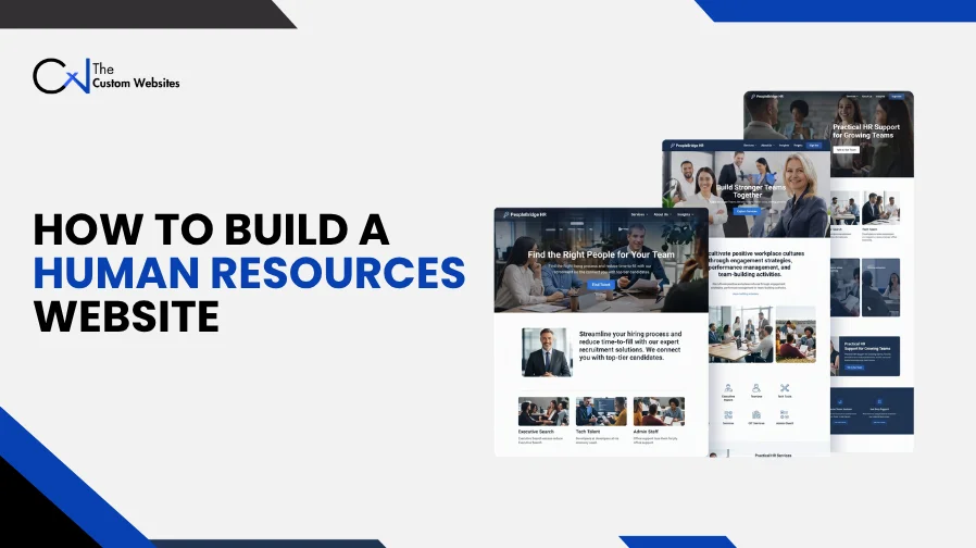
An HR consultant’s website has a different job from a recruitment portal. One needs to explain services and generate inquiries. The other needs to help candidates find vacancies and complete applications. An employee portal serves another audience entirely.
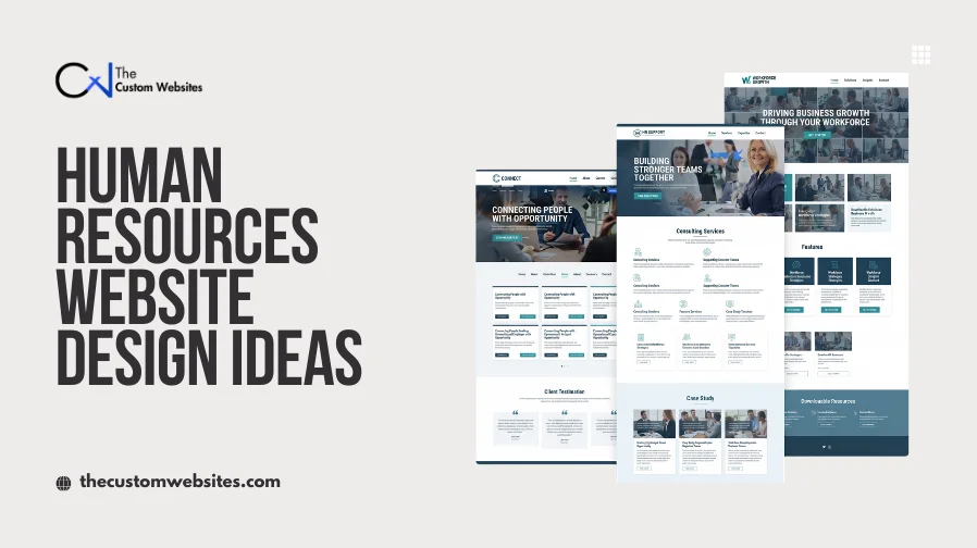
The Custom Websites provides Human Resources Website Design and Development services for consultancies, staffing agencies and businesses. These services can include public service pages, recruitment interfaces and employee resources, with software integrations assessed around each project.
These Human Resources Website Design Ideas show how different layouts can support those needs. The examples cover recruitment themes, consulting websites, employee communities and learning platforms. Each offers a useful starting point for organizing information around the people who will use it.
1. WorkScout
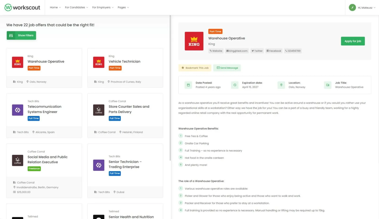
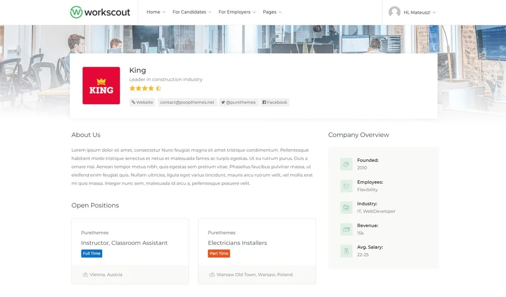
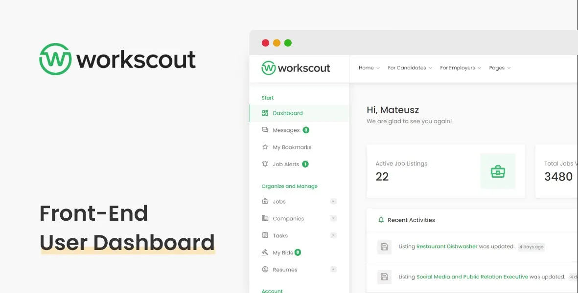
Design Overview: WorkScout’s recruitment layout puts job search at the center of the experience. Filters sit beside vacancy cards, while green controls highlight actions. The company profile gives employer information its own space above available roles.
Key Design Features: Separate search, employer and account areas provide useful direction for a job board website. Job labels help candidates scan listings, while dashboard navigation groups recurring account tasks.
What Makes This Design Effective: Applicants can narrow their search before opening a vacancy. Employer information stays connected to the jobs without crowding each listing.
Inspiration for Other HR Businesses: For recruitment website design, give candidates and employers separate starting points. Keep job titles, locations and application actions easy to find. Assess Applicant Tracking System (ATS) integration separately from the visual layout.
2. JobCareer
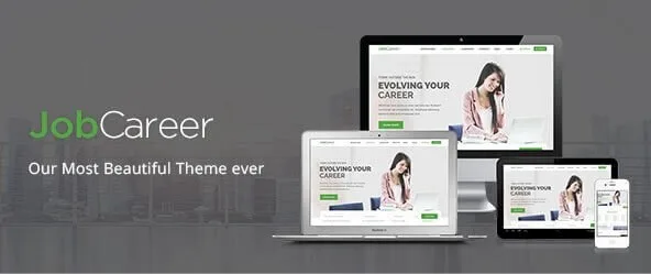
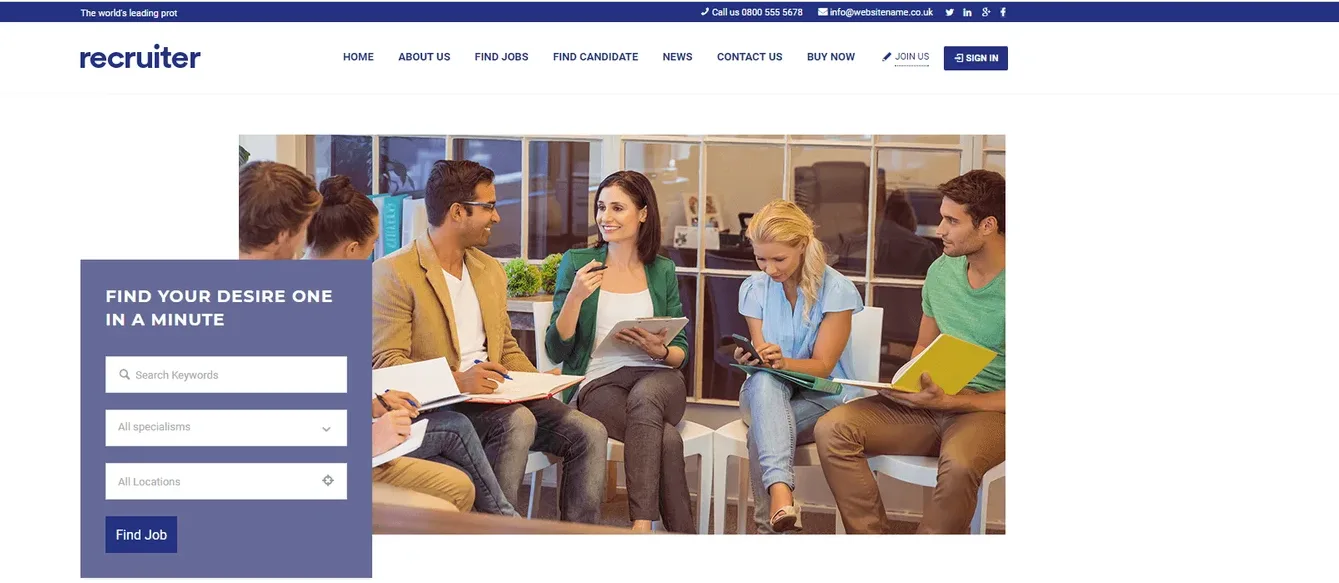
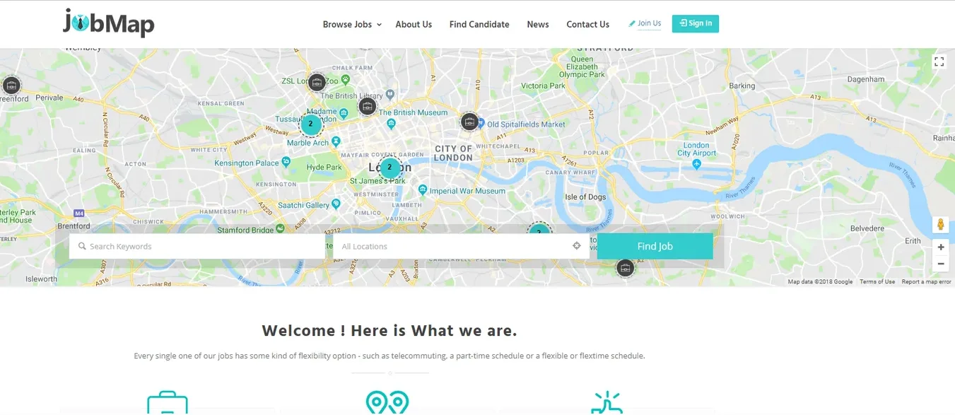
Design Overview: JobCareer’s recruiter example uses blue accents, a horizontal header and alternating content sections. Its map focused design gives location more attention near the opening. Both approaches leave room for vacancy information further down the page.
Key Design Features: Candidate and employer routes support different recruitment tasks. Profile information, job listings and location tools provide a structure for organizing a staffing website.
What Makes This Design Effective: Geography matters when someone is looking for work. Bringing location into the search helps candidates focus on relevant opportunities before reading individual descriptions.
Inspiration for Other HR Businesses: A staffing agency website can combine service explanations with searchable vacancies. Make the employer inquiry route distinct from candidate registration. Decide which candidate details should remain private before configuring profile visibility.
3. Consultio
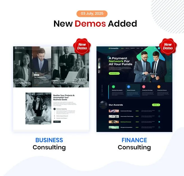
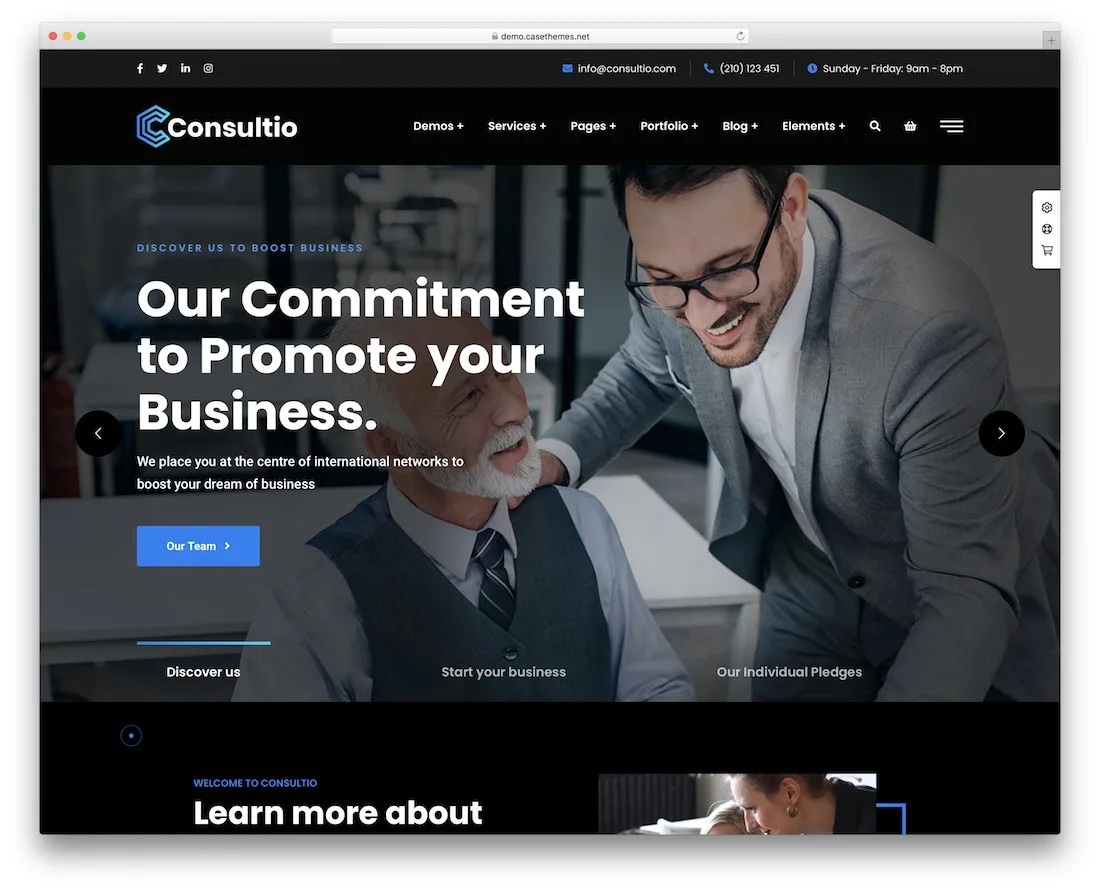
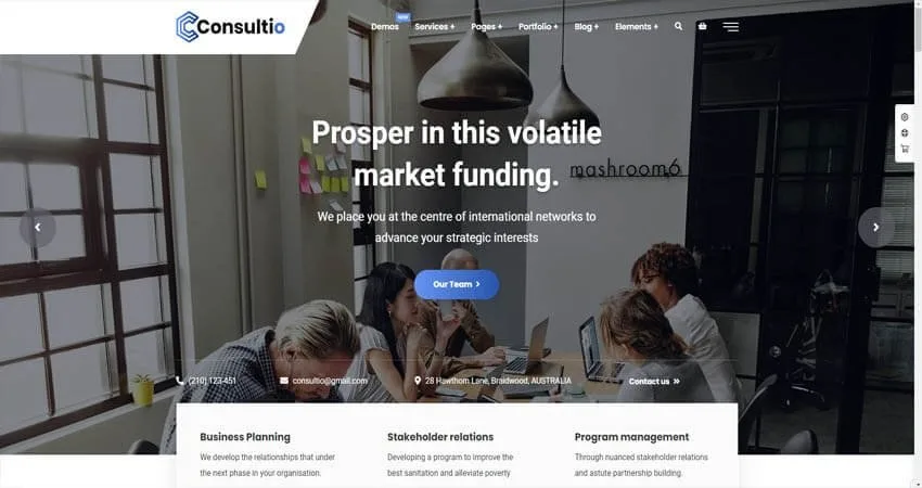
Design Overview: Consultio’s business layouts use large headings, professional photography and blue action buttons. Light service cards break information into smaller sections. A darker variation gives the opening message more visual weight.
Key Design Features: Service introductions, company information and inquiry sections suit an HR consultancy website. These pages can explain outsourced HR support, policy development and organizational consulting.
What Makes This Design Effective: A prospective client needs to understand what the consultancy handles. Separate service sections help explain the scope before asking someone to arrange a discussion.
Inspiration for Other HR Businesses: Build HR consulting website design around client questions. Explain who the service helps, what work it covers and how the engagement begins. Employee records, payroll and recruitment systems require their own implementation.
4. Superio
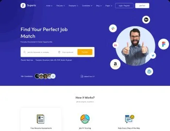
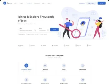
Design Overview: Superio’s examples use different hero treatments around a similar search structure. One pairs a portrait with a light background. Others use a dark blue section or illustration, followed by a spaced category grid.
Key Design Features: Vacancy search, category browsing and account navigation appear early in the journey. Candidate profiles and application related screens offer further reference points for recruitment portal design.
What Makes This Design Effective: Visitors can recognize the main task quickly. Categories also give candidates a starting point when they have not settled on an exact job title.
Inspiration for Other HR Businesses: Keep search controls readable across desktop and mobile screens. Use meaningful hiring categories and explain what happens after an application. Check the required plugins before planning job alerts or application tracking.
5. SaaSland
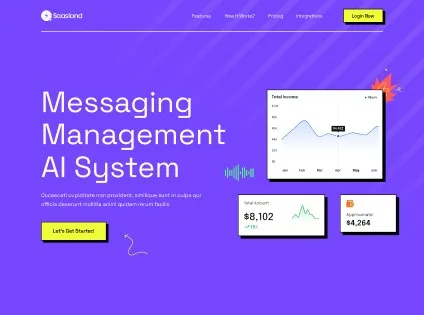
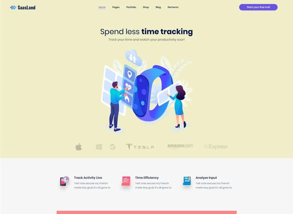
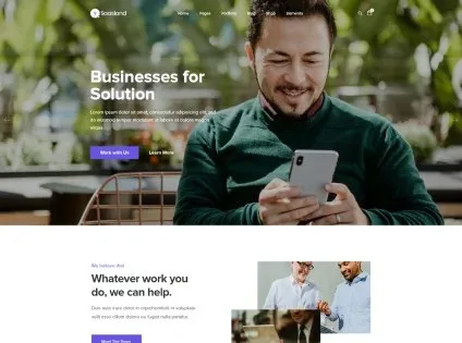
Design Overview: SaaSland’s software examples give product messaging and interface images prominent positions. Purple and pale yellow variations create different moods. The business layout uses photography and stacked sections to explain the offer.
Key Design Features: Product screenshots, feature explanations and demonstration requests suit an HR technology website. These sections can introduce employee onboarding software, workforce scheduling or a Human Resource Information System (HRIS).
What Makes This Design Effective: Visitors can connect a product feature with the task it supports. A useful interface image gives more context than a broad claim about improving productivity.
Inspiration for Other HR Businesses: For HR software website design, show genuine product screens and explain real workflows. Place a relevant demo or trial action nearby. A marketing theme provides the presentation layer, while the software requires separate development.
6. Jobify
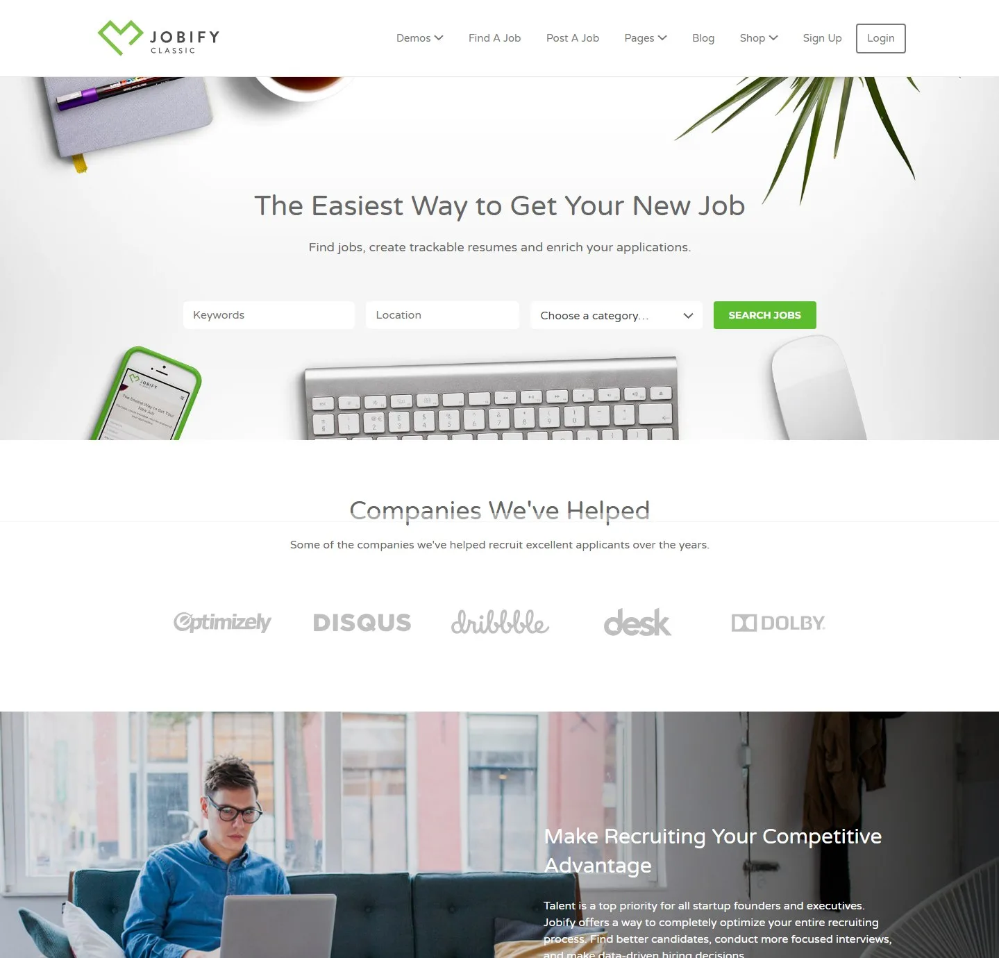
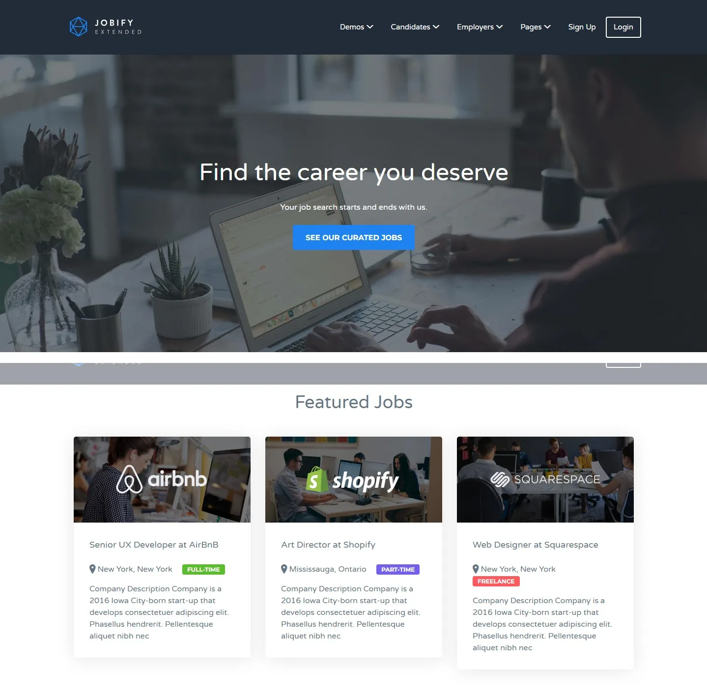
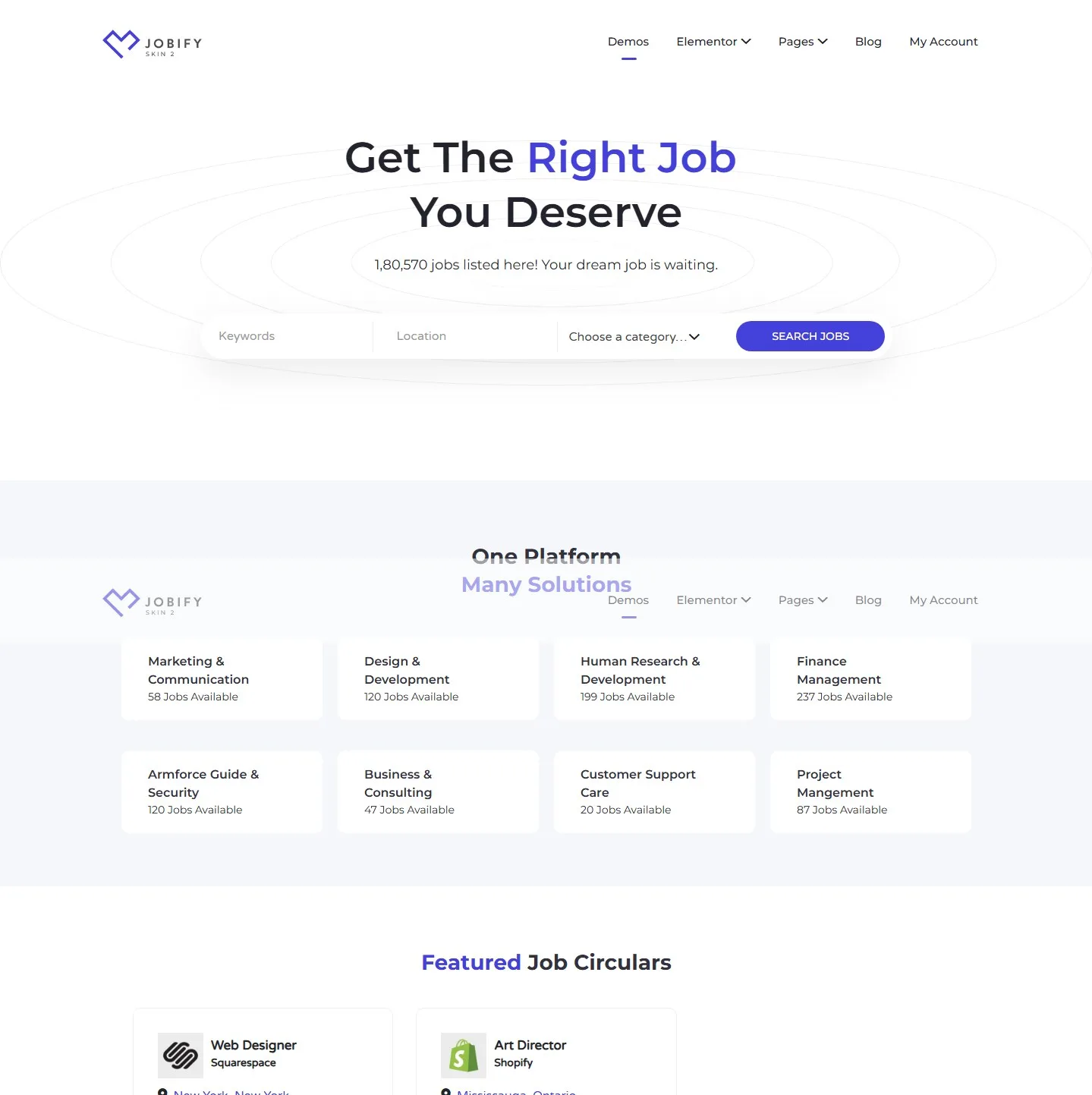
Design Overview: Jobify’s examples range from a bright search focused layout to a darker opening photograph. Company logos, job cards and category sections follow the main search. Each variation keeps navigation above the primary action.
Key Design Features: Vacancy listings, employer information and application routes provide the main structure. Maps and account areas can support further browsing when included in the selected setup.
What Makes This Design Effective: Familiar listing patterns help candidates compare opportunities. They can identify a role and employer before deciding whether to read the full description.
Inspiration for Other HR Businesses: Choose job card fields around applicant needs. Salary information, location and employment type should have consistent positions when available. Review the complete application process when planning a WordPress recruitment website.
7. Careerfy
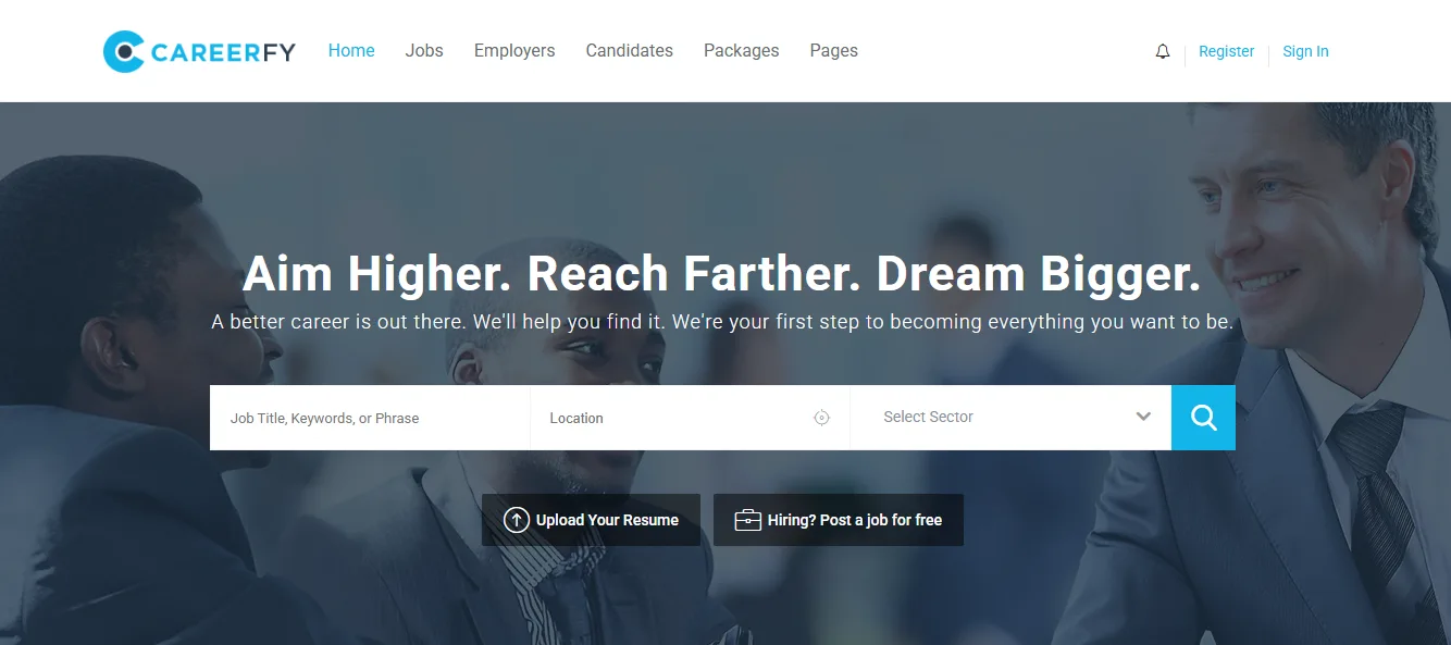
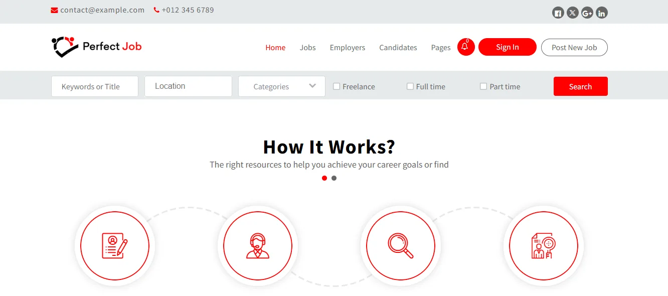
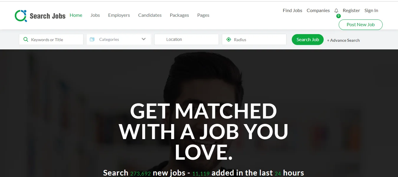
Design Overview: Careerfy’s previews use different colors and hero images around a familiar recruitment structure. Search appears first, followed by categories and vacancy sections. Supporting content sits further down the page.
Key Design Features: Candidate registration, account access and job browsing create distinct stages in the user journey. Sector categories can organize opportunities for a recruitment business serving several industries.
What Makes This Design Effective: Visitors move from a broad search toward a smaller set of roles. Repeated listing patterns make that process easier to follow.
Inspiration for Other HR Businesses: Build talent acquisition website categories around actual hiring activity. Avoid adding empty sectors simply because they appear in a demo. Test registration and application forms on a phone before publishing.
8. Astra
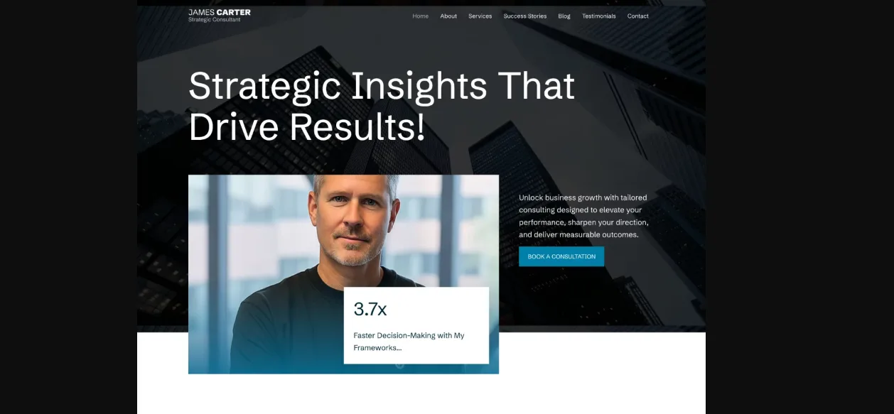
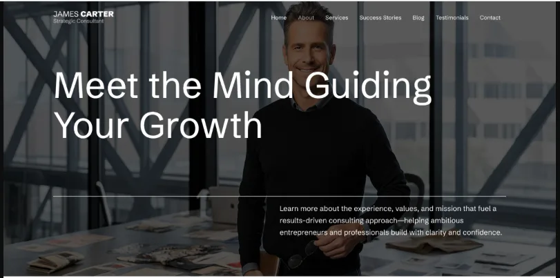
Design Overview: The consultant examples use dark photography, teal accents and clear white content areas. Each page has a different purpose, while the shared header and footer keep the website consistent.
Key Design Features: A service homepage, about page and inquiry route provide a practical foundation for a small HR practice. Individual service pages can explain employee relations, HR policy support and management advice.
What Makes This Design Effective: Visitors can assess the consultant’s experience alongside the work offered. They do not have to search through one long page for every answer.
Inspiration for Other HR Businesses: An independent adviser can start with a focused HR professional website. Give each core service enough detail to explain its scope. Add recruitment or employee self service tools when the business needs them.
9. Bridge
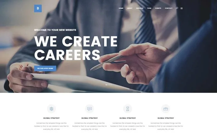
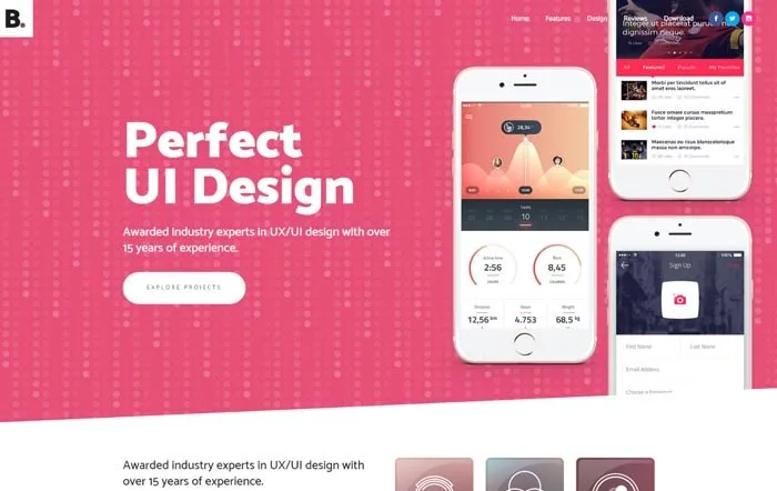
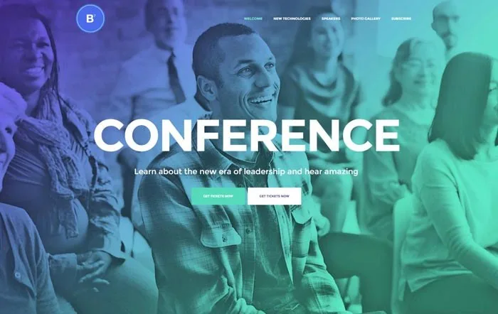
Design Overview: Bridge’s examples show three different visual directions. The careers layout emphasizes a large heading over photography. The agency design uses brighter colors, while the conference version introduces an event focused structure.
Key Design Features: Bold headings, horizontal navigation and separate content blocks can support employer branding, consultancy services or HR events. The chosen layout should reflect the information visitors need.
What Makes This Design Effective: A strong opening message can establish the website’s purpose quickly. Clear sections then give that message useful detail.
Inspiration for Other HR Businesses: An employer branding agency can use expressive photography and project examples. An HR conference website needs schedules, speakers and registration information. Choose one direction and keep essential text readable over every background.
10. BuddyBoss
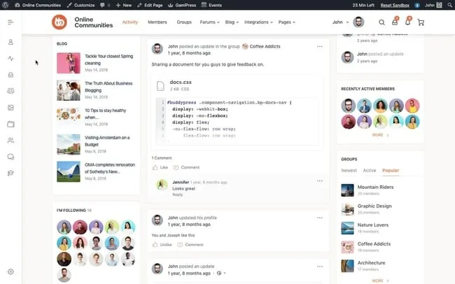
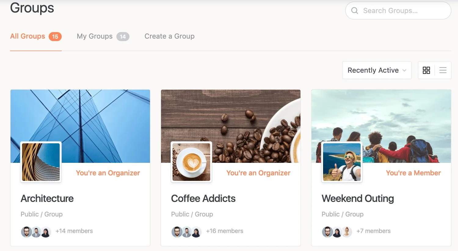
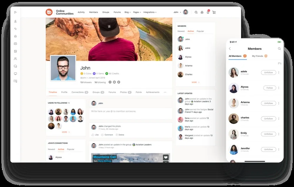
Design Overview: BuddyBoss uses a community interface rather than a conventional consultancy homepage. A central feed holds conversations, while side navigation and supporting panels provide access to groups and resources.
Key Design Features: Member profiles, discussion groups and activity areas offer ideas for an employee engagement portal. Learning connections may also support a broader staff development experience, depending on the selected products.
What Makes This Design Effective: Employees can return to familiar spaces for ongoing conversations. Topic based groups give information a more useful home than an unstructured stream of updates.
Inspiration for Other HR Businesses: Organize an employee community around departments, onboarding and shared learning needs. Make account access and resource navigation clear. Define permissions separately for staff information, discussions and any connected HR systems.
11. LearnDash
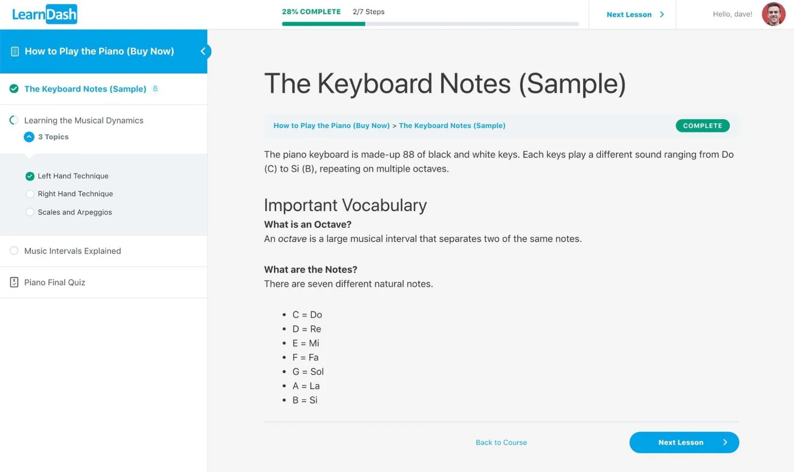
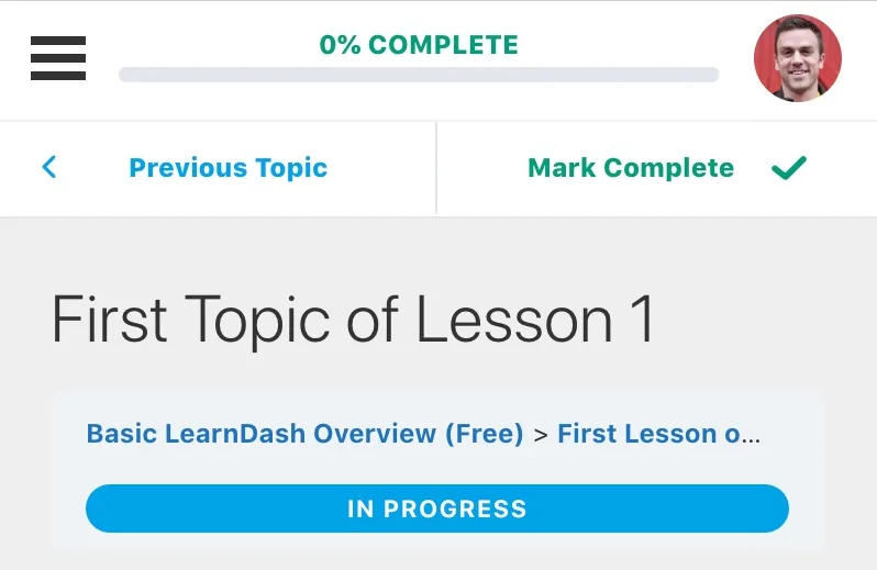
Design Overview: LearnDash’s Focus Mode places lesson navigation in a sidebar and learning content in the main area. Progress controls identify the next action. The mobile example adapts the lesson to a narrower screen.
Key Design Features: Course sequences, lesson navigation and progress indicators provide useful reference points for employee training website design. LearnDash is primarily a Learning Management System (LMS) plugin, with visual presentation also shaped by its theme.
What Makes This Design Effective: Learners can understand where they are within a course. A visible outline reduces the effort needed to resume training.
Inspiration for Other HR Businesses: Build onboarding courses around a clear sequence. Keep required lessons and completion actions easy to recognize. Assess learning requirements separately from employee records and other HRIS functions.
12. Divi
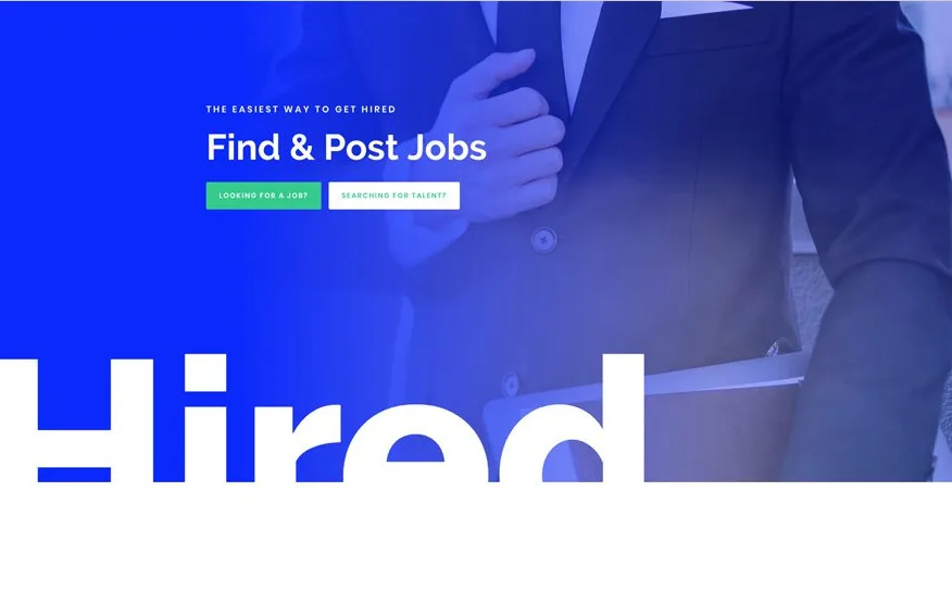
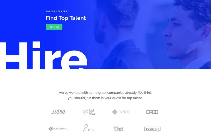
Design Overview: Divi’s Job Recruiter layouts use strong blue sections, white display text and lighter content areas. Illustrations add interest while repeated colors connect the homepage, employer page and vacancy layout.
Key Design Features: Separate audience pages give employers and applicants relevant information. A detailed vacancy page can organize responsibilities, requirements and the application action.
What Makes This Design Effective: Employers can explore recruitment support without moving through candidate content. Applicants can focus on the role they are considering.
Inspiration for Other HR Businesses: Use a consistent design across employer and candidate journeys. Explain the service on one route and the application process on the other. A recruitment page layout still needs a working vacancy source and application connection.
13. Avada
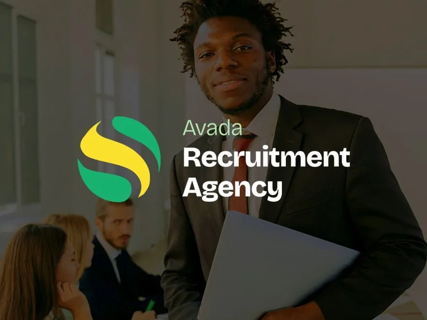
Design Overview: These compact previews emphasize the first screen. People photography and clear opening messages introduce each business. The Recruitment example has the closest subject fit for a staffing agency.
Key Design Features: Service sections, company introductions and supporting content provide ideas for a broader human resources company website. Consistent page patterns can help organize several service areas.
What Makes This Design Effective: A clear hierarchy helps visitors understand how the services relate. They can identify a relevant area before reading detailed information.
Inspiration for Other HR Businesses: Group related offers under useful navigation labels. An established HR firm might separate consulting, recruitment and training. Inspect the complete demo before choosing it, as a small homepage preview cannot show every user journey.
14. Eduma
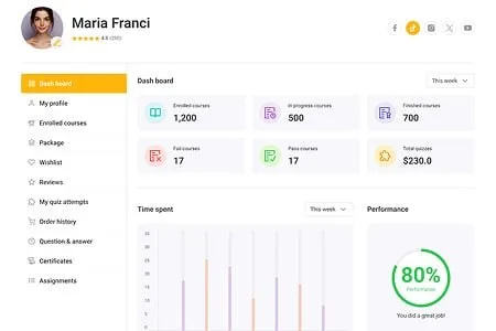
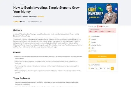
Design Overview: Eduma’s learning examples use light backgrounds, dark text and yellow accents. The course page places detailed content beside an enrollment panel. Filters organize the wider course collection.
Key Design Features: Course categories, learner profiles and enrollment information offer a structure for professional development websites. Eduma works within the LearnPress learning ecosystem, with requirements varying by setup and add ons.
What Makes This Design Effective: Visitors can compare learning options before opening individual courses. On the course page, important details remain close to the enrollment action.
Inspiration for Other HR Businesses: Organize HR training by topic, audience and learning level. Explain the course content before asking someone to enroll. Internal employee development programs also need appropriate access controls.
15. MasterStudy
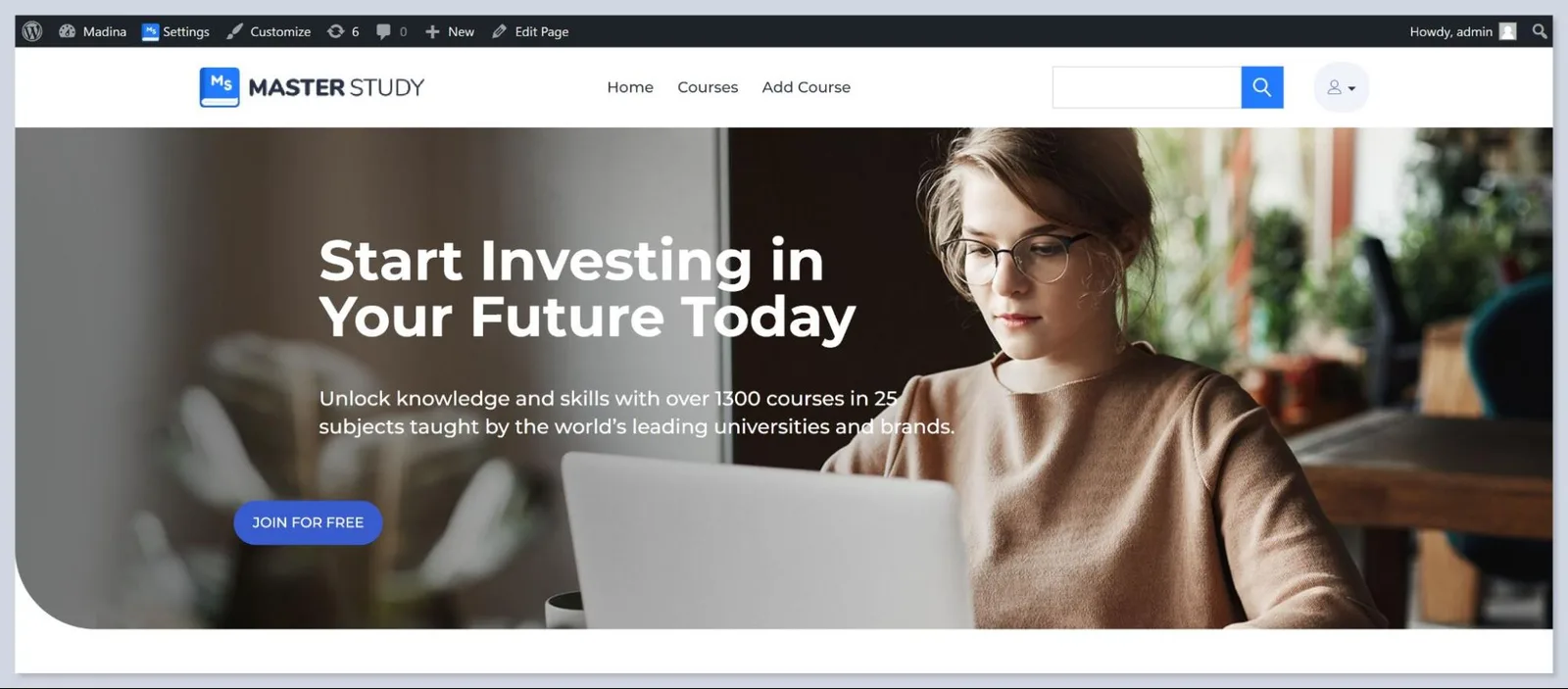
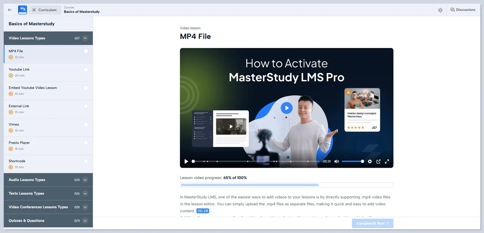
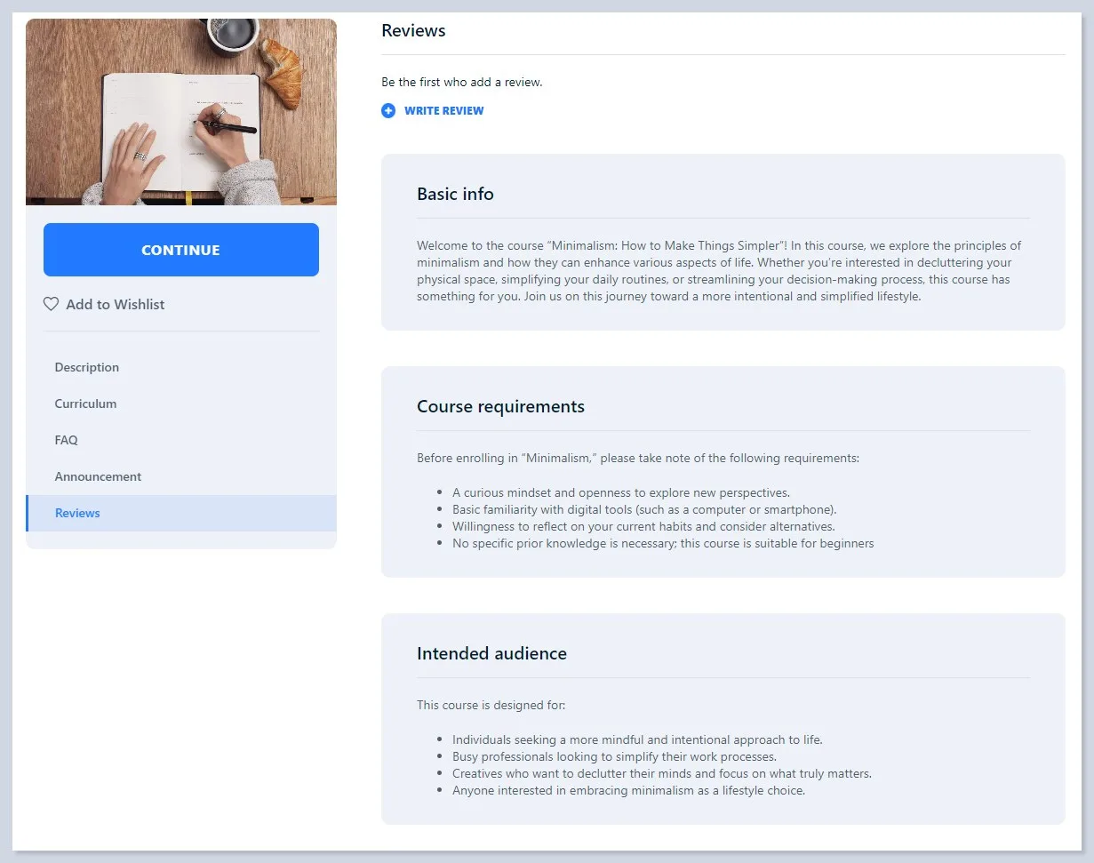
Design Overview: MasterStudy’s examples cover both promotional pages and learning interfaces. A broad banner introduces the training offer. Lesson navigation and course tabs then organize the material within individual programs.
Key Design Features: Course information, quizzes and structured lessons are relevant to a corporate learning website. The theme and related LMS products need separate consideration when confirming features.
What Makes This Design Effective: Prospective learners can review a course before joining. Once enrolled, they can follow a defined learning sequence.
Inspiration for Other HR Businesses: Build a corporate academy around the training employees actually need. Separate onboarding, manager development and optional learning where appropriate. Confirm which product and plan supplies each required function before planning the portal.
16. KnowAll
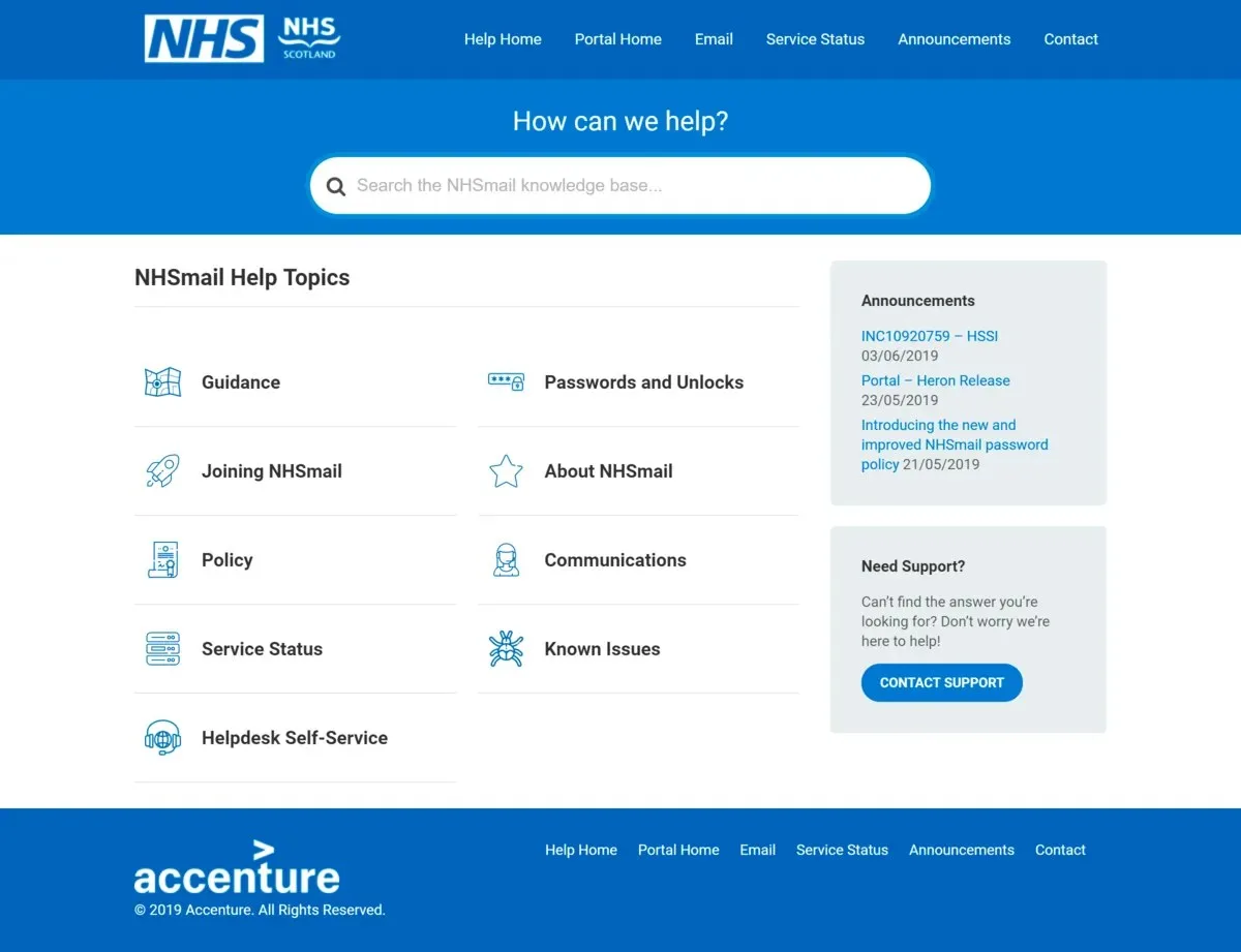
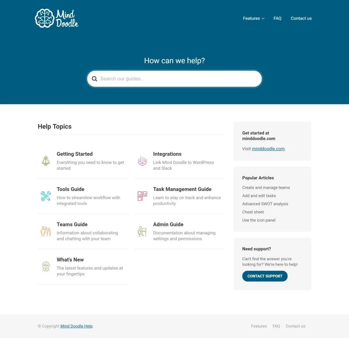
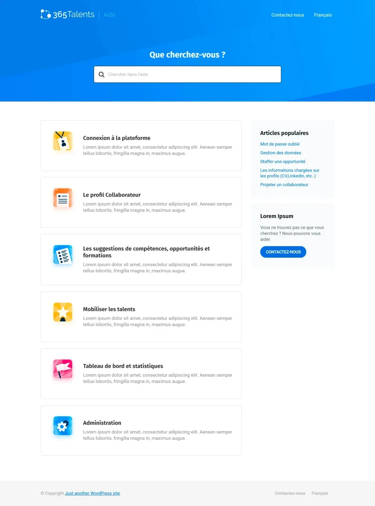
Design Overview: These customer examples place search near the top and group help content into recognizable categories. Blue and teal headers give the websites different identities while preserving a clear information structure.
Key Design Features: Search, topic categories and focused articles offer useful direction for an HR knowledge base. Content might explain onboarding steps, leave procedures or how to request support.
What Makes This Design Effective: Employees can search for an answer directly or browse a relevant topic. They have more than one way to reach the same information.
Inspiration for Other HR Businesses: Write article titles around common employee questions. Keep each answer focused and identify who maintains it. Confirm access controls before using a knowledge base for internal policies or staff guidance.
17. Houzez
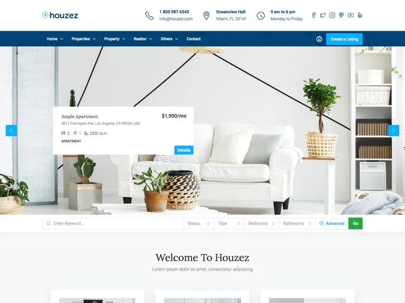
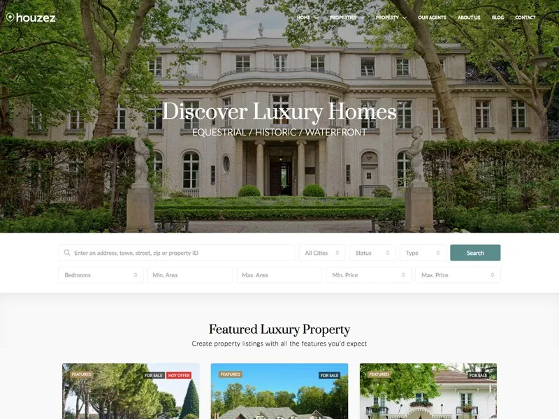
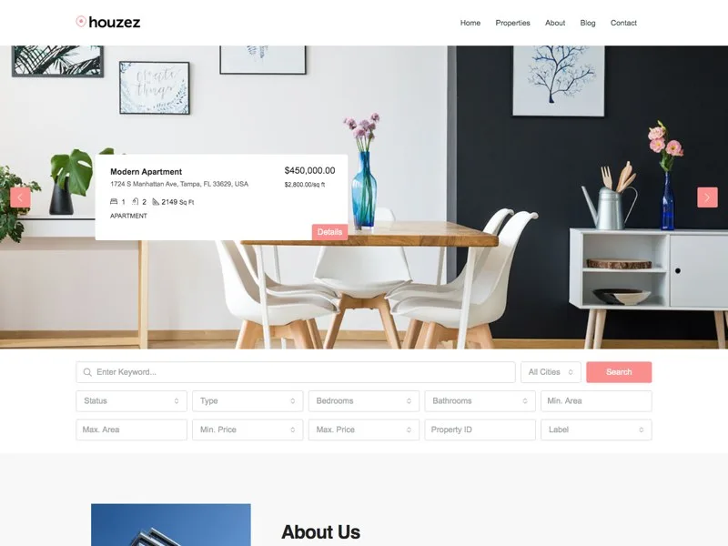
Design Overview: Houzez’s property layouts combine a large opening image with search controls and listing cards. Different previews use blue, green and white palettes. Their main value here is the organization of searchable information.
Key Design Features: Filters, listing summaries and detail pages offer ideas for directory design. However, the supplied examples use property fields and real estate workflows.
What Makes This Design Effective: Structured cards help visitors compare options without opening every page. Consistent information placement supports scanning across a large directory.
Inspiration for Other HR Businesses: Borrow the visual approach when studying job listing website design. Keep recruitment fields relevant to candidates and employers. Houzez is a real estate theme, so a dedicated recruitment solution is usually a closer starting point for vacancy management.
18. The7
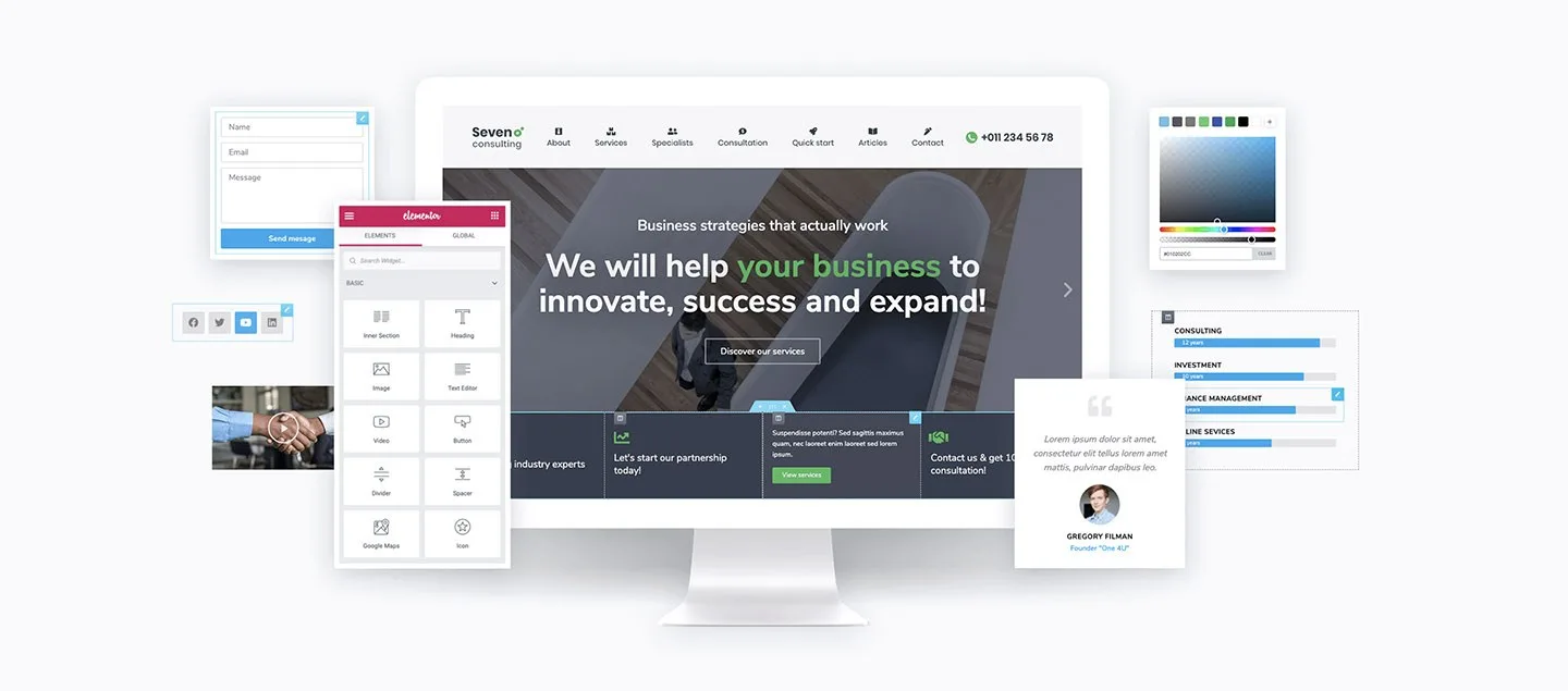
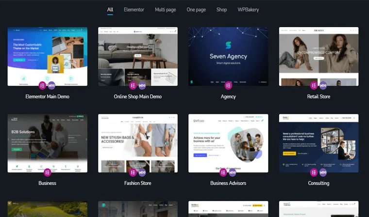
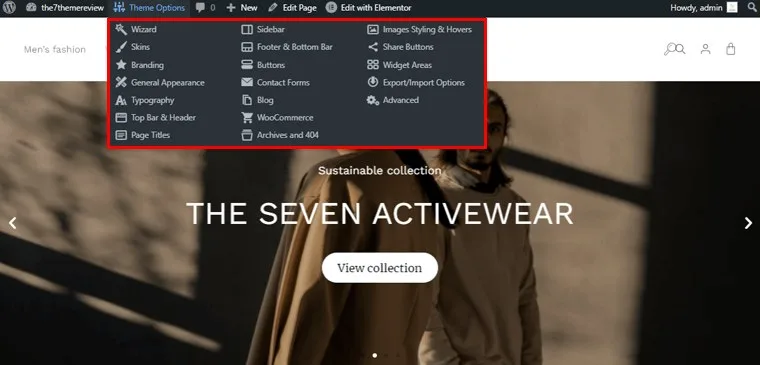
Design Overview: The7’s preview composition shows website layouts across devices. Its demo collection offers different visual starting points, while the customization image explains how design options are organized.
Key Design Features: Consistent headers, service page structures and responsive presentation can inform a corporate HR website. The actual pages matter more than the promotional preview composition.
What Makes This Design Effective: A consistent layout helps visitors recognize navigation as they move between services. Mobile presentation also matters when someone opens a vacancy or inquiry page from their phone.
Inspiration for Other HR Businesses: Use direct labels such as Services, Careers and Contact. Check the selected demo and its required plugins. Scope employee databases, applicant workflows and HR management integrations separately from public page design.
19. Salient
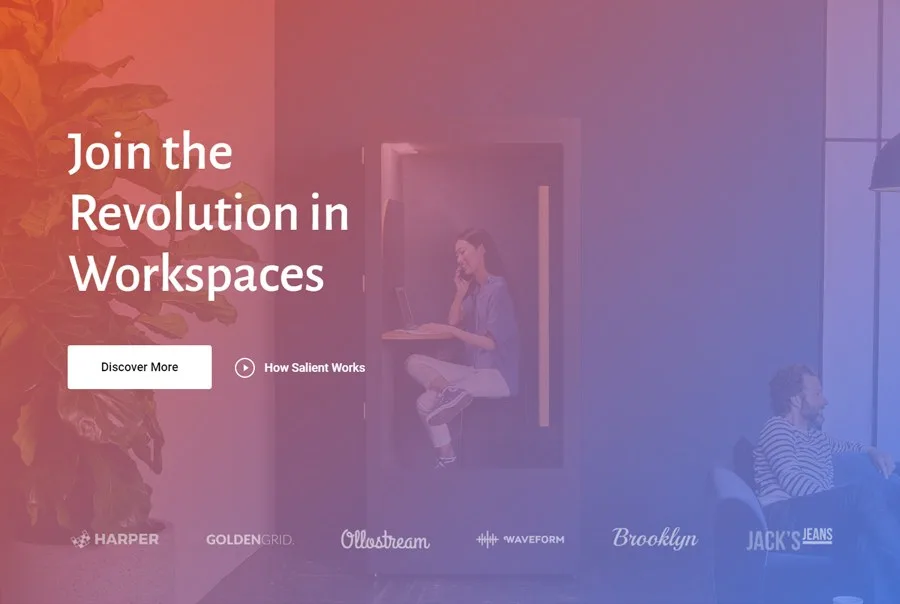
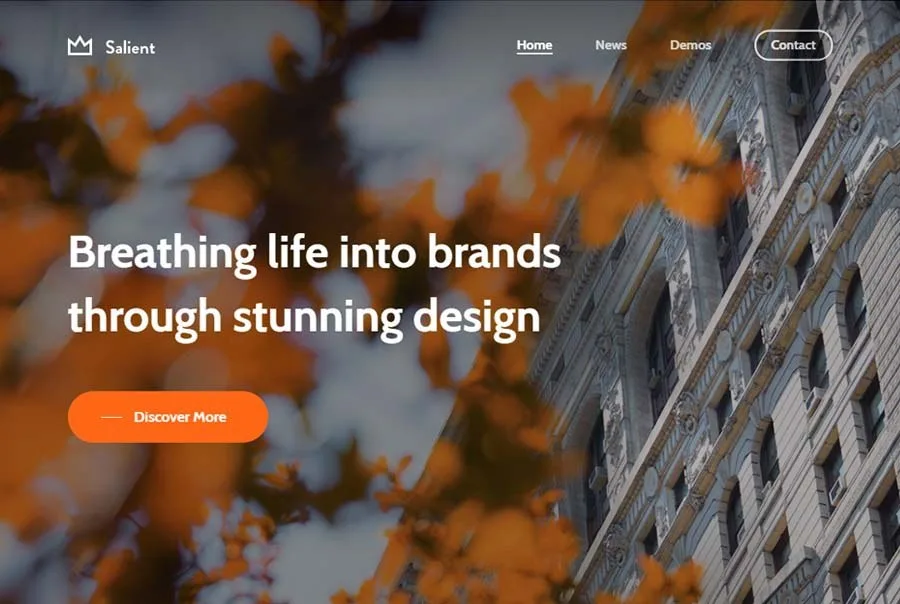
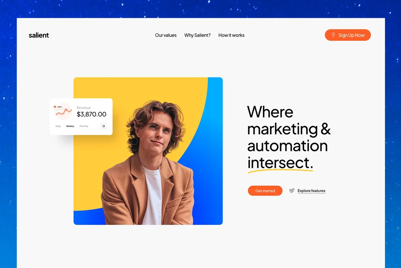
Design Overview: Salient’s examples give the opening message strong emphasis. Workplace photography supports the business layouts, while the SaaS variation uses more space around text and product imagery.
Key Design Features: Large headings, visual storytelling and project sections can support employer branding website design. A software focused variation offers another direction for an HR technology business.
What Makes This Design Effective: The design creates space for a clear point of view. Supporting content can then explain the company’s approach and provide examples of its work.
Inspiration for Other HR Businesses: Use strong images when they help explain your people or projects. Keep service information accessible without requiring an animation to finish. Case studies should describe the work clearly and respect client confidentiality.
20. Uncode
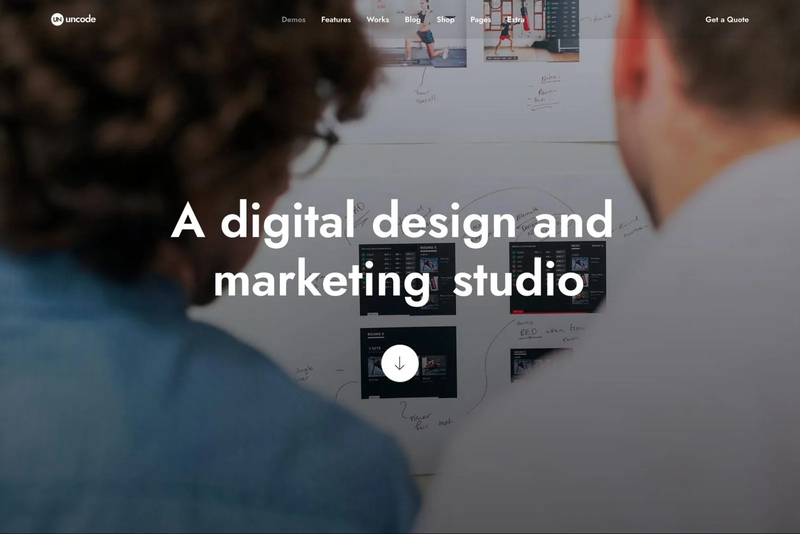
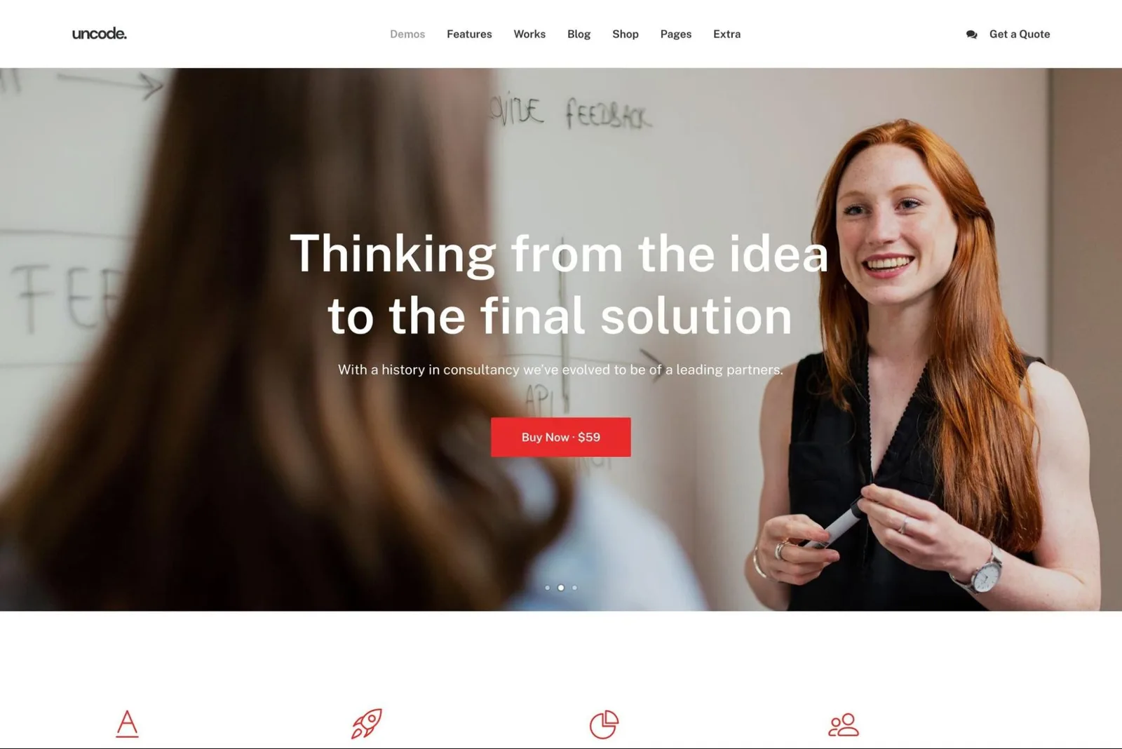
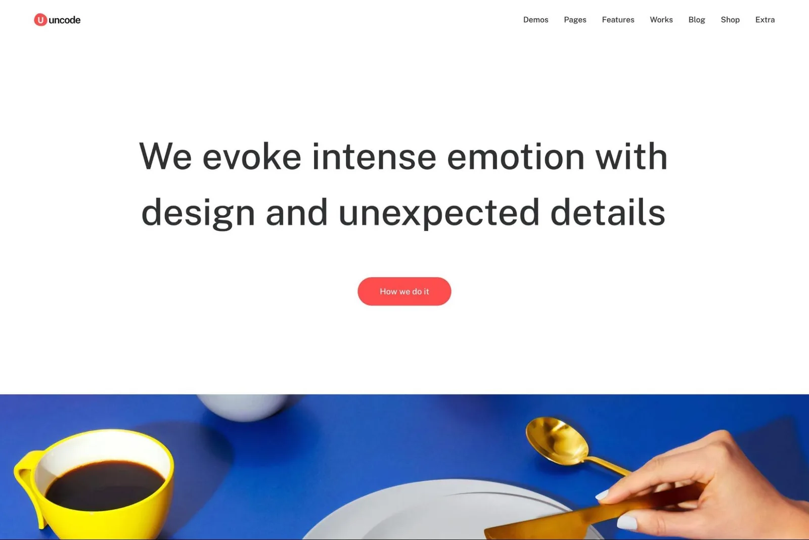
Design Overview: Uncode’s examples balance service messaging with project presentation in different ways. The agency layout makes a bold opening statement. The business version introduces an adviser, while the portfolio design gives individual work more room.
Key Design Features: Project grids, consulting introductions and case study pages can support a people strategy website. Their usefulness depends on having enough relevant material to explain the work.
What Makes This Design Effective: Visitors can move from a general service claim to a specific example. That gives the consultancy’s approach more context.
Inspiration for Other HR Businesses: Describe the client problem, the work completed and the outcome where disclosure is permitted. An employer branding portfolio needs explanation alongside images. Keep inquiry routes visible as visitors explore the projects.
21. Betheme
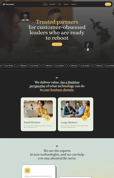
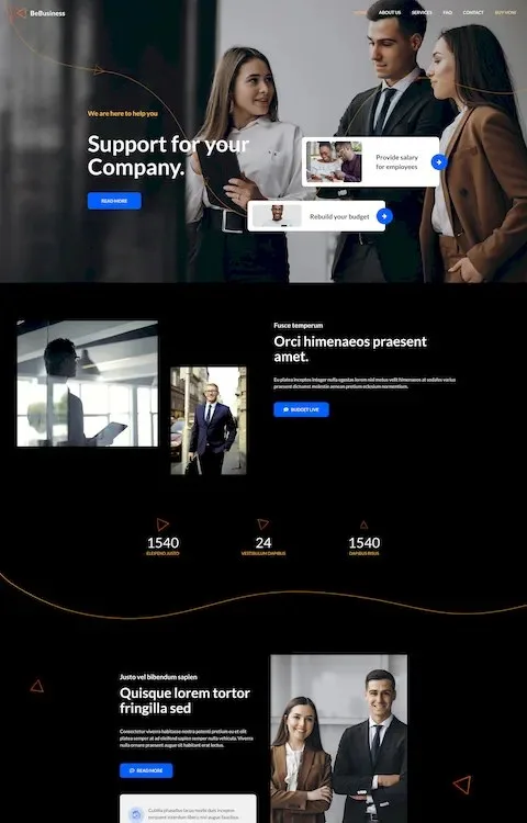
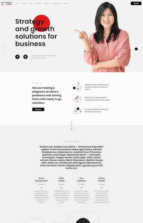
Design Overview: Betheme’s consulting examples offer several tones within a similar stacked structure. Dark sections create emphasis in two previews. The lighter consultant design gives the adviser’s portrait a more prominent role.
Key Design Features: Service introductions, adviser profiles and inquiry sections can form a focused HR advisory website. Repeated content blocks help organize information without changing the layout on every page.
What Makes This Design Effective: Visitors can follow a straightforward explanation of the business. Each section can answer a different question about the offer.
Inspiration for Other HR Businesses: Choose one visual direction and adapt it around real services. Remove demo sections that do not help prospective clients. Confirm form requirements and any private client area separately before planning development.
22. Enfold
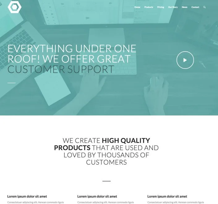
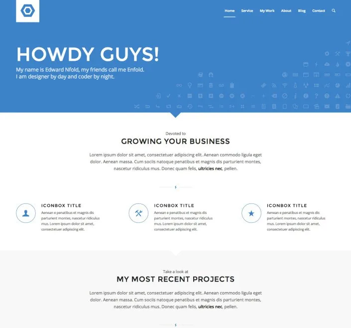
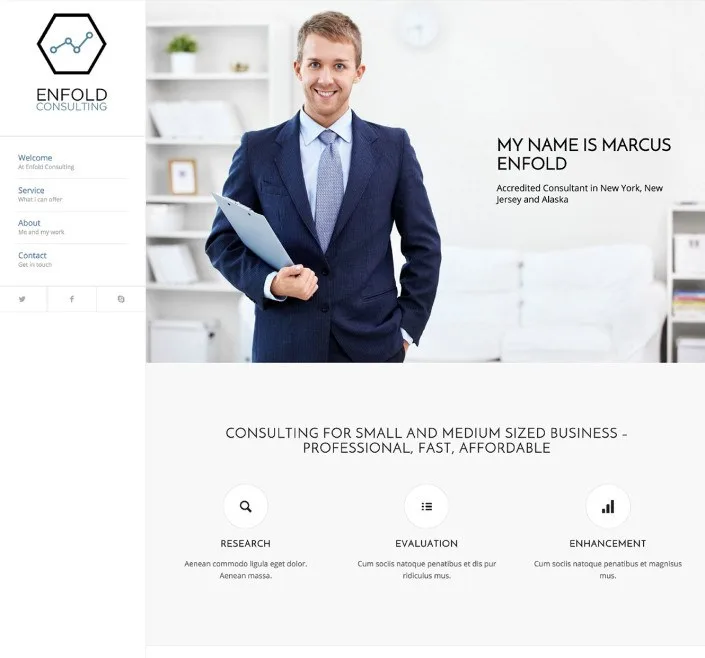
Design Overview: Enfold’s examples use horizontal headers and clear section headings. The consulting preview places an adviser near the opening message. Other layouts give more attention to business imagery and service content.
Key Design Features: Public service pages and organized help content provide two useful directions. An HR consultancy may need both, but each serves a different audience.
What Makes This Design Effective: Clients can learn about professional support, while resource readers can look for practical guidance. Clear navigation prevents those journeys from becoming mixed together.
Inspiration for Other HR Businesses: Separate public HR services from internal employee resources. Use recognizable labels for policies and support topics. A knowledge base layout still needs verified access controls before it holds restricted staff information.
23. Kalium
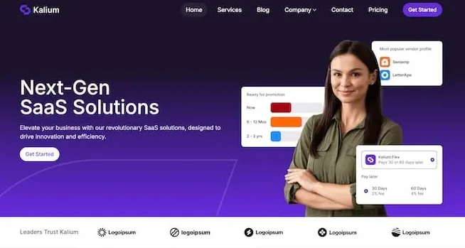
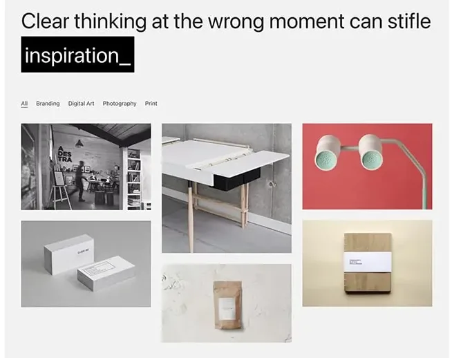
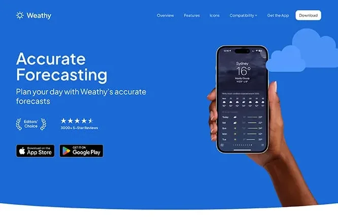
Design Overview: Kalium’s examples vary in content density and emphasis. The software layout gives product imagery a central role. The agency design uses white space and large text, while the landing page introduces features through alternating sections.
Key Design Features: Project displays, product explanations and service content can support different human resources web design needs. The best choice depends on what the organization can show.
What Makes This Design Effective: The layout can give the most useful evidence enough room. A consultancy may need detailed projects, while an HR software vendor needs understandable product screens.
Inspiration for Other HR Businesses: Match the template to available content. Use project layouts for consulting work and product layouts for genuine software interfaces. Plan recruitment workflows and employee account functions separately.
24. TheGem
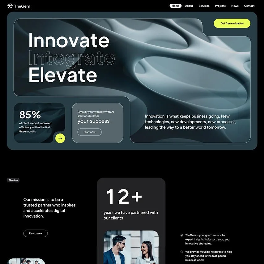
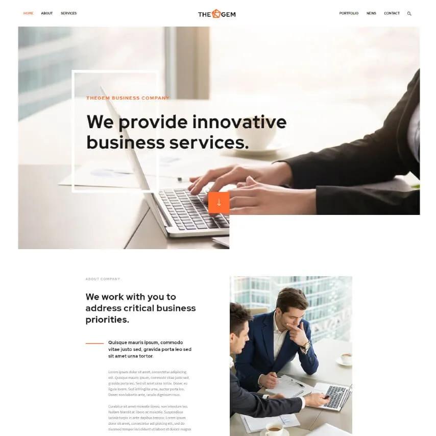
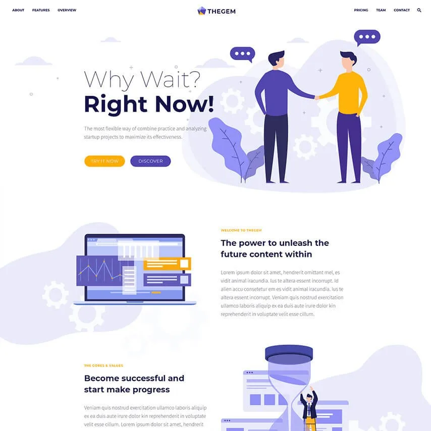
Design Overview: TheGem’s examples show different approaches to a public business website. The technology layout uses stronger contrast. The consulting design relies on business photography, while the startup version introduces illustrated content.
Key Design Features: Reusable service layouts, headers and page templates can help an HR company organize a growing website. A consistent structure leaves room for different service details.
What Makes This Design Effective: Visitors can compare services through familiar page patterns. They can focus on the offer rather than working out a different layout each time.
Inspiration for Other HR Businesses: Create a repeatable structure for HR consulting, recruitment and training pages. Explain scope, process and the next step within each service. Assess candidate accounts and employee self service requirements before selecting supporting software.
25. Jupiter
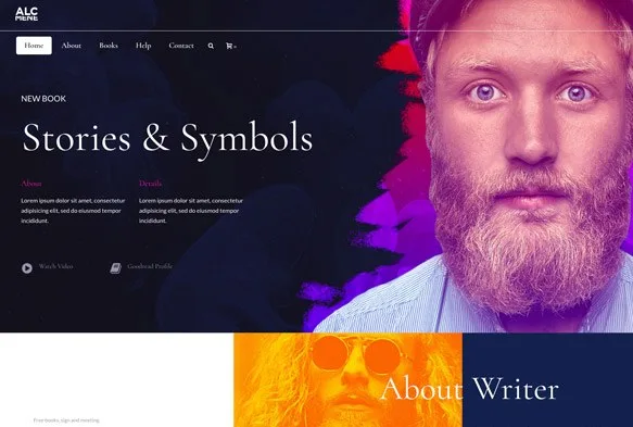
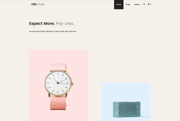
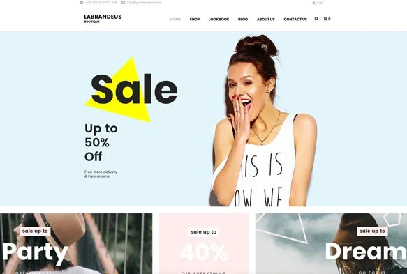
Design Overview: These classic Jupiter examples use large images and distinct visual styles. They are broader design references rather than dedicated HR demos. Their value lies in hierarchy, branding and the placement of navigation.
Key Design Features: Opening statements, page sections and configurable headers can inform a public advisory website. Commerce elements in a reference layout would need replacing when they do not serve the HR business.
What Makes This Design Effective: A clear hierarchy helps visitors understand which message matters first. Consistent navigation then connects that introduction with detailed service information.
Inspiration for Other HR Businesses: Confirm whether the chosen reference belongs to Jupiter or Jupiter X before preparing specifications. Build the HR website around useful service pages and working inquiry journeys. Verify recruitment and HRIS connections separately.
Choose an HR Website Design That Fits Your Audience
Start with the action visitors need to complete. Recruitment agencies need clear vacancy search and application routes. HR consultancies need service explanations and inquiry forms. Employee portals need organized resources and appropriate account permissions.
Use these human resources website design examples to compare structures before choosing colors or visual effects. Check the complete mobile journey and confirm the software connections each task requires.
The Custom Websites offers HR Website Design and Development services around those needs. A focused structure can help employers find support, candidates explore opportunities and employees reach useful information.