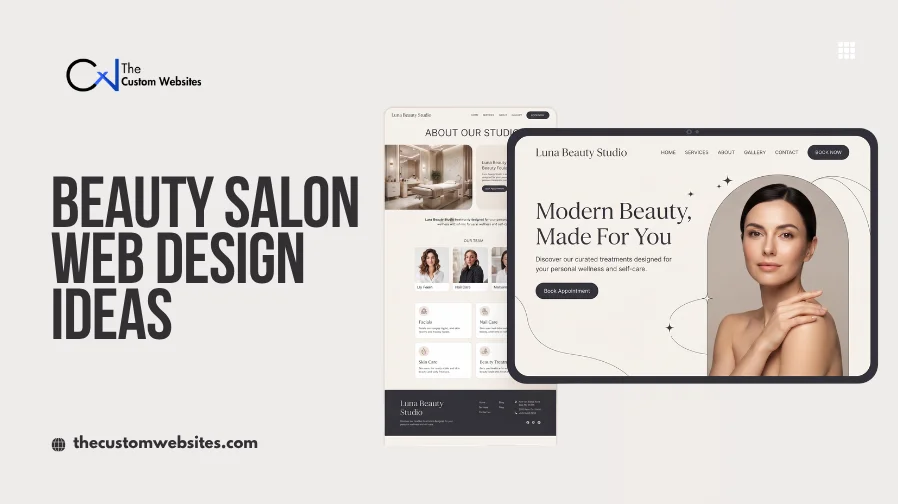
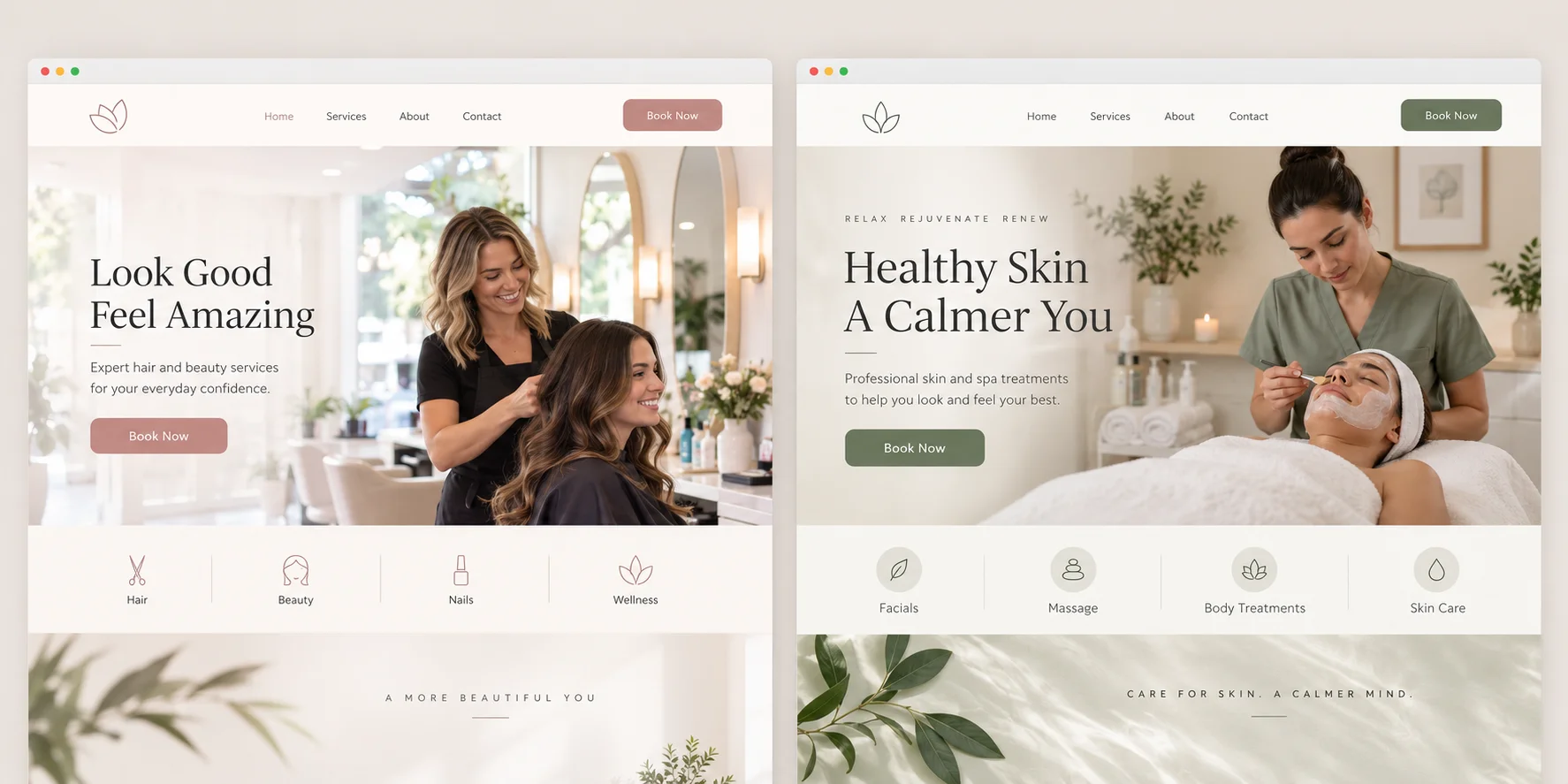
A salon website often creates the first clear picture of the business. Its colors, photography, typography and layout should reflect the experience clients can expect inside the salon.
Effective Beauty Salon Website Design and Development also makes practical information easy to find. Visitors should be able to explore services, compare treatments, review pricing, meet the team, view previous work and book an appointment without searching through several pages.
The following beauty salon website design examples come from real WordPress themes and professionally designed salon websites. The observations focus on visible layouts and features documented by their creators or shown on the live websites.
1. Kendall Spa, Hair and Beauty Salon
Design Overview
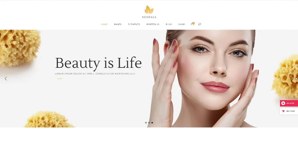
Kendall uses a refined editorial layout with large photography, thin typography and plenty of open space. The design combines full-width visual areas with structured content blocks. This balance lets photography establish the mood while service information remains readable.
The subdued color palette supports a premium appearance without distracting from salon images.
Key Design Features
The developer documents gallery layouts, pricing lists, pricing tables, booking functionality, shop pages and a blog. The demos also show service presentations and large visual sections suitable for hair, spa and beauty content.
What Makes This Design Useful
Kendall shows how a salon can use editorial styling without hiding important information. Its pricing and booking features can move visitors from inspiration to service selection within the same visual system.
Best For
Luxury salons, beauty salons, spa businesses and hair and beauty studios.
2. Chérie Beauty Salon
Design Overview
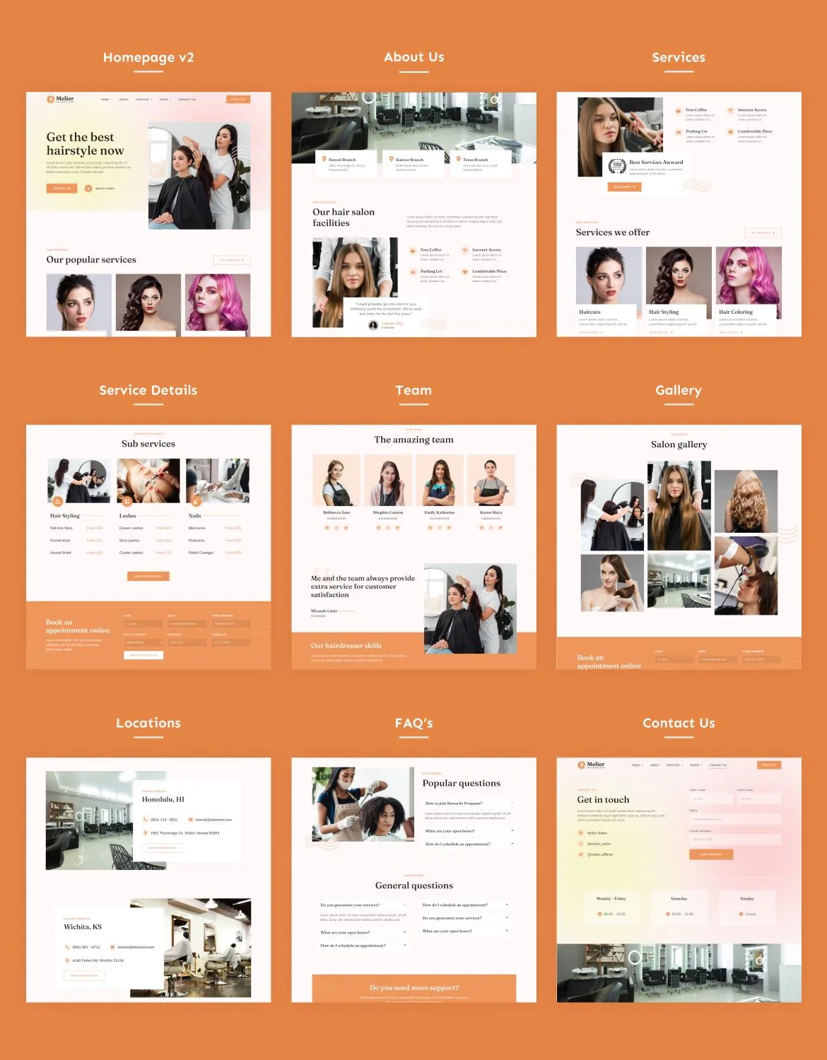
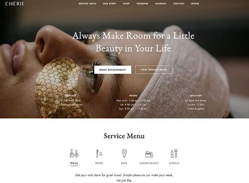
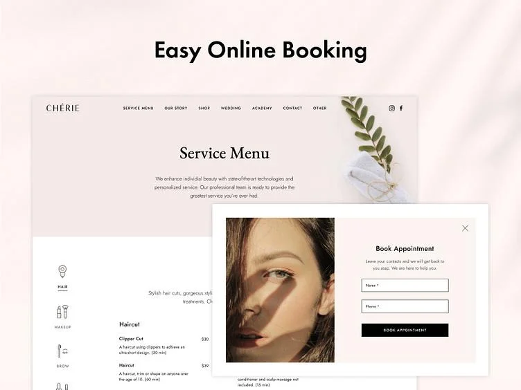
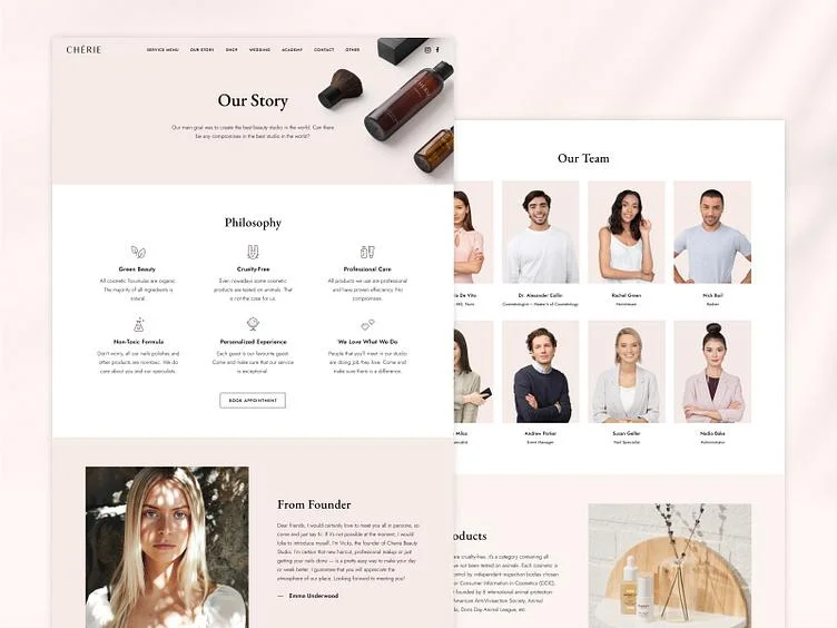
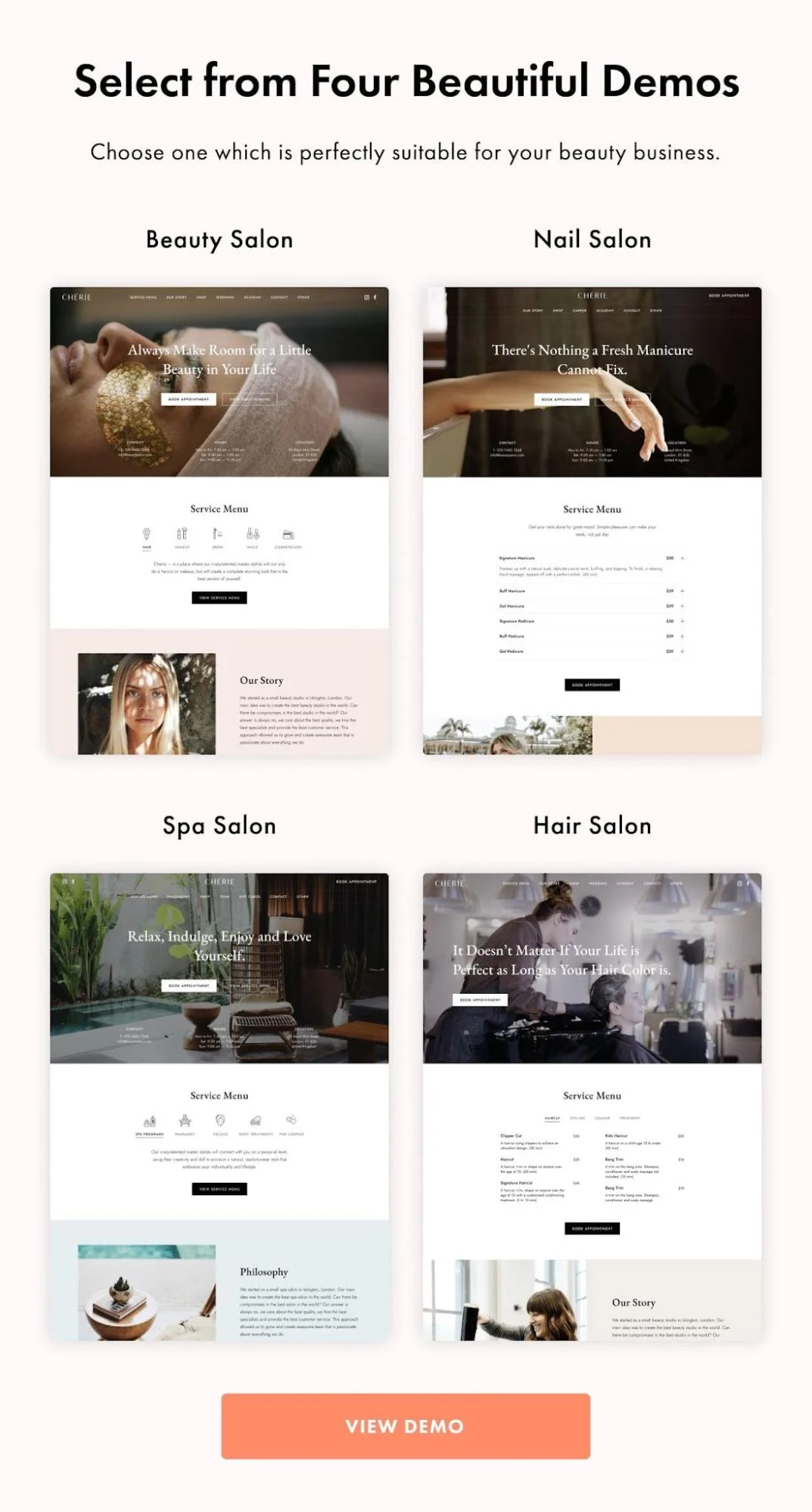
Chérie uses soft colors, rounded shapes and spacious content sections. Its visual direction feels approachable rather than highly formal. Large headings create a clear hierarchy while image and text blocks divide information into manageable sections.
The design provides separate visual treatments for services, staff information and appointment content.
Key Design Features
The theme is intended for beauty, hair, nail and spa businesses. It includes a detailed service menu and is compatible with the Amelia appointment booking plugin. Its documentation confirms that the booking integration can support appointment functionality within the WordPress website. Review the Chérie documentation.
What Makes This Design Useful
This example demonstrates how to make a service-heavy website feel calm. Instead of showing every treatment in one dense list, salons can divide services into clear categories and provide a booking route beside the relevant information.
Best For
Beauty salons, nail salons, hair salons, estheticians and boutique spa businesses.
3. Kendall Hair Salon
Design Overview
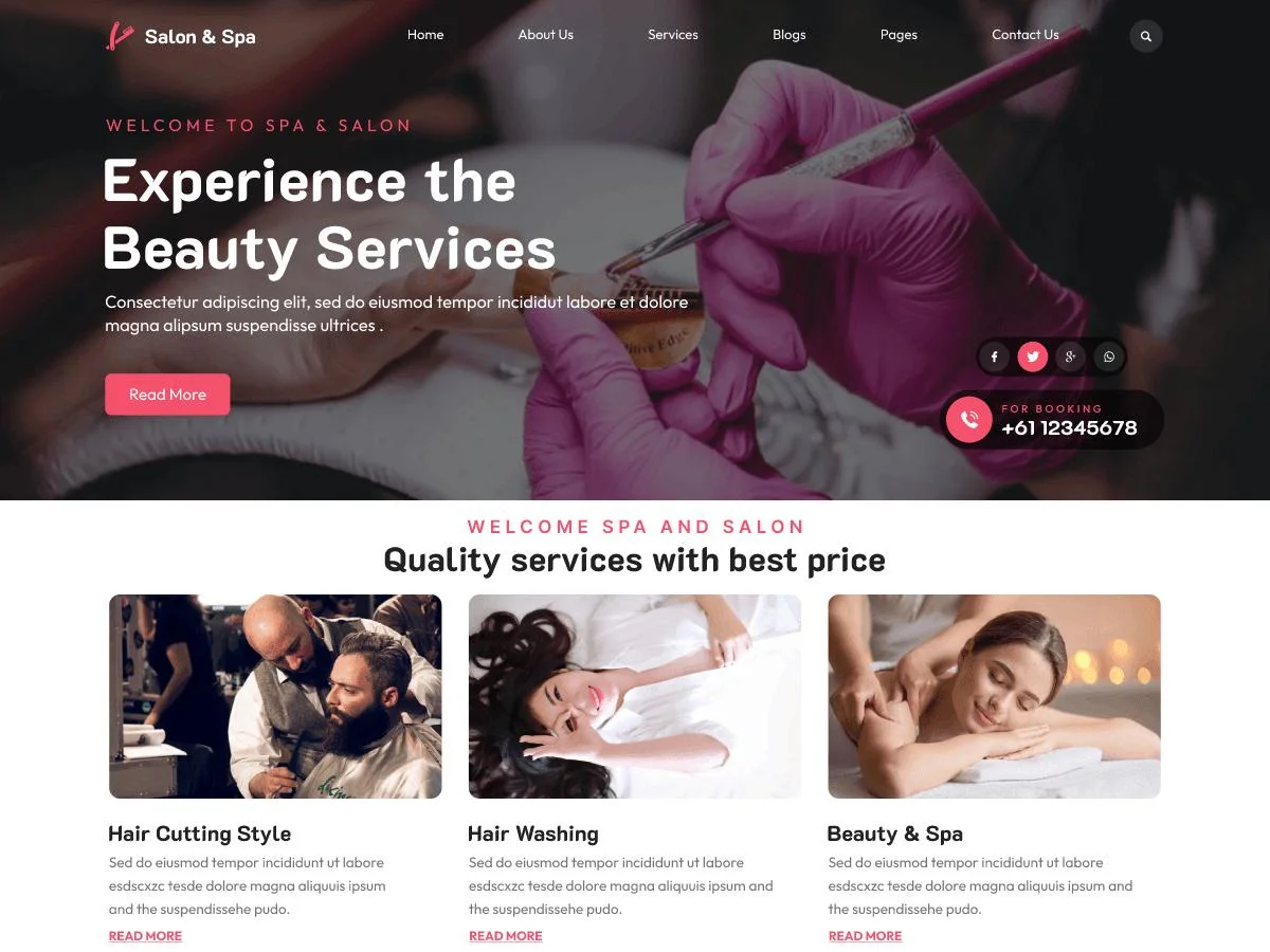
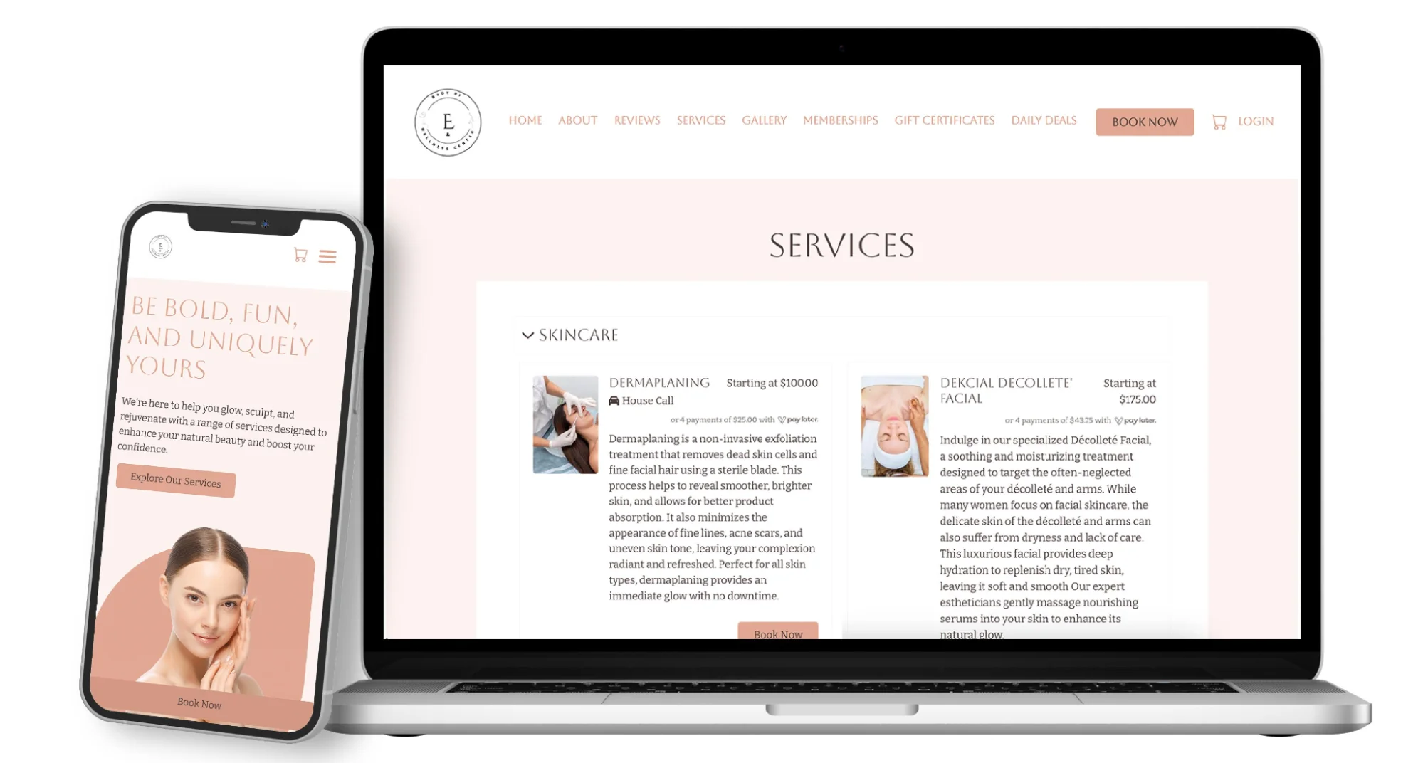
The hair-focused Kendall demo places greater emphasis on stylist photography, hair imagery and service pricing. Its large images create visual interest while narrow content columns keep descriptions easy to scan.
Strong spacing separates the brand story from practical sections. This prevents the homepage from feeling like one long service menu.
Key Design Features
The underlying theme provides multiple galleries, booking tools, price lists, tables, shop support and blog layouts. The hair salon direction adapts those components around stylist services and visual work rather than spa treatments.
What Makes This Design Useful
A theme does not need to use the same information order for every salon type. A hair salon can prioritize cuts, coloring, styling, stylists and portfolio images while a spa may lead with treatment categories and atmosphere.
Best For
Hair salons, color studios, independent hair stylists and premium hair and beauty studios.
4. Aviana Wellness and Spa
Design Overview
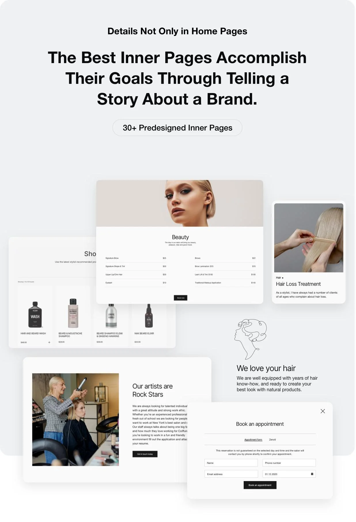
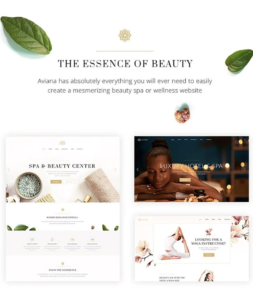
Aviana combines large lifestyle photography with slim text blocks and structured service areas. Decorative typography gives the pages an elegant tone while simpler body text keeps treatment descriptions legible.
Its demos cover several wellness business types. This gives the theme a broader visual system than a single-purpose hair salon layout.
Key Design Features
The official listing documents multiple homepage concepts, extensive customization, demo import and content layouts for wellness and beauty businesses. Available demos include hair salon, spa, resort and related wellness concepts. See Aviana on ThemeForest.
What Makes This Design Useful
Aviana shows how a salon can build a consistent visual identity across different service categories. Photography may change between hair, skin or wellness services while typography, spacing and buttons remain consistent.
Best For
Spa salons, wellness centers, luxury beauty salons and businesses offering several treatment categories.
5. Curly Hairdresser and Hair Salon
Design Overview
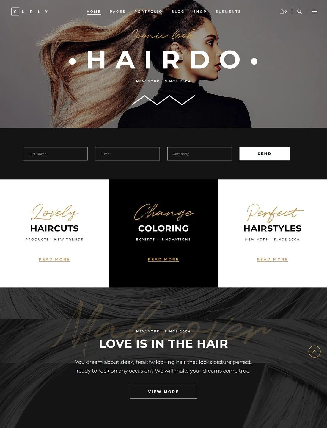
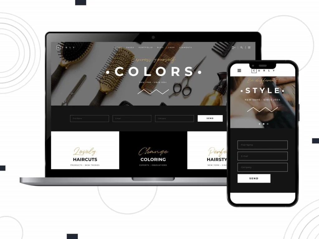
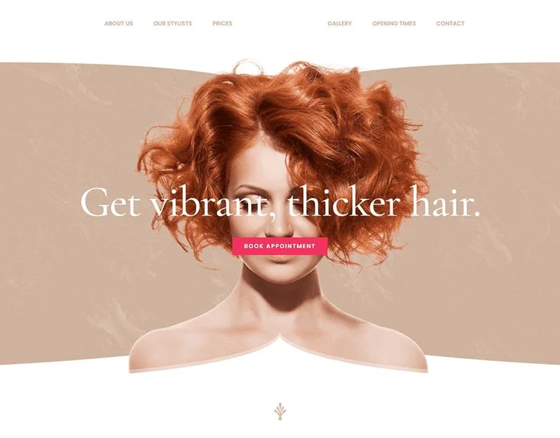
Curly takes a more expressive approach to hair salon website design. It uses bold typography, strong image crops and energetic compositions. The layout feels closer to a fashion publication than a traditional local business website.
The visual hierarchy relies on scale. Oversized headings introduce major sections while smaller text supports service details.
Key Design Features
The theme includes layouts designed for hairdressers and salons, along with service presentations, portfolios, team content and appointment-oriented elements. Its visual approach supports businesses that want stylists and finished work to play a central role.
What Makes This Design Useful
Curly demonstrates that a salon website can have a distinctive creative identity while retaining a clear structure. The lesson is to keep navigation and booking buttons simple when photography and typography are already visually strong.
Best For
Creative hair salons, color studios, editorial stylists and fashion-led hair and beauty studios.
6. Jacqueline Spa and Massage Salon
Design Overview
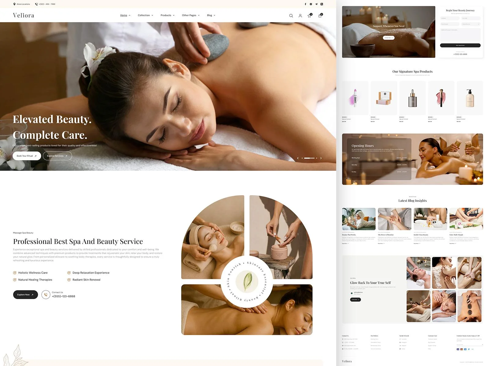
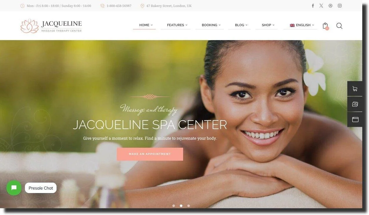
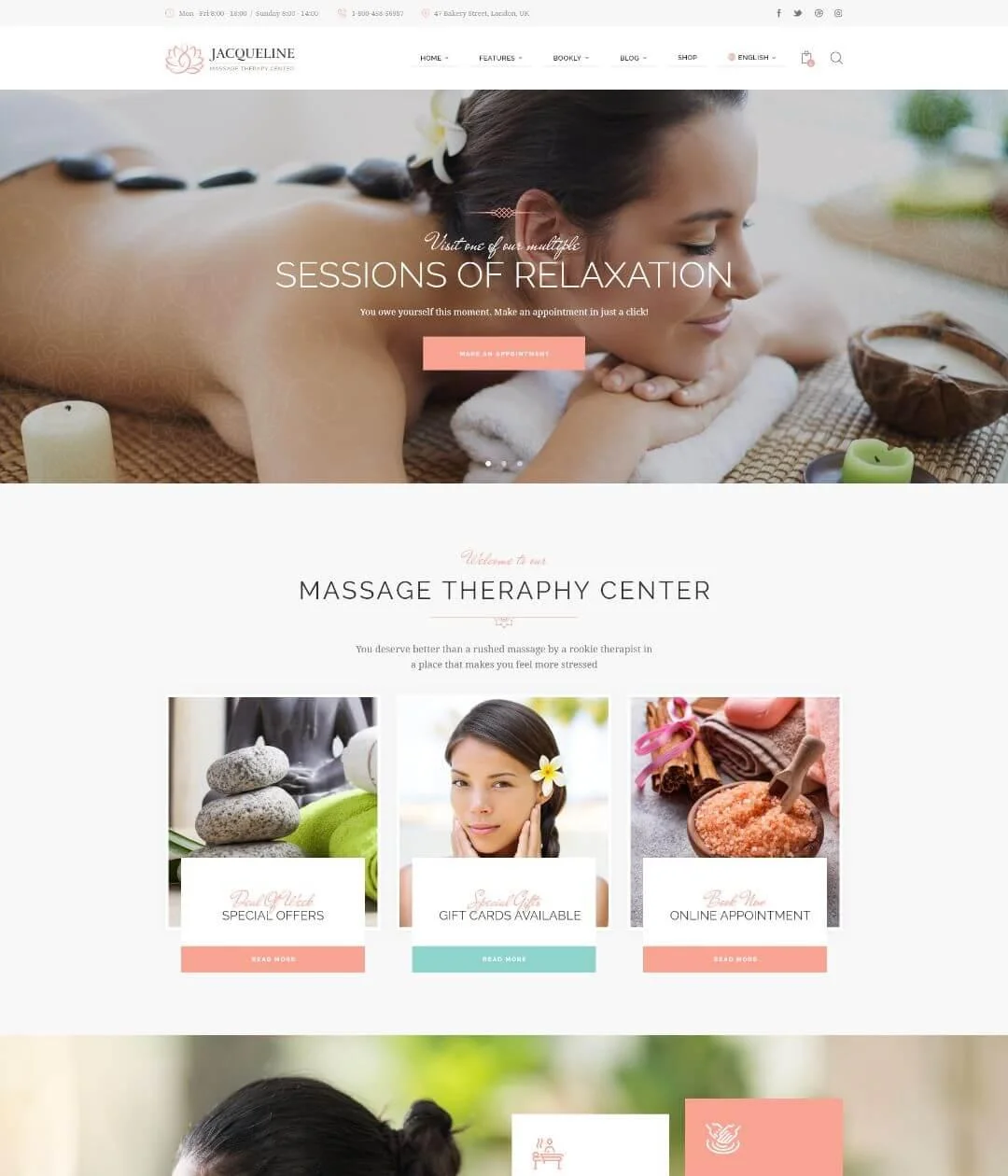
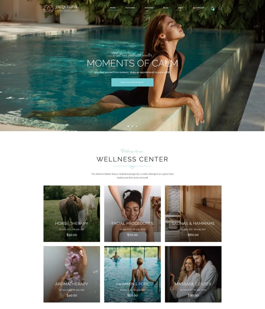
Jacqueline uses warm neutral colors and treatment photography to create a calm visual direction. Its homepage is divided into clear commercial sections rather than functioning only as a brand presentation.
Service areas, treatment information and appointment actions appear as separate content blocks. This makes the design practical for a business with a large service menu.
Key Design Features
The theme is designed for spa, beauty, wellness and massage businesses. Its documented functionality includes service presentation, appointments, pricing tables, gift-related features, testimonials and WooCommerce support.
What Makes This Design Useful
This design shows how treatment information and transactional tools can share one website. Clients can learn about a service and then move toward an appointment or purchase without switching to a visually unrelated system.
Best For
Spa salons, estheticians, massage businesses and beauty salons that sell services or gift products.
7. The Beauty Spot, Lake Forest
Design Overview
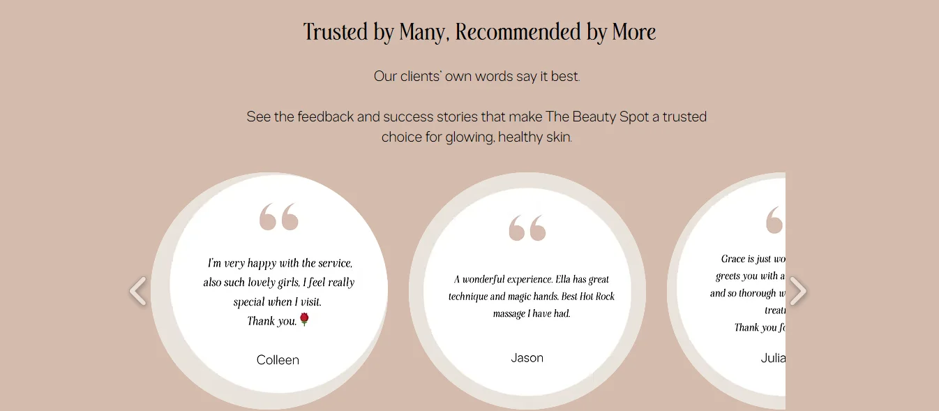
The Beauty Spot is an actual salon website rather than a marketplace template. Its homepage uses a direct local-business structure. Visitors see the salon introduction, service categories, testimonials, business address and opening hours.
The design favors accessibility of information over an experimental layout. Service categories use separate links so visitors can move directly to the relevant treatment area.
Key Design Features
The visible website includes a Book Online action, an about section, service categories, testimonials, salon imagery, an address and opening hours. Its service categories include hair, makeup and tanning, massage, nails, skincare and waxing.
What Makes This Design Useful
It is a strong example of a customer journey built around local intent. A visitor can identify the salon, check whether it provides the required service, review practical details and begin booking from one page.
Best For
Local beauty salons, day spas and businesses offering several beauty services at one location.
8. The Beauty Spot, Swan Hill
Design Overview
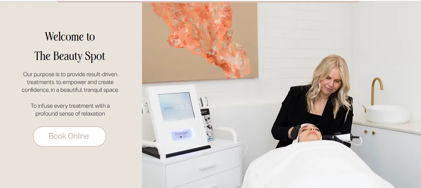
This real salon website uses a service-led navigation structure. Instead of placing all treatments under one general page, its menu exposes individual service categories.
The approach suits a salon with a substantial treatment range because users do not have to scan an oversized page to find one service.
Key Design Features
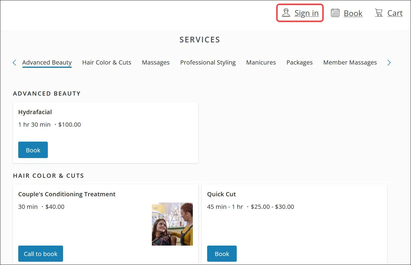
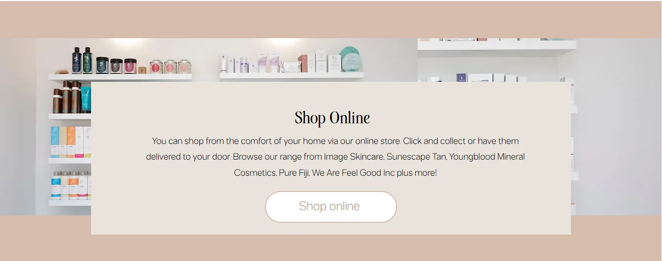
The website visibly organizes services such as spa facials, advanced facials, massage, brows and lashes, waxing and sugaring, foot treatments, LED treatments, spray tanning and makeup. It also includes an online shop with gift vouchers and skincare products.
What Makes This Design Useful
The website demonstrates when deeper navigation is valuable. A salon with many treatments can create a main Services menu and give important categories their own pages. This also provides space for treatment details, suitability notes and booking links.
Best For
Skin clinics, spa salons, advanced beauty businesses and salons with retail products.
9. Chérie Beauty Salon Website Design
Design Overview:
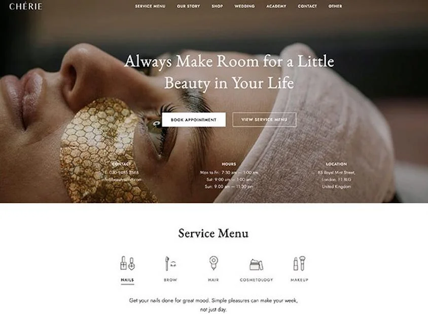
Chérie uses soft colors, clean typography and spacious sections. The homepage can start with a large salon image and a visible booking button. Service cards can present hair, skin, nail and spa treatments without making the page feel crowded.
Key Design Features:
Full-width hero section
Online appointment button
Featured salon services
Service pricing
Team member profiles
Client testimonials
Image gallery
Contact details
What Makes This Design Useful:
The layout separates services into clear visual blocks. Visitors can review a treatment and move directly to the appointment section.
Best For:
Beauty salons, nail salons, boutique salons, estheticians and hair and beauty studios.
10. Curly Hair Salon Website Design
Design Overview:
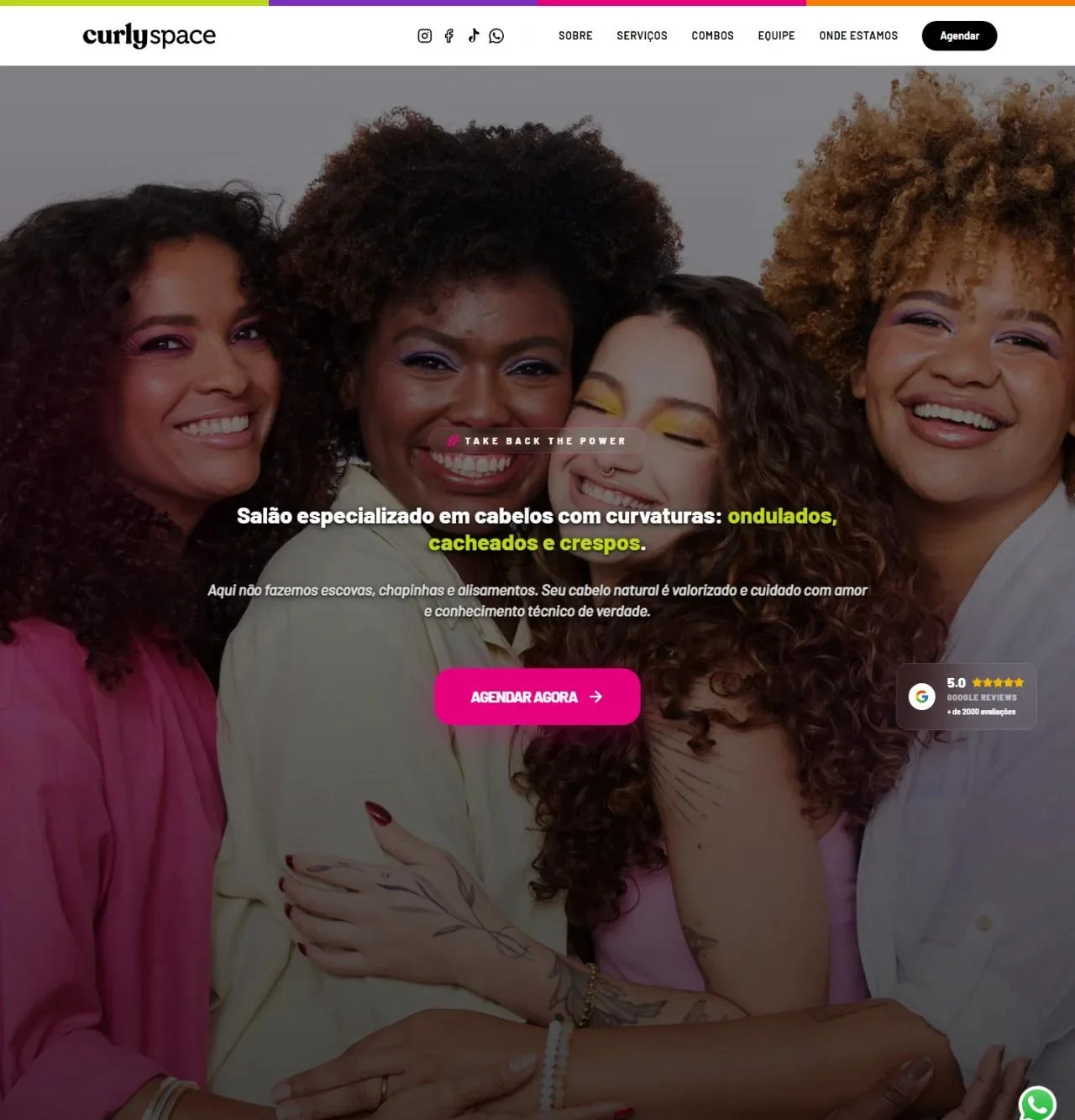
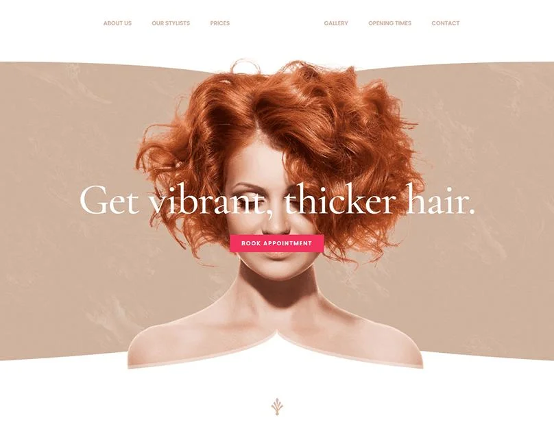
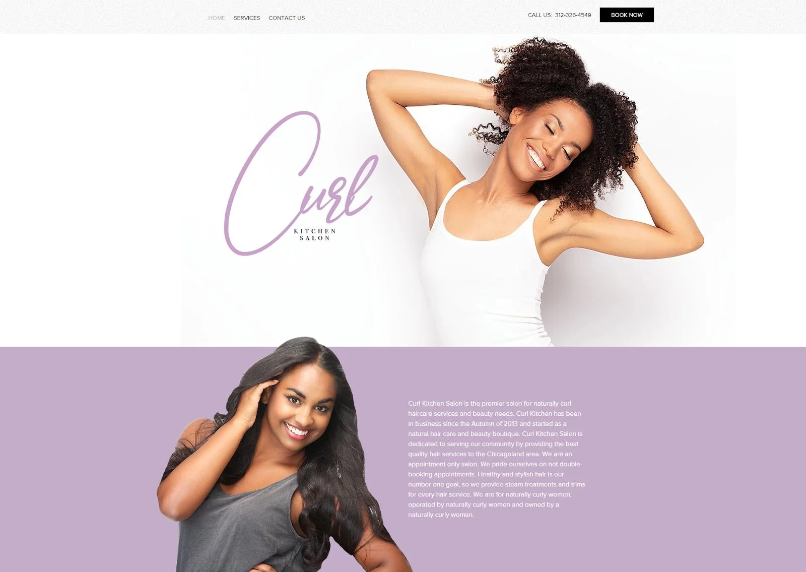
Curly uses bold typography, large hair photography and an editorial layout. The design gives salon work more visual space while keeping navigation and booking actions easy to find.
A salon can use the homepage to introduce its style, show popular services and feature recent hair transformations.
Key Design Features:
Large editorial hero image
Hair service categories
Hair stylist profiles
Pricing information
Portfolio gallery
Appointment CTA
Salon introduction
Contact information
What Makes This Design Useful:
The design makes hair photography part of the website structure. It works well for salons that regularly produce strong haircut, coloring and styling images.
Best For:
Hair salons, color studios, creative stylists, boutique hair salons and fashion-focused studios.
11. Aviana Wellness and Beauty Salon Website Design
Design Overview:
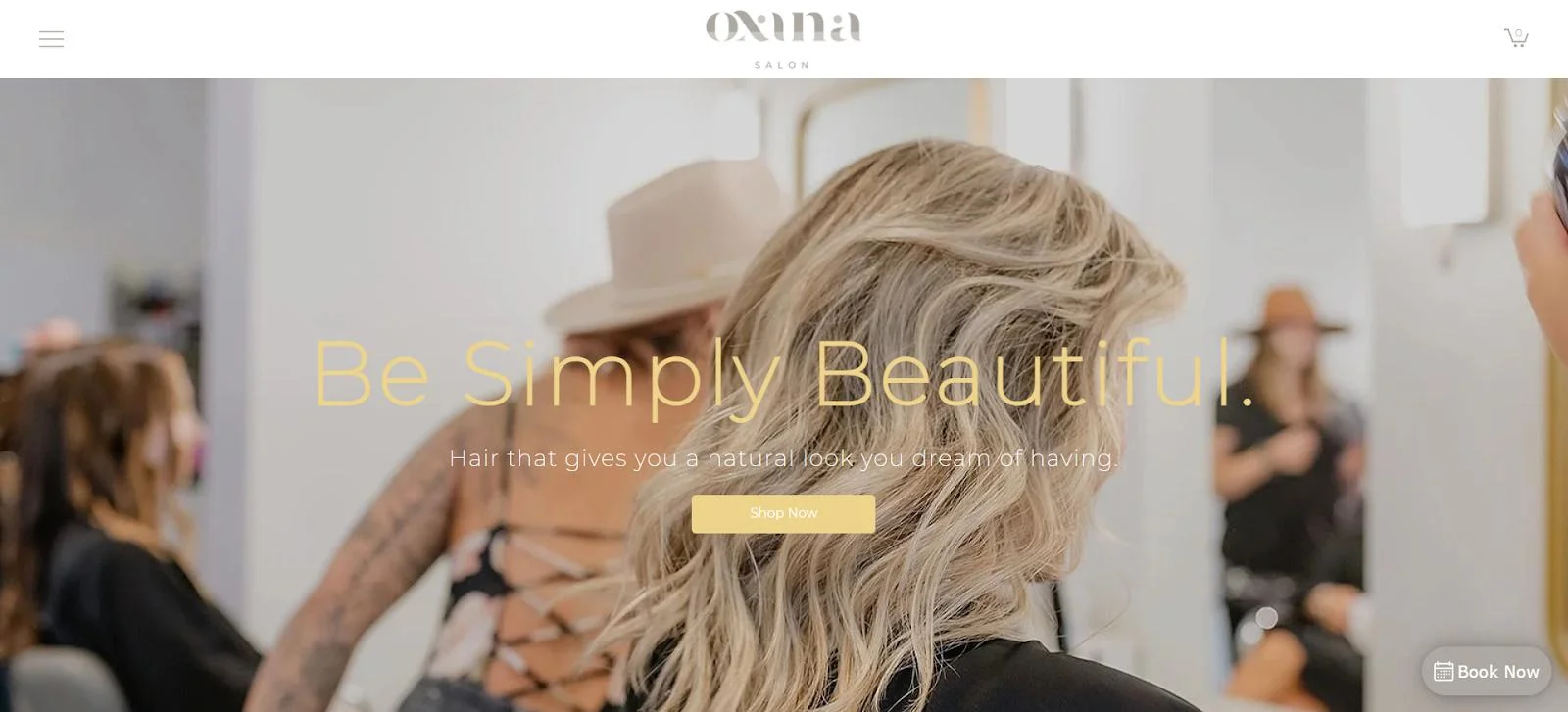
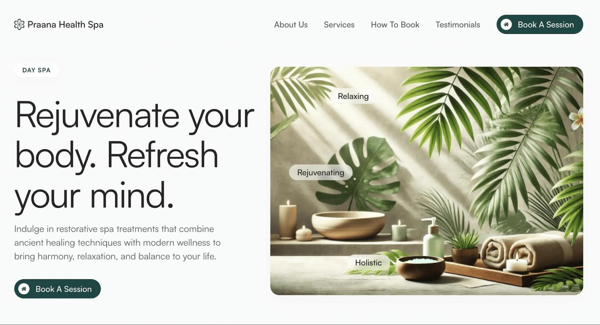
Aviana combines elegant typography with large treatment and lifestyle images. Its neutral colors create a calm visual direction suitable for salons that provide beauty and wellness services.
The homepage can introduce the salon before presenting treatments, packages, specialists and appointment options.
Key Design Features:
Large beauty or treatment hero image
Treatment category sections
Salon introduction
Service packages
Team or specialist profiles
Gallery
Testimonials
Booking CTA
Location and contact section
What Makes This Design Useful:
Aviana can organize several treatment categories within one consistent layout. Hair, skincare, spa and wellness pages can use different images while retaining the same typography and buttons.
Best For:
Spa salons, luxury beauty salons, wellness centers, skin treatment businesses and multi-service beauty studios.
Beauty Salon Homepage Design Ideas
A useful beauty salon website homepage design introduces the brand and gives visitors a direct path to services, proof and appointments. Each section should have a specific job.
Hero Section
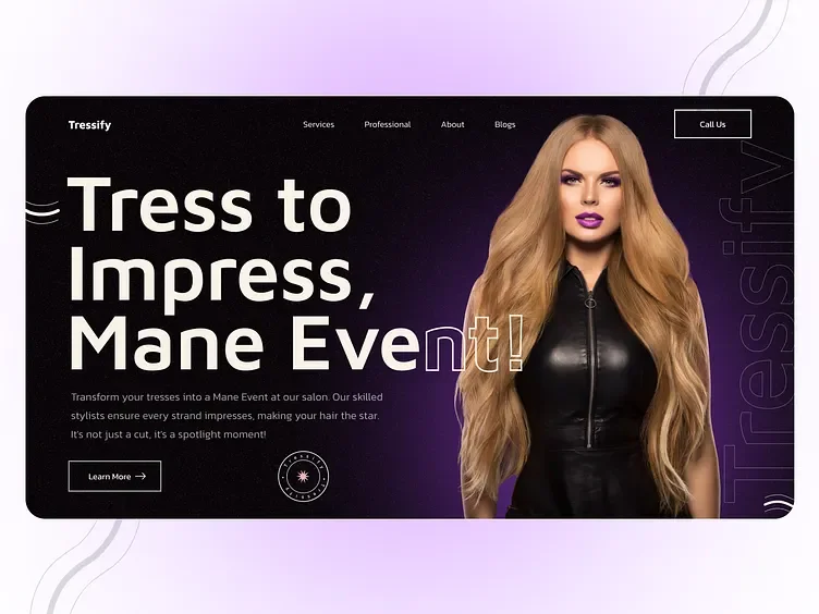
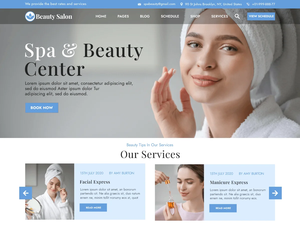
The hero should contain the salon name, a short description of its specialty and one main action such as “Book an Appointment” or “View Services.”
Use a high-quality image of the salon, a stylist at work or a real result. Text needs sufficient contrast against the image. Avoid placing several competing buttons over busy photography.
Salon Introduction
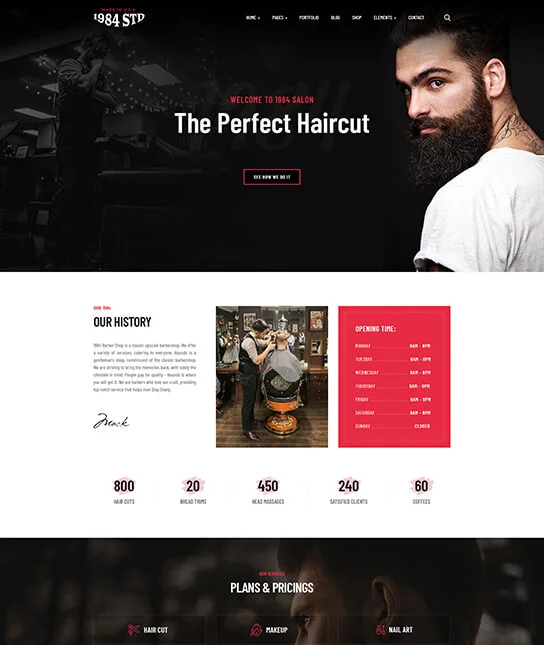
Introduce the type of salon, its location and the main service focus. Two or three short paragraphs are usually enough.
Present this content beside an interior, team or treatment image. Link to the full About page for visitors who want more detail.
Featured Services
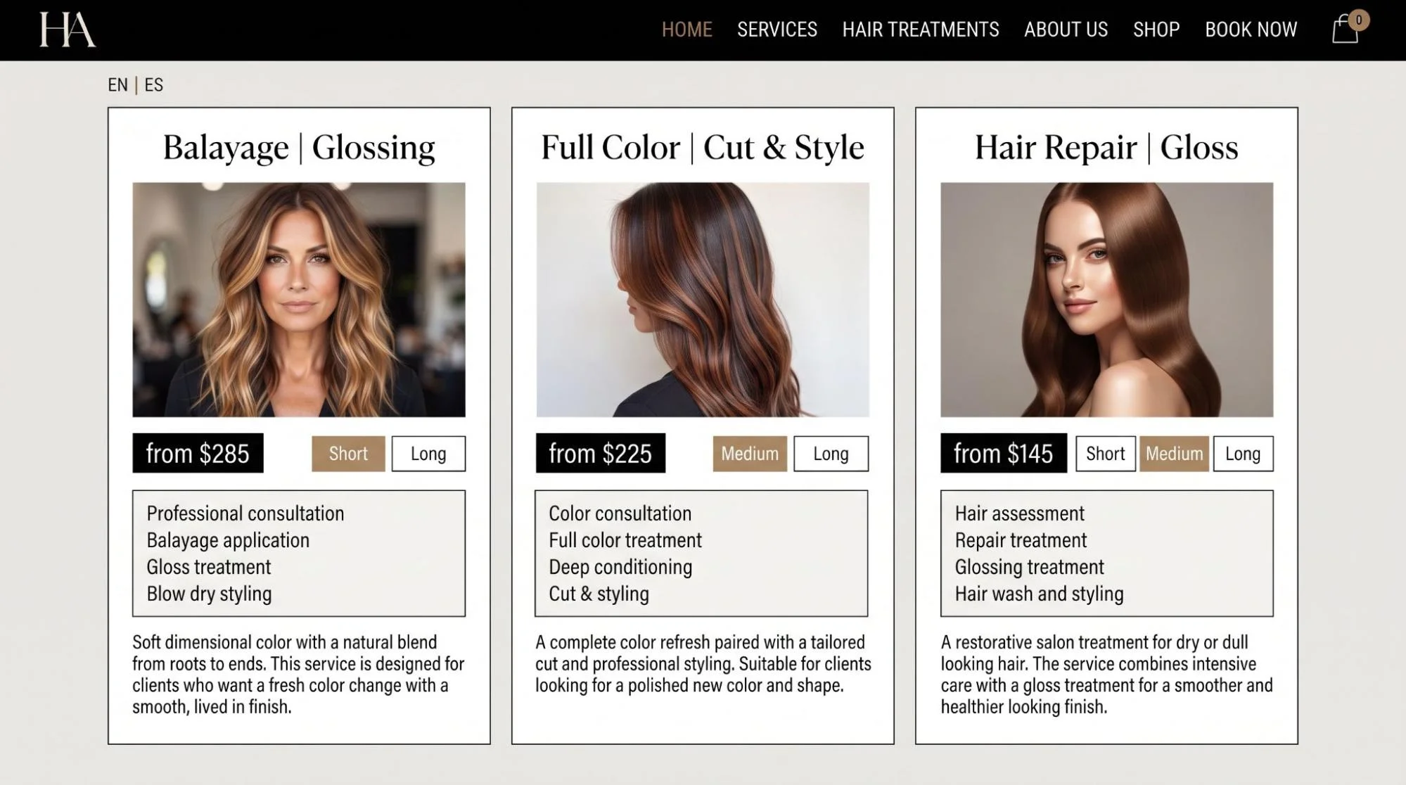
Show the services that most visitors are likely to seek. Each service card can include a name, short description, image and link.
Cards help users compare categories without reading a long paragraph. If the salon offers many treatments, feature only the main categories and direct users to the complete service menu.
Treatment Categories
A salon that offers hair, nails, makeup and skin treatments should separate them visually. Use tabs, cards or clearly labeled content bands.
Category labels should use client language. A label such as “Hair Coloring” is clearer than an internal or branded term that new clients may not understand.
Booking CTA
Place a clear booking action near the hero and repeat it after service sections. The button should look the same each time.
A sticky booking button can be useful on mobile, but it should not cover page content or navigation controls.
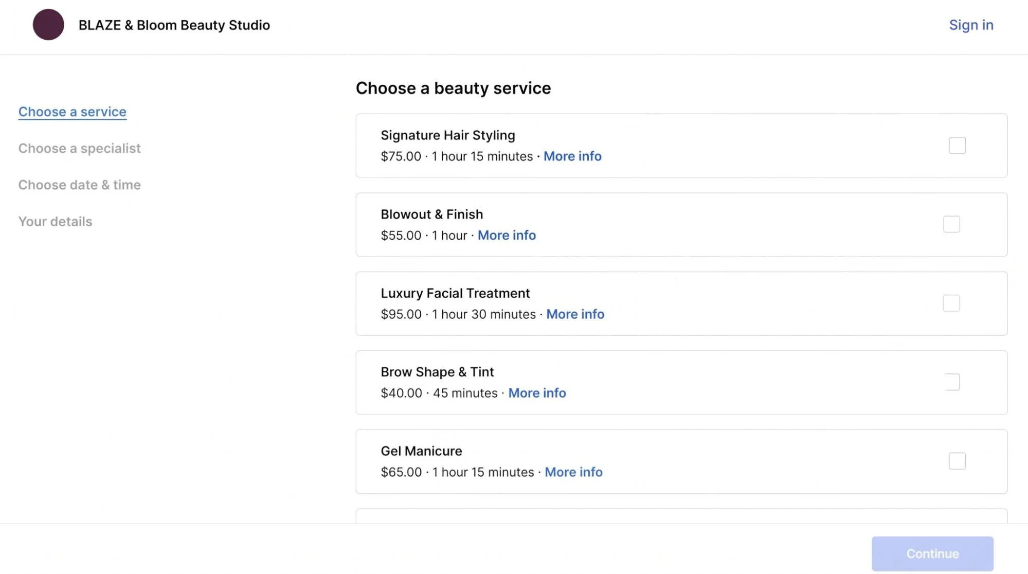
Pricing or Service Menu
Show starting prices, price ranges or a link to the complete menu where appropriate. Pair each price with the service name and any essential duration information.
Use aligned columns or simple cards. Decorative menus that are difficult to read on mobile weaken the beauty salon website user experience.
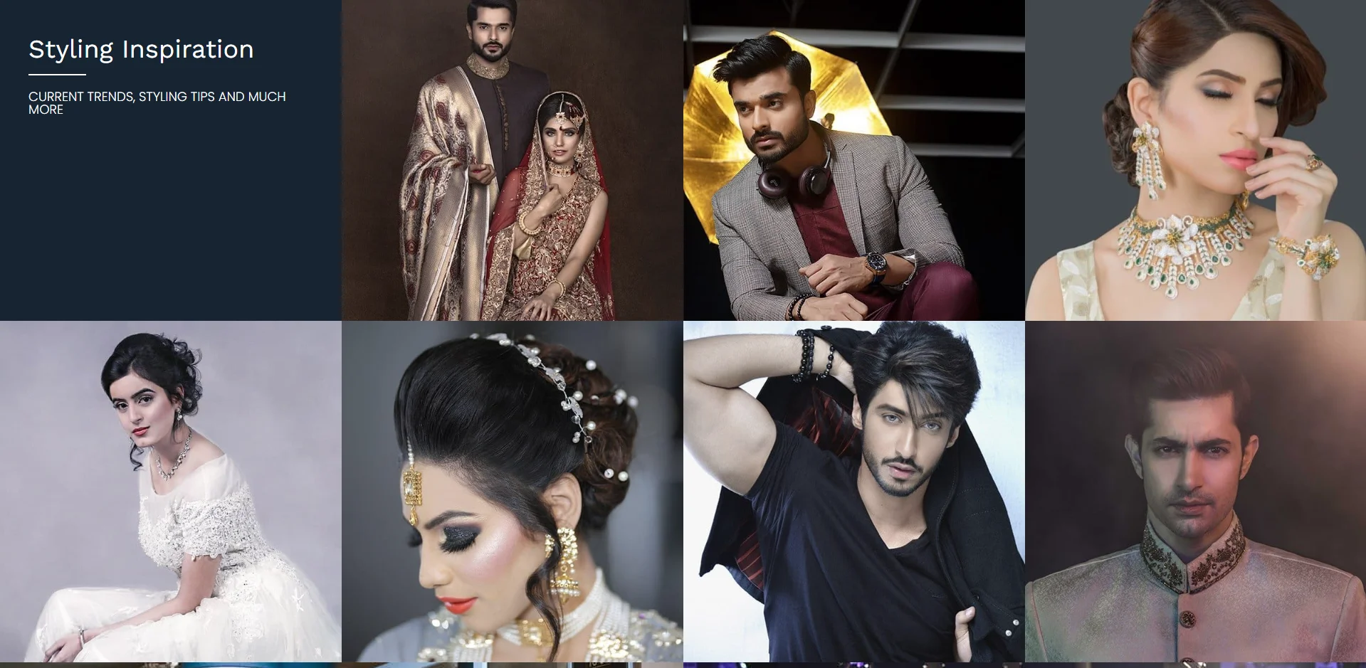
Gallery
Display a focused selection of real work. Hair transformations, nail designs, makeup applications and finished styles should be grouped when the salon offers several specialties.
Use consistent image dimensions to stop the layout from jumping between rows.
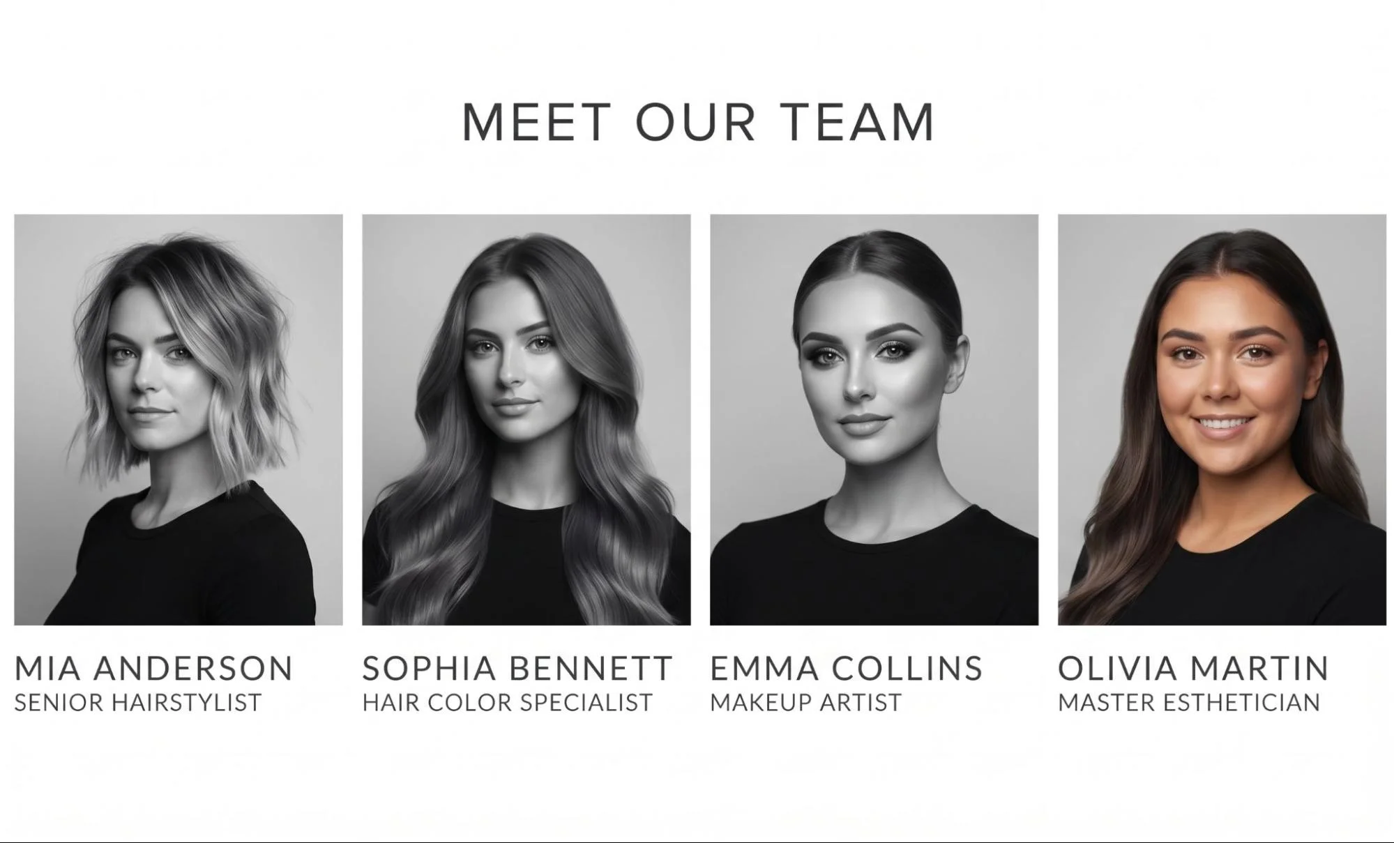
Meet the Team
Include professional portraits, names and specialties. A short profile can explain whether a person focuses on coloring, styling, nails, makeup or skin treatments.
Link each profile to relevant services or a booking system when clients can choose a specific professional.
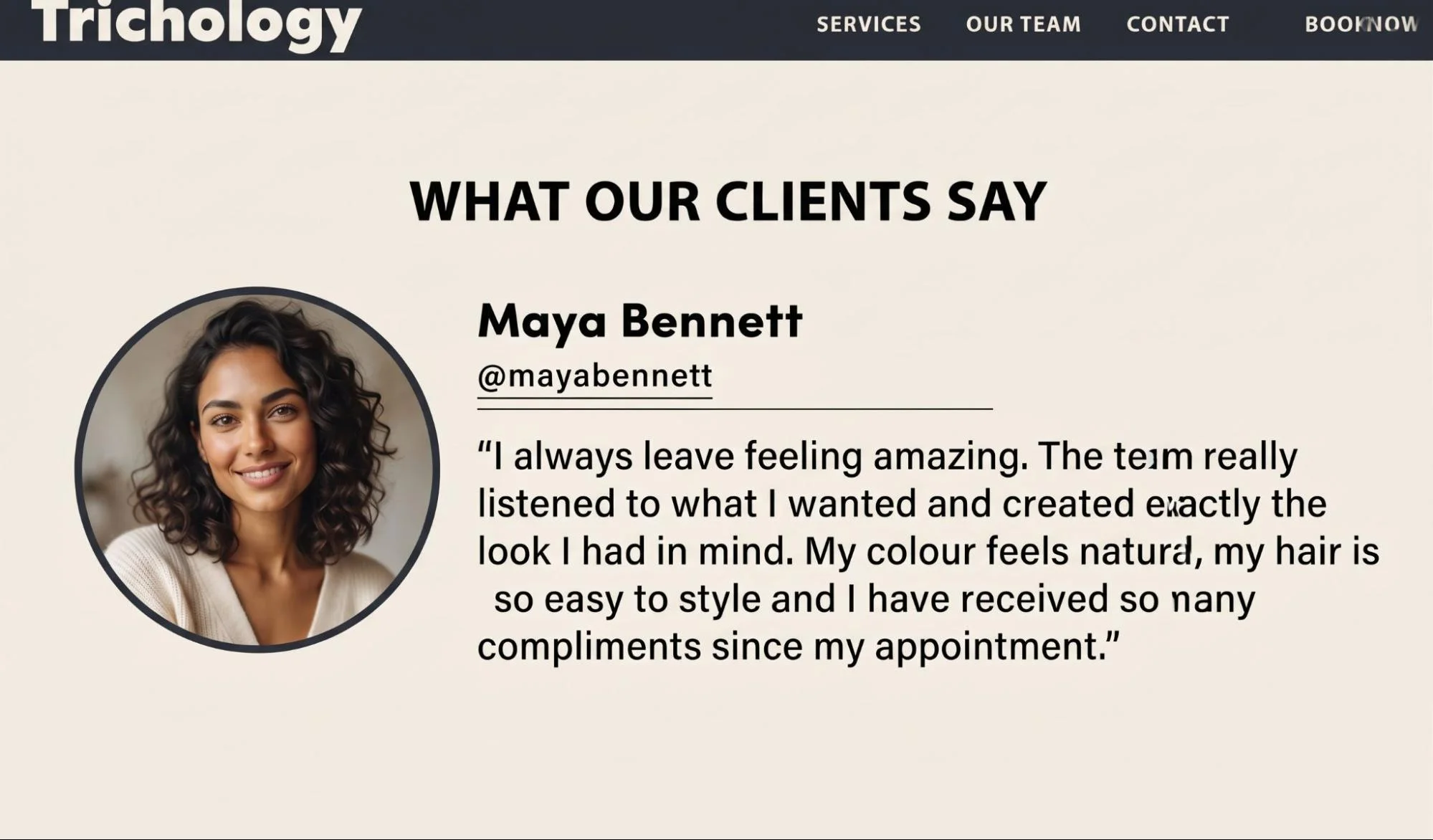
Customer Testimonials
Use a small number of concise customer comments and identify their source when permission and platform rules allow. Do not fill the homepage with a long testimonial slider.
Location and Opening Hours
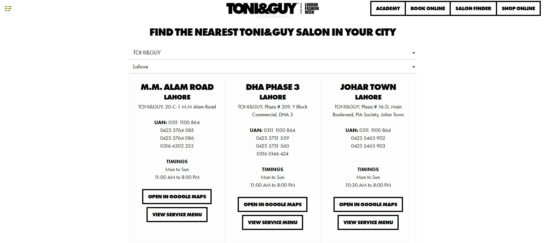
Display the street address, phone number, opening hours and a Google Maps link or embedded map. This information should also appear in the footer.
Contact or Booking Section
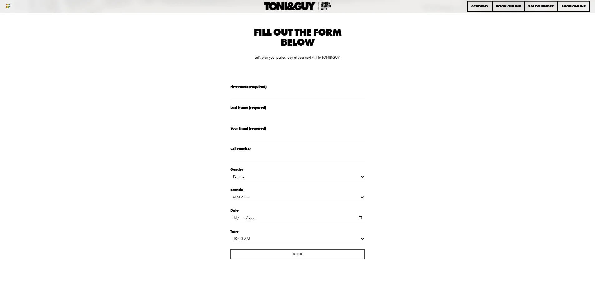
Close the page with one clear next step. Depending on the business, that may be an online booking interface, a short inquiry form or a phone call.
Beauty Salon Website Layout
The right beauty salon website layout depends on the number of services, the brand position and the amount of visual content available.
Layout approach | How it works | Suitable use |
Full-width | Uses wide images and horizontal content sections | Salons with strong interior and treatment photography |
Image-focused | Gives portfolio images more space than text | Hair, makeup and nail businesses with frequent visual work |
Card-based | Places services in repeatable cards | Multi-service salons that need clear categories |
Editorial | Uses varied image sizes and magazine-style typography | Fashion-led hair salons and creative studios |
Minimal | Uses restrained color, short copy and open space | Boutique salons with a focused service list |
Luxury | Uses refined typography, controlled animation and premium photography | High-end salons and destination spas |
Grid-based | Organizes work into even image rows or masonry galleries | Salons with large portfolios or several visual categories |
Beauty salon website layout ideas should begin with the content rather than visual trends. An editorial layout needs excellent photography. A card-based beauty salon site design works better when services require quick comparison.
Beauty Salon Website Structure
A practical beauty salon website structure may include:
Home: Brand introduction, selected services, gallery preview and booking actions.
About: Salon story, approach, interior and business information.
Services: Overview of all available service categories.
Treatments: Detailed pages for treatments that need preparation, process or suitability information.
Pricing: Service names, durations, price ranges and package details where applicable.
Gallery: Organized examples of salon work.
Our Team: Team profiles, specialties and booking links.
Booking: The complete appointment flow or a clear link to the booking platform.
Contact: Address, phone, email, map, hours and accessibility details.
Blog or Beauty Resources: Useful service explanations, preparation guidance and aftercare information.
FAQs: Booking, cancellations, consultations, payments and treatment preparation.
The main navigation should contain the pages most clients need before booking. Secondary material can appear in the footer. Large salons may use a dropdown under Services while a small boutique salon may only need one service page.
Beauty Salon Website UI and UX Design
UI design describes the visible interface, including buttons, cards, menus, forms and typography. UX design concerns the complete experience of using those elements.
Good beauty salon website UI design supports the customer journey instead of decorating it.
Keep Navigation Predictable
Use familiar labels such as Services, Pricing, Team, Gallery, Booking and Contact. Visitors should not need to interpret creative menu names.
Build Scannable Service Cards
Each card should show the service name, a useful description and a next step. Keep card heights and image ratios consistent.
Use One Booking Button Style
A consistent color and label make booking actions easier to recognize. Changing between “Reserve,” “Schedule,” “Get Started” and “Book” can create unnecessary uncertainty.
Make Service Menus Readable
Do not upload the only price list as a small image or PDF. Build important service information as responsive page content.
Design Short Forms
Ask only for information needed at that stage. An inquiry form might require a name, contact method, requested service and message. The booking system can collect appointment-specific details later.
Reduce Booking Friction
A strong beauty salon website UX design makes the next step clear after every service description. Visitors should not have to return to the homepage before booking.
Establish Visual Hierarchy
Headings, spacing, color and button placement should show which information matters first. A page with five competing font styles or several accent colors weakens that hierarchy.
Test the Complete Interface
Beauty salon website interface design includes error messages, empty states and booking confirmations. These details need the same care as the homepage.
Modern Beauty Salon Website Design Ideas
Modern beauty salon website design relies on clarity and controlled visual choices rather than adding effects to every section.
Large professional photography provides immediate evidence of the salon environment and work.
Minimal layouts reduce visual competition around services and booking actions.
Elegant typography can establish personality, but body copy still needs a highly readable font.
Brand-led color systems create consistency across headings, buttons, forms and service cards.
Large calls to action make the booking route visible on touchscreens.
Editorial layouts suit salons with distinctive campaigns and strong image direction.
Interactive galleries allow filtering or lightbox viewing without forcing users through several pages.
Clean navigation keeps service discovery separate from secondary company information.
Mobile-first design treats the small-screen booking journey as a primary experience.
Creative beauty salon website design should still support common tasks. A dramatic transition is not useful if it delays access to prices or makes navigation difficult.
Professional beauty salon website design also accounts for content updates. A content management system allows salon staff to change services, team profiles, prices, opening hours and gallery images without rebuilding page layouts.
Beauty Salon Services Page Design
A service page should help visitors understand what the salon offers and decide what to book.
Possible categories include haircuts, coloring, styling, facials, skin treatments, nails, makeup and other beauty treatments. Only include services the business actually provides.
Each service entry can show:
Service name
Short description
Expected duration
Price or starting price where appropriate
Relevant image
Preparation or consultation note when needed
Booking button
Use accordions carefully. They can shorten a large mobile page, but service names and key details should remain visible without excessive tapping.
Packages need a clear list of included services. Avoid presenting a package name without explaining what the client receives.
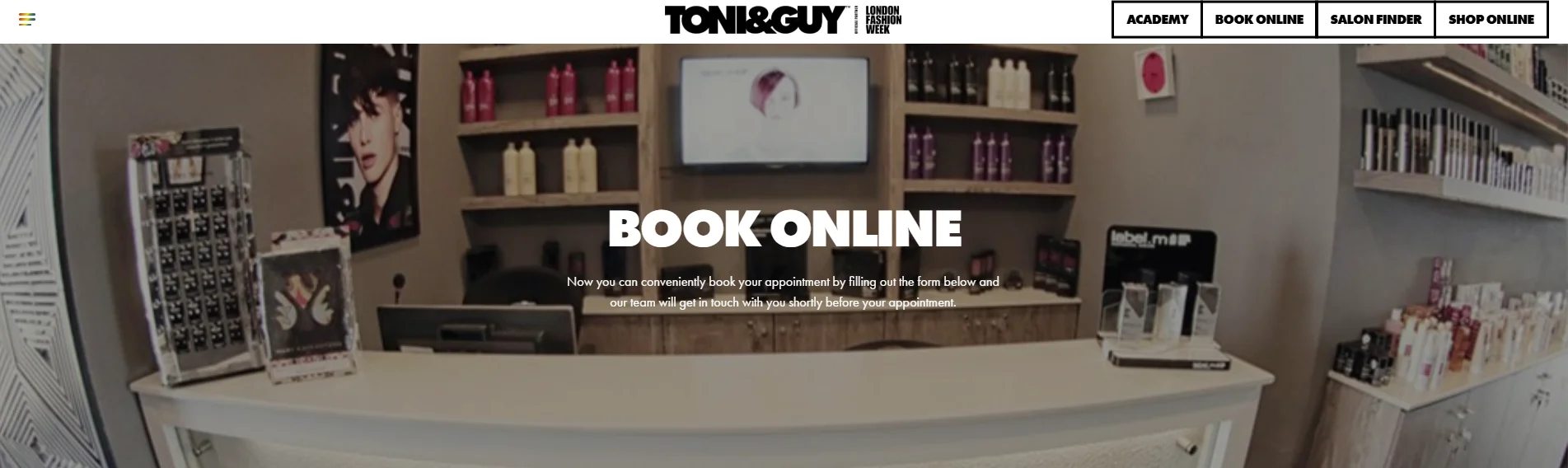
Beauty Salon Booking Website Design
A phone number provides a contact route, but it is not the same as a structured online booking journey.
A complete booking flow may let the client:
Select a service.
Choose a team member or accept any available professional.
Select an available date and time.
Enter contact information.
Review the appointment details.
Receive confirmation.
The Book Now CTA should open the booking process directly. Avoid sending users through several promotional pages first.
On mobile, use large selection controls, readable calendars and short form fields. The system should clearly display unavailable times and explain validation errors. Confirmation should state the service, location, staff member, date and time.
If the salon uses an external booking platform, its visual transition should feel intentional. Keep the salon name and appointment details clear so clients know they have reached the correct booking page.
Beauty Salon Gallery and Portfolio Design
A salon portfolio should show relevant work rather than a general collection of lifestyle photos.
Useful gallery categories may include:
Hair transformations
Hair color
Styling
Makeup
Nail designs
Skin or beauty treatments
Before-and-after results
Use clear, well-lit images with consistent editing. Avoid mixing highly filtered images with neutral photographs because the result becomes difficult to assess.
Before-and-after images should use similar angles, lighting and framing. Add short captions when the technique, service or context helps the viewer.
Grid layouts work well on desktop. On mobile, use one or two columns and preserve useful image detail. Compress images during website development so a large salon portfolio does not make pages unnecessarily slow.
Responsive Beauty Salon Website Design
Responsive beauty salon website design adapts the content and interface to desktop, tablet and mobile screens.
Desktop
Desktop layouts can display wide hero images, multi-column service cards and larger gallery grids. Keep line lengths controlled so text does not stretch across the entire screen.
Tablet
Tablet layouts may reduce three or four service cards to two columns. Navigation, forms and calendars should work in both portrait and landscape orientation.
Mobile
Beauty salon website mobile design should prioritize service discovery, directions and booking.
Use:
A clear mobile menu
Flexible images that do not crop important details
Single-column service cards where necessary
Wide, tap-friendly booking buttons
Proper input types for phone numbers and email addresses
Short booking forms
Readable body text
Simple gallery grids
Adequate space between links and buttons
Test the website on real devices. A layout can technically respond to screen width while still being difficult to use.
Beauty Salon Website Navigation
The main navigation should help visitors move from discovering a service to booking it with few unnecessary steps.
A practical navigation could be:
Home | Services | Pricing | Gallery | Team | About | Contact | Book Now
The booking link can use a button style so it remains visible. If location information is especially important, include it on the Contact page and in the site footer rather than crowding the main menu.
Mobile navigation should use short labels and a clear close control. Keep Book Now visible within the menu or as a separate button.
Footer navigation can contain FAQs, policies, blog content, social links, the address, hours and contact information. It should support the main beauty salon website navigation rather than duplicate a large menu without structure.
Beauty Salon Website Design Best Practices
1. Keep Branding Consistent
Use the same colors, logo treatment, photography direction and tone across every page. Consistency makes separate service pages feel like one website.
2. Use Professional Salon Photography
Show the real space, team and work wherever possible. Professional images give clients more useful information than generic stock photos.
3. Make Services Easy to Scan
Use category headings, short descriptions and consistent cards. Visitors should be able to distinguish between related treatments quickly.
4. Keep Booking Options Visible
Place booking actions at natural decision points such as the hero, service entries and team profiles.
5. Use Clear Navigation
Prioritize services, pricing, gallery, booking and contact details. Move legal and secondary company pages to the footer.
6. Design for Mobile Users
Check menus, calendars, buttons, forms and image crops on narrow screens. Do not treat mobile as a reduced desktop page.
7. Present Pricing Clearly Where Appropriate
State whether a figure is fixed, starts at a certain amount or depends on a consultation. Connect each price to the correct service.
8. Showcase the Salon Team
Use consistent portraits and list each person’s role or specialty. Let clients choose a team member only when the booking system supports that option.
9. Display Location and Opening Hours
Include this information on the contact page and in the footer. Add a Google Maps link to help mobile visitors get directions.
10. Make Contact Forms Simple
Remove fields that staff do not need. Clear labels work better than placeholder text that disappears when users type.
11. Use Consistent Typography
Limit the number of typefaces and define clear styles for headings, body copy, prices and buttons.
12. Maintain a Clear Visual Hierarchy
Use size, contrast and spacing to guide attention. Important actions should not compete with decorative elements.
13. Avoid Overcrowding the Homepage
Feature the main services and link to deeper pages. The homepage does not need to contain every treatment detail or team biography.
14. Keep Important CTAs Easy to Find
Use clear action labels and sufficient contrast. Test each button to confirm that it opens the expected page or booking step.
How to Choose a Beauty Salon Website Design
The best approach depends on how the salon operates.
Salon type | Suitable design priorities |
Luxury salon | Refined typography, high-end photography, generous spacing and discreet but visible booking actions |
Boutique salon | Personal brand story, focused service list, team visibility and a simple appointment route |
Hair salon | Stylist profiles, cuts and color services, transformation gallery and staff-based booking |
Spa salon | Treatment categories, duration, preparation details, packages and a calm visual system |
Nail salon | Detailed visual portfolio, service categories, pricing and fast mobile booking |
Hair and beauty studio | Clear separation of hair, makeup, skin or nail categories with unified booking and navigation |
Consider the target clientele and brand identity first. A playful nail studio may need bright colors and a dense visual gallery. A high-end spa may use quieter colors and more space around treatment descriptions.
Content volume also affects the choice. A small salon can use a compact site with five main pages. A business with dozens of treatments may need category pages, filters and deeper navigation.
Review booking requirements before choosing a template. Some businesses only need an inquiry form. Others need service selection, staff availability, times, deposits and automated confirmation. The design must accommodate the actual appointment process.
Finally, review gallery needs and mobile behavior. A photography-led salon website design only works when the business can maintain a consistent portfolio. A simpler card-based design may be easier to manage and more useful for a service-led business.
Build a Beauty Salon Website with The Custom Websites
Ready to turn your beauty salon website ideas into a professional online experience? The Custom Websites creates custom beauty salon websites that showcase your services, treatments, team, portfolio and booking options in a clear, brand-focused layout. Get in touch today to discuss your beauty salon website design and development project.