A successful magazine website must help readers understand what matters within seconds. Magazine Website Design and Development focuses on creating a clear visual hierarchy that highlights major stories while using categories, article grids, and search tools to make deeper content easier to discover.
The best magazine website design also adapts smoothly to phones and tablets. It combines readable typography, compelling images, logical navigation, and focused calls to action without overwhelming visitors.
The following magazine website design ideas come from ten real templates available through established marketplaces. Their layouts, documented features, and intended uses were reviewed before inclusion.
1. Jannah
Design Overview
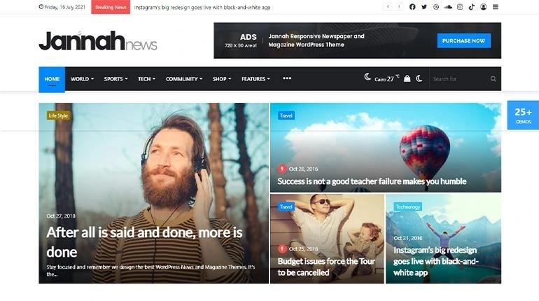
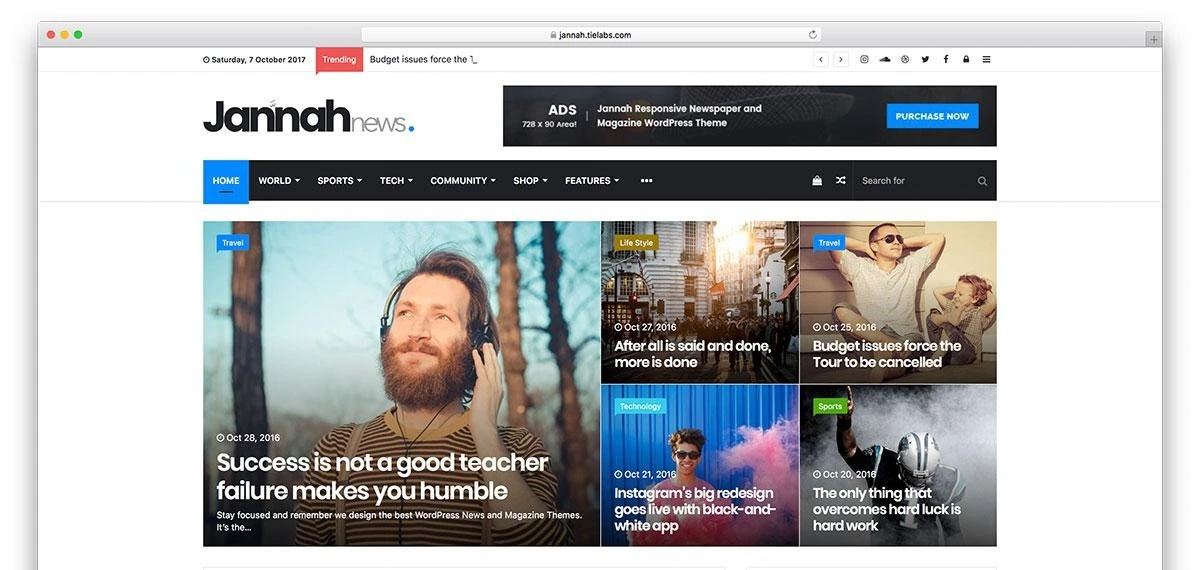
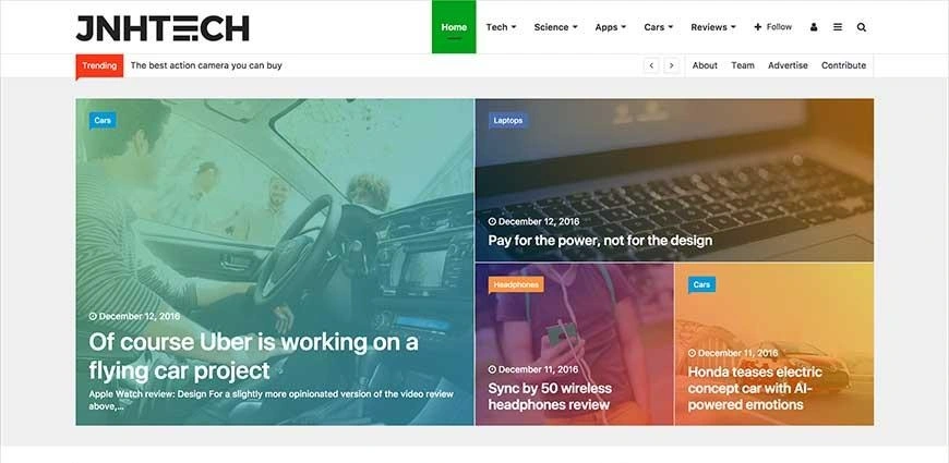
Jannah uses a busy but carefully divided news magazine website layout. Its available demos combine a prominent featured-story area with smaller supporting stories, topical content blocks, and sidebar elements.
The homepage can present several headlines above the fold without making every story appear equally important. Large photography establishes the lead story, while compact cards provide additional reading options.
Key Design Features
Featured-story grid with one dominant article
Category-based navigation
Trending and recent-story sections
Modular article blocks
Social media areas
Sidebar content
Responsive layouts
Multiple prebuilt magazine demos
Best For
Jannah suits news portals, sports publications, technology magazines, entertainment websites, and general editorial platforms with frequent publishing schedules.
Why This Design Works
The varied card sizes create an immediate visual hierarchy. Readers can identify the most important story before scanning smaller headlines.
Its modular structure also helps publishers separate sports, technology, lifestyle, and other topics on one homepage. This makes a large archive feel more manageable.
2. Newspaper
Design Overview
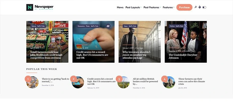
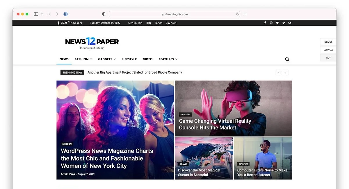
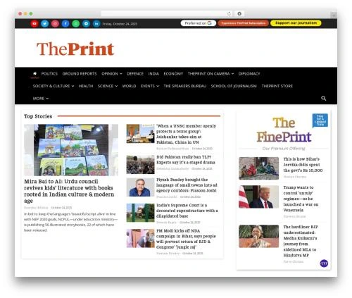
Newspaper by tagDiv is designed for content-heavy publishing. Its demos use large headline mosaics, prominent category menus, modular post sections, and areas for supporting content.
The theme includes access to the tagDiv Cloud Library, which provides different page, section, and article layouts. This gives publishers more flexibility than a single fixed homepage design.
Key Design Features
Large featured-story mosaics
Breaking or trending headline areas
Category-focused content blocks
Article cards with images and metadata
Search and navigation tools
Advertisement positions
Subscription and membership capabilities
Multiple article-page layouts
Responsive presentation
Best For
This news magazine website design works well for newspapers, technology publishers, business magazines, sports portals, entertainment sites, and high-volume blogs.
Why This Design Works
The modular system lets publishers give each content category its own space. Lead stories receive large images, while secondary stories appear in more compact lists and grids.
This approach supports frequent publishing because new content can be added without redesigning the entire homepage. It also creates practical opportunities for advertising and subscription promotion.
3. Newsup
Design Overview
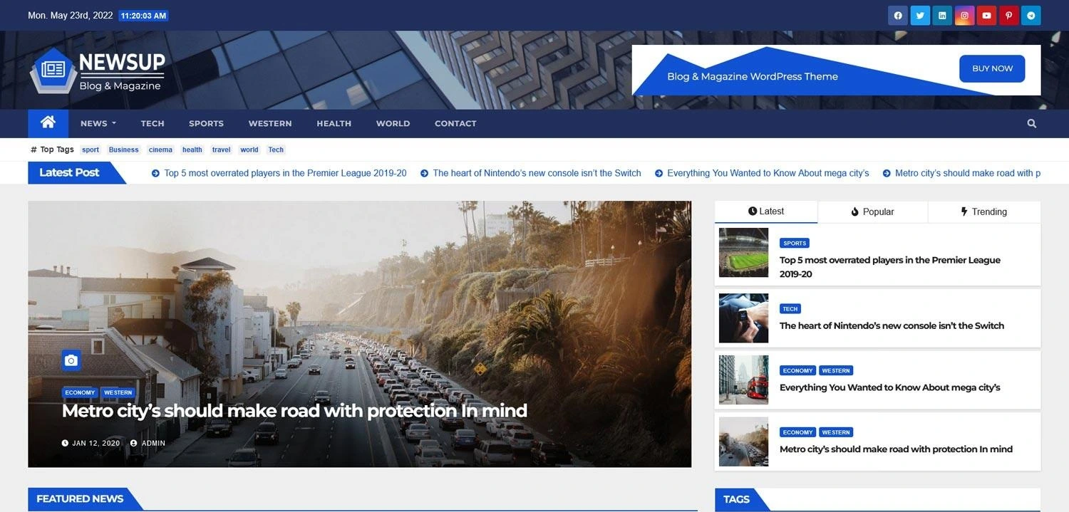
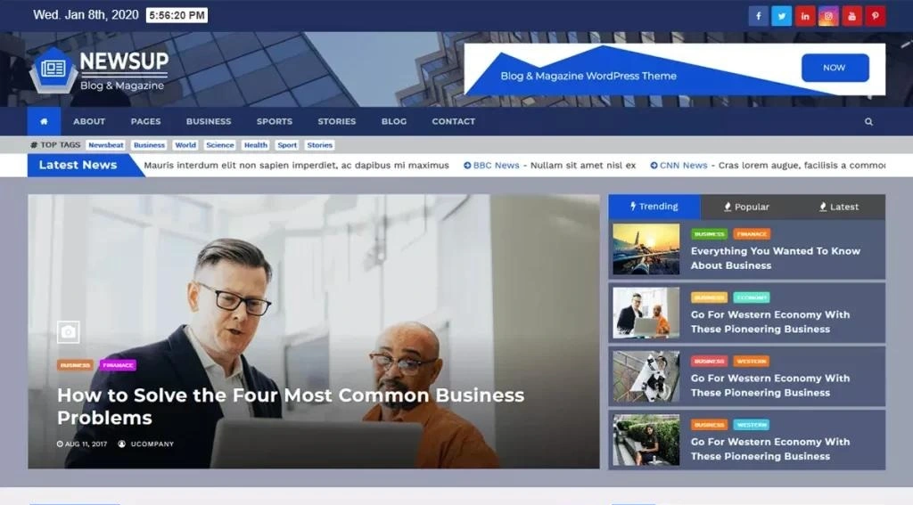
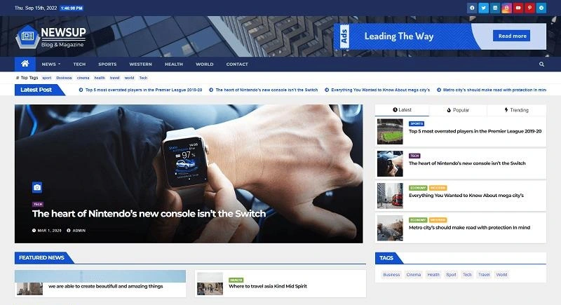
Newsup uses a familiar digital newspaper structure. Its preview presents an information bar and category menu above a latest-post ticker. A large featured article leads the page, supported by smaller stories and sidebar content.
The design prioritizes scanning. Headlines, categories, publication details, and story images are placed in predictable positions.
Key Design Features
Latest-post headline ticker
Lead-story presentation
Featured-news blocks
Category navigation
Latest, popular, and trending tabs
Sidebar widgets
Tag-based content discovery
Responsive design
Widget-controlled content areas
Best For
Newsup is suitable for local news, sports reporting, technology news, current affairs, gaming publications, review websites, and general online magazines.
Why This Design Works
Readers who arrive for breaking or recent content can immediately see the latest headlines. The tabbed sidebar offers additional choices without consuming excessive page space.
Repeated card patterns also make the interface easier to learn. Readers quickly understand where to find categories, dates, headlines, and supporting stories.
4. Twenty Fourteen
Design Overview
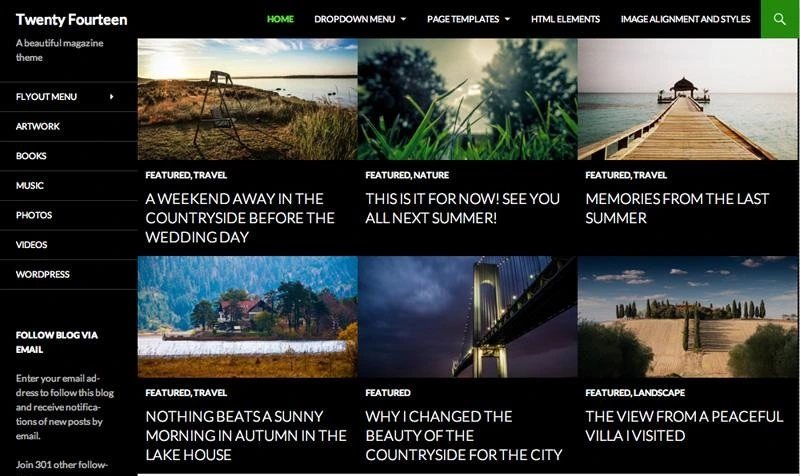
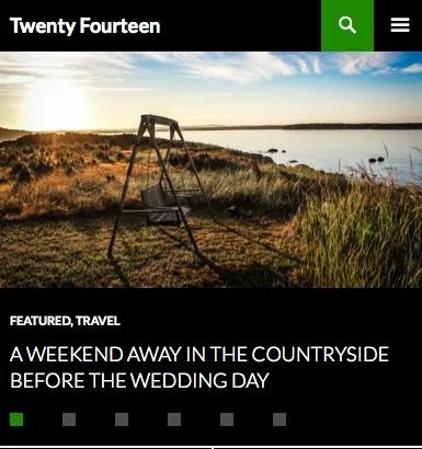
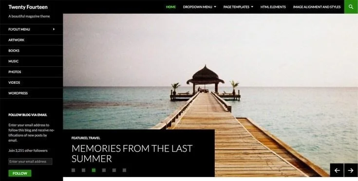
Twenty Fourteen is a classic WordPress magazine theme created for content-rich websites. It uses a dark sidebar, a strong featured-content area, and a conventional reading column.
Publishers can highlight selected articles on the homepage instead of relying entirely on chronological order. This helps important features remain visible after newer posts are published.
Key Design Features
Featured-content section
Strong use of featured images
Primary left sidebar
Optional article sidebar
Footer widget area
Multimedia widget for video, audio, and links
Responsive layout
Readability-focused article column
Best For
Twenty Fourteen works for general-interest magazines, photography publications, cultural journals, community news sites, and smaller editorial teams.
Why This Design Works
The fixed-looking sidebar creates a clear separation between site navigation and editorial content. Featured images provide visual impact, but the main reading area remains restrained.
WordPress documents an article line length of approximately 55 to 75 characters for this theme. That range supports comfortable reading, particularly on long articles.
5. Issue
Design Overview
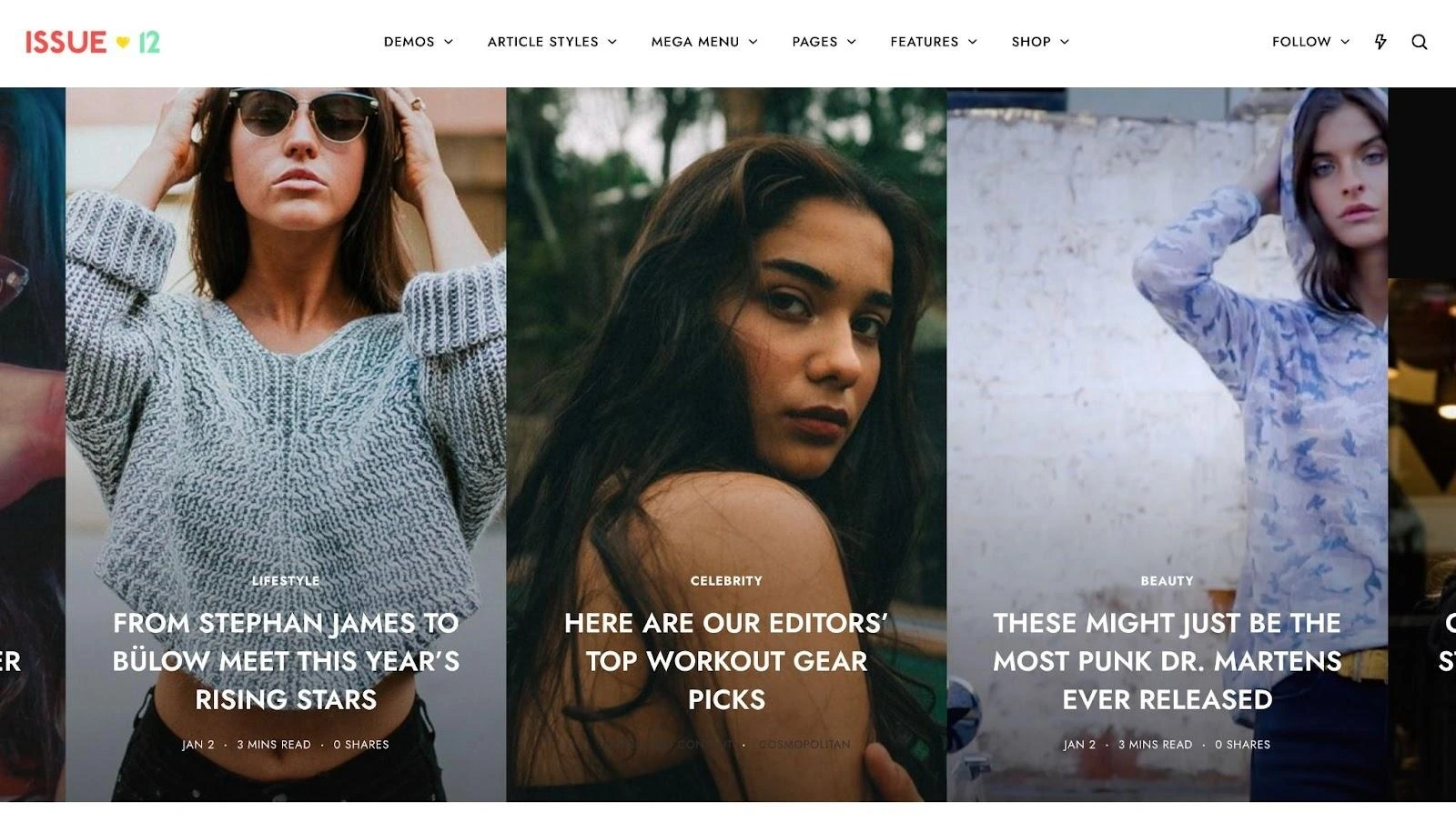
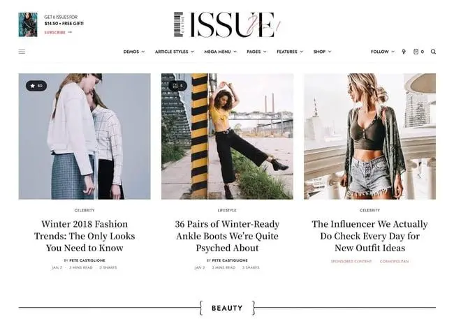
Issue takes a more visual and typography-led approach to digital magazine website design. WordPress describes it as a magazine theme centered on sizable type and imagery for articles, reviews, artwork, and news.
Instead of filling the screen with numerous small widgets, the design gives individual stories more visual breathing room. This produces a more curated editorial feeling.
Key Design Features
Large headline typography
Prominent featured images
Query-loop article sections
Category-based post filtering
Full site editing
Block-based layout control
Responsive presentation
Editorially focused article cards
Best For
Issue is a strong option for art, design, fashion, culture, photography, review, and independent editorial magazines.
Why This Design Works
Large headlines and images give every selected story a clear presence. The approach feels closer to a designed magazine spread than a traditional news portal.
The reduced visual density also supports stronger branding. Publications can use typography, spacing, and photography to establish a recognizable editorial personality.
6. Matter

Design Overview
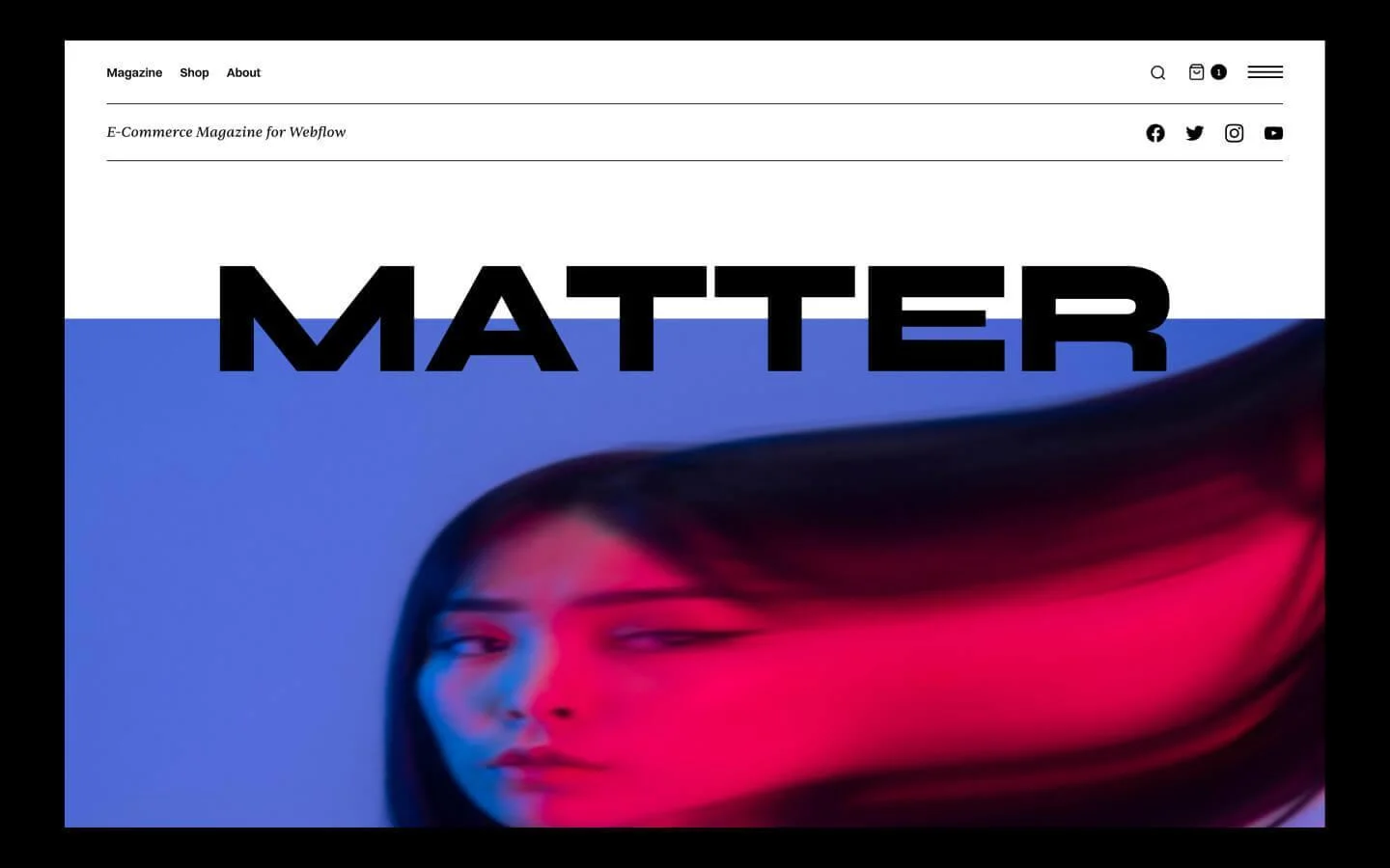
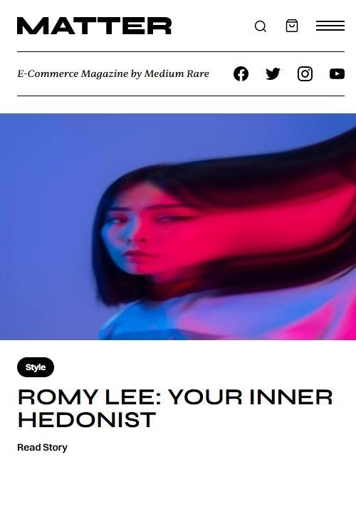
Matter uses a commanding masthead, editorial typography, and a predominantly black-and-white visual system. Its structure combines online publishing with optional ecommerce for printed editions or branded products.
The template provides 15 page layouts, including a homepage, article page, category listing, author profile, product pages, an about page, and a privacy page.
Key Design Features
Dominant publication masthead
Featured editorial content
Category listing pages
Author pages with article listings
Subscription modal
Large off-screen navigation menu
Contact forms
Ecommerce layouts
Responsive CMS structure
Best For
Matter suits independent publications, design magazines, cultural journals, fashion editorials, architecture magazines, and publishers selling print editions or merchandise.
Why This Design Works
The limited color palette lets typography and photography carry the design. This creates a premium visual identity without introducing unnecessary interface decoration.
It is also a strong example of connecting content and commerce. Readers can move from editorial material to printed issues or products without entering a completely different visual environment.
7. Thesis
Design Overview
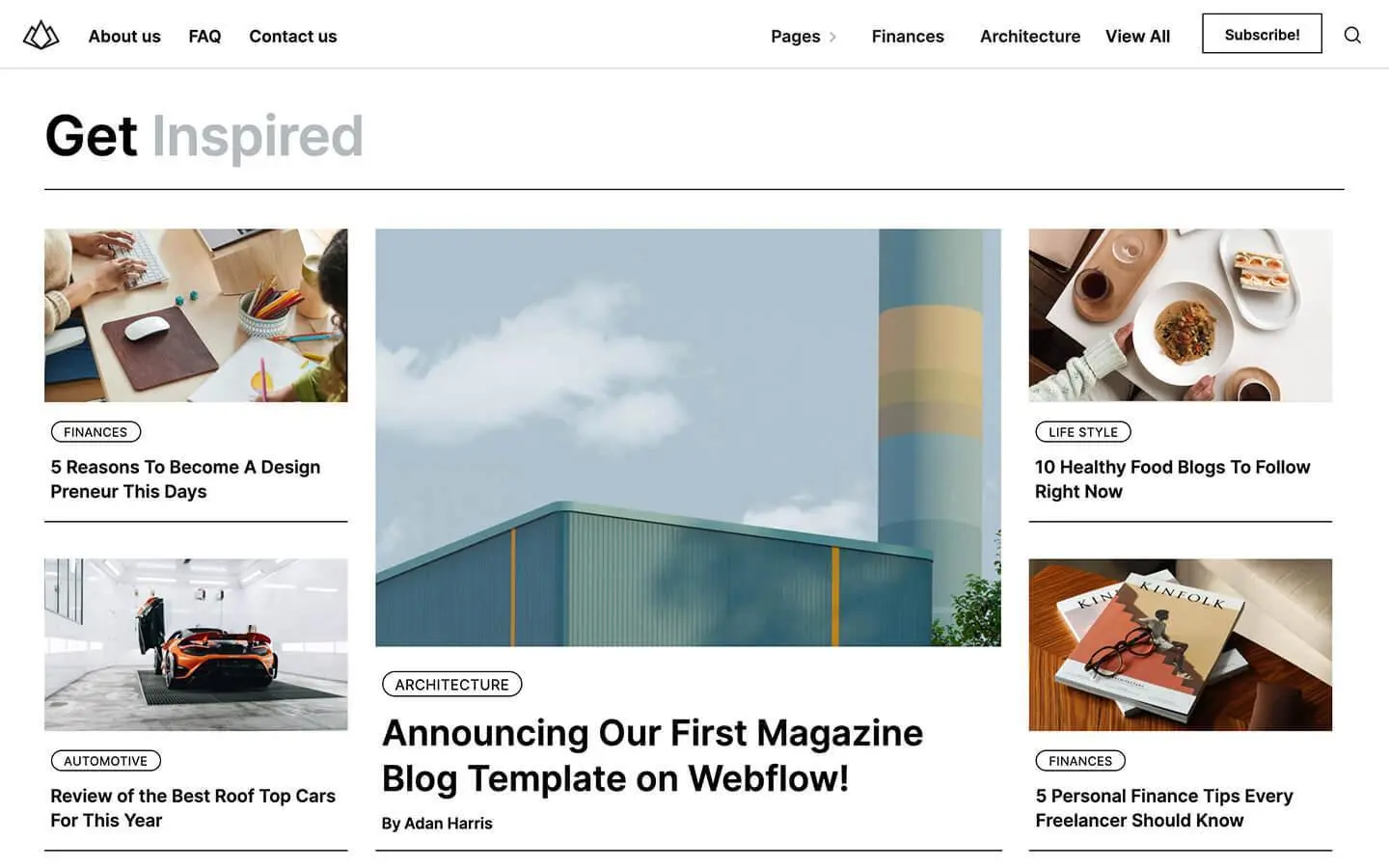
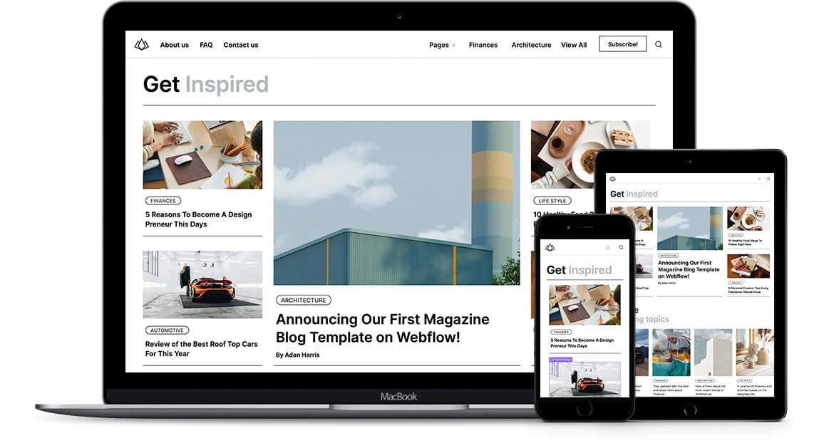
Thesis is built as a CMS-powered magazine and blog template. It provides dedicated structures for authors, categories, tags, search results, image galleries, and contact forms.
Its visual approach is clean and adaptable. The template emphasizes content relationships rather than relying only on a chronological stream of posts.
Key Design Features
Magazine-style homepage
Author collections
Category and tag structures
Site search
Image gallery
Contact forms
CMS-managed articles
Grid-based layouts
Responsive design
Best For
Thesis works for professional journals, business publications, thought-leadership websites, educational magazines, research publications, and multi-author blogs.
Why This Design Works
Categories and tags create multiple paths into the same content library. A reader can search directly, browse a subject, or explore more articles from a particular author.
That structure becomes increasingly valuable as publishing volume grows. It prevents older articles from disappearing inside a simple date-based archive.
8. Essential Mag
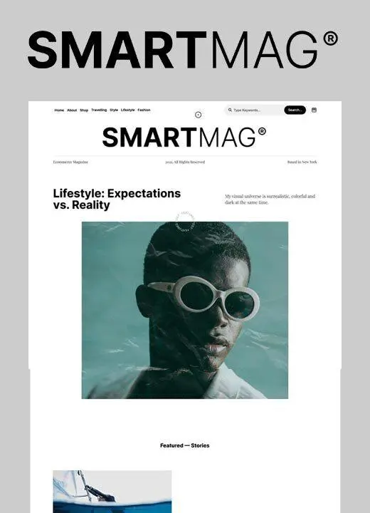
Design Overview
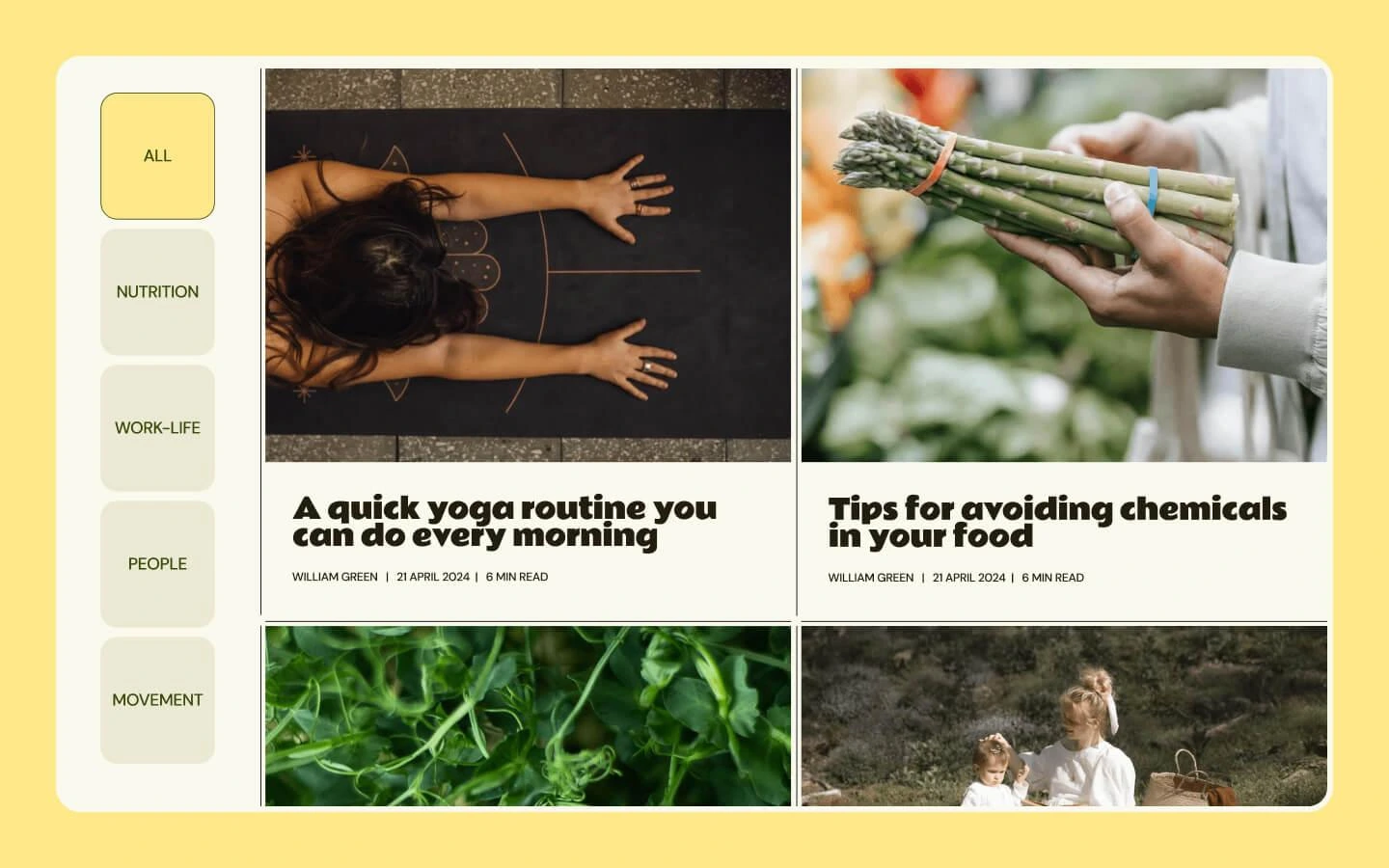
Essential Mag combines a minimalist interface with an organic editorial aesthetic. Its layout uses confident typography, generous spacing, and uncluttered article presentation.
The included pages cover the homepage, complete article archive, category pages, individual articles, and supporting utility pages.
Key Design Features
Minimalist homepage
All-articles archive
Category pages
Dedicated article layout
Strong typography
CSS Grid structure
CMS-managed content
Responsive navigation
Search-friendly hierarchy
Best For
This magazine website templates design is appropriate for wellness, lifestyle, food, travel, sustainability, interiors, and personal editorial publications.
Why This Design Works
Essential Mag avoids presenting too many competing interface elements. The restrained layout keeps the reader’s attention on headlines, imagery, and article introductions.
Generous spacing also makes the page easier to scan on smaller screens. It is useful magazine website design inspiration for publishers who value calm presentation over breaking-news density.
9. Nextmag
Design Overview
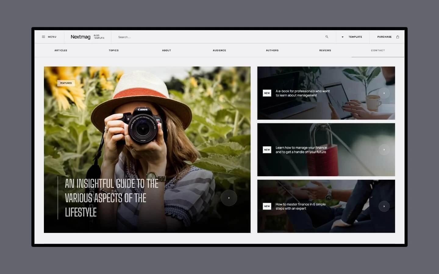
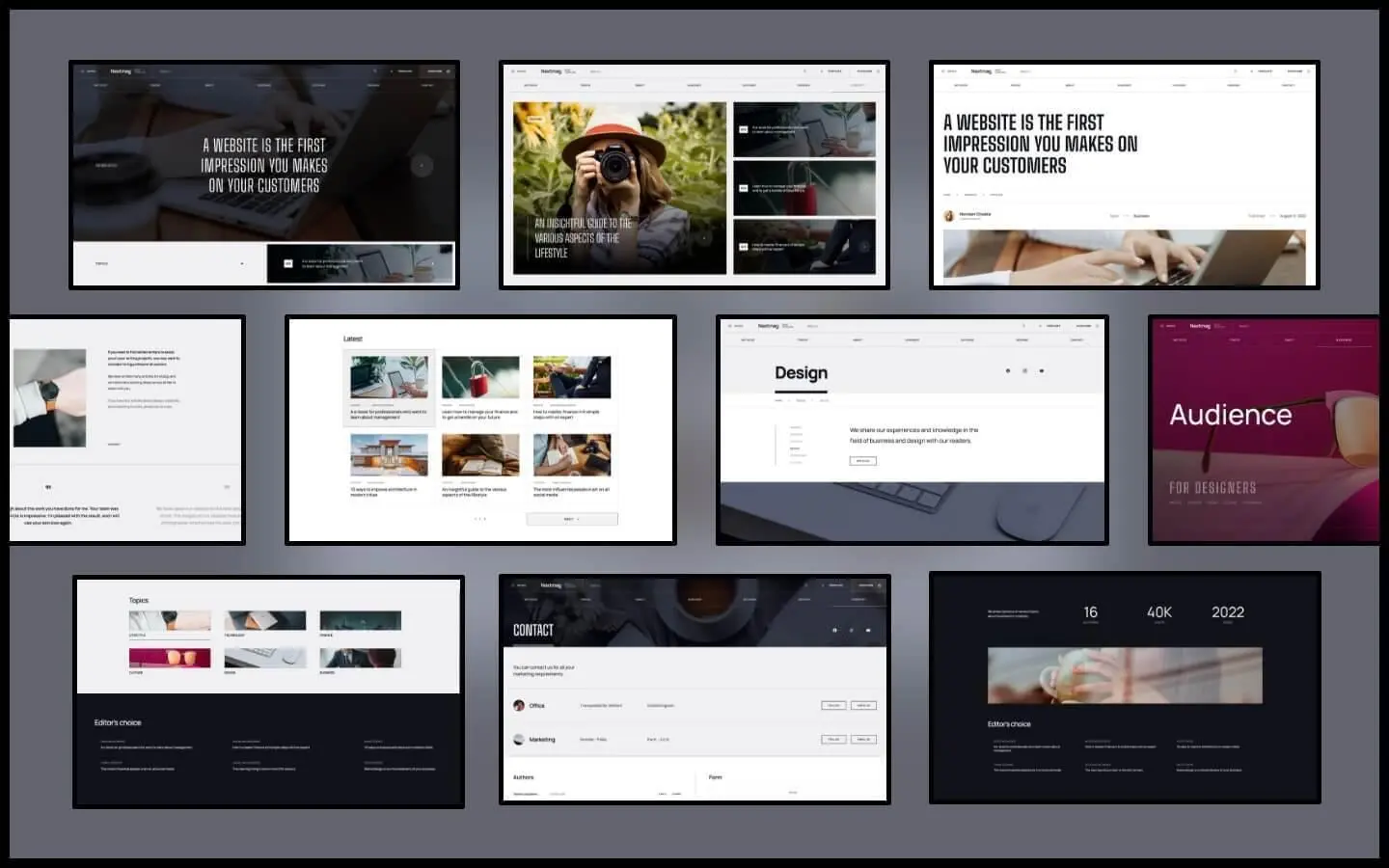
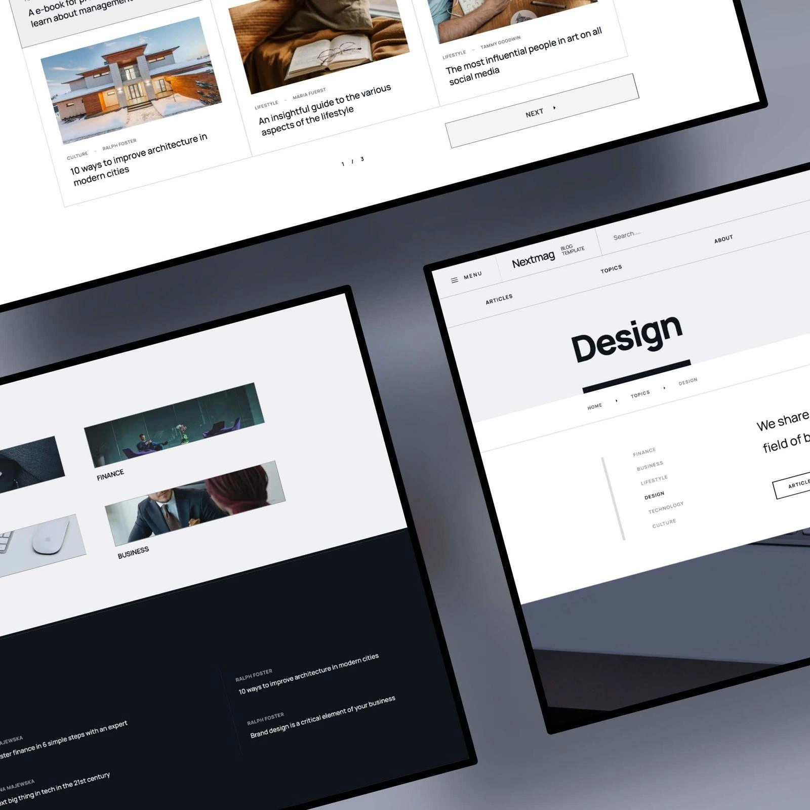
Nextmag offers a large design system rather than one rigid magazine website layout. Its documented package includes more than 30 static and CMS pages and over 40 sections for content and listings.
The template supports multiple presentation styles for articles, topics, authors, and audience-focused landing pages.
Key Design Features
Multiple article-listing designs
Topic and category sections
Author content
Full-screen and side navigation menus
Connected CMS collections
Tabs, lightboxes, and accordions
Contact and newsletter forms
Custom interactions
Fully responsive layouts
Best For
Nextmag fits lifestyle, entertainment, fashion, travel, culture, music, and multi-topic digital publications that need varied landing pages.
Why This Design Works
Different listing patterns prevent a large editorial website from feeling repetitive. Publishers can choose one visual treatment for features and another for archives or specialist topics.
The built-in author and audience pages also help a publication promote contributors and create targeted content journeys for different reader groups.
10. News Blog
Design Overview
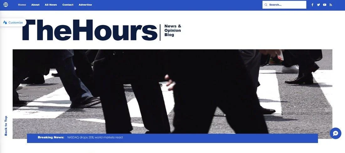
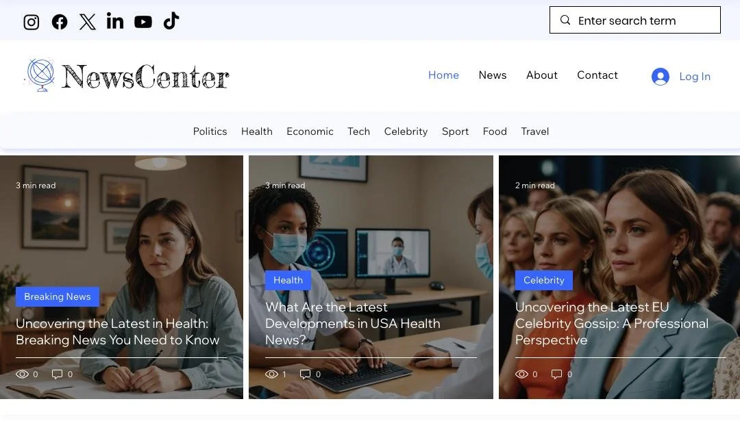
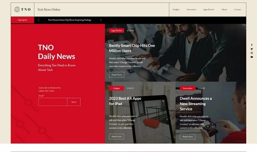
The News Blog template is a content-rich design built around the Blog system. Its documented structure lets publishers organize writing across feeds, categories, and individual pages.
The template also supports video publishing, visitor subscriptions, and contact actions. This makes it practical for smaller teams that want editorial and audience-building tools within one platform.
Key Design Features
Built-in blog feeds
Category-based publishing
Dedicated content pages
Video support
Subscription option
Contact functionality
Image-led article presentation
Mobile-friendly layouts
Best For
This template suits local news websites, community publications, student journalism, entertainment blogs, opinion magazines, and small editorial teams.
Why This Design Works
The homepage gives readers several ways to enter the publication. They can follow the main feed, select a category, watch a video, or subscribe for future updates.
Its comparatively straightforward structure also reduces administrative complexity. A small team can publish and organize content without maintaining an elaborate custom system.
Key Design Ideas for Magazine Websites
The examples above use different aesthetics, but several design principles appear repeatedly.
Build a Clear Featured-Content Layout
The main story should be visually dominant. It may use a large photograph, oversized headline, or full-width editorial block.
Supporting stories can appear beside or below it in smaller cards. The difference in scale tells readers what to examine first.
Avoid giving six articles identical visual weight above the fold. When everything looks important, nothing feels important.
Use Magazine-Style Grids Carefully
Article grids let publishers display several stories in a controlled area. They work particularly well for fashion, lifestyle, technology, entertainment, and news magazine website design.
A useful grid may combine:
One large lead article
Two or three supporting features
Compact latest-story cards
Separate rows for specific categories
Maintain consistent image proportions within repeated card groups. Irregular images can make an otherwise organized grid feel unstable.
Create Simple Category Navigation
Major categories should be visible in the primary menu. Use familiar names such as Business, Technology, Culture, Fashion, Sports, or Reviews.
Too many top-level options make navigation difficult. Place narrower subjects in submenus, category landing pages, or filtering controls.
Each category page should have a meaningful introduction and a clearly ordered list of relevant articles.
Choose Typography for Reading
Magazine web design needs typography that works at two levels. Headlines must create personality, while body text must remain comfortable during long reading sessions.
Use a limited type system with predictable styles for:
Main headlines
Section headings
Article titles
Summaries
Metadata
Body text
Captions
Keep body copy at a comfortable size and avoid extremely wide text columns. Strong contrast is essential, especially on mobile devices.
Use Images to Establish Editorial Identity
Photography and illustration can distinguish one magazine from another before readers process the headline.
Fashion and travel magazines may benefit from larger image-led layouts. Business and technology publications may use more compact thumbnails to present a higher volume of stories.
Every image should serve the article. Decorative pictures that have little connection to the headline can weaken trust and confuse readers.
Separate Trending Content from Recent Content
“Trending” and “Latest” describe different things. Latest content is ordered by publication time, while trending content reflects current reader interest or editorial promotion.
Label these sections accurately. A news ticker can serve urgent updates, while a popular-post list can help readers find widely viewed evergreen articles.
Provide Search and Useful Filtering
Search becomes essential when a publication has hundreds or thousands of articles. Place the search control somewhere readers can find without opening several menus.
Large archives can also benefit from filters for:
Category
Topic or tag
Author
Publication date
Content format
Filtering should simplify discovery rather than require readers to understand a complicated classification system.
Give Newsletter Sections a Clear Purpose
A generic “Join our newsletter” message provides little motivation. Explain what subscribers will receive and how often it will arrive.
For example, a business magazine might offer a weekday market briefing. A culture magazine could send a weekly selection of interviews and reviews.
Place the signup form after valuable content, in the footer, or within a clearly separated homepage section. Avoid repeatedly interrupting article reading.
Integrate Social Media Selectively
Social links help readers follow the publication, while article-sharing controls can extend content reach.
Display only the channels the publication actively maintains. Empty or abandoned profiles can reduce credibility.
Author pages may also include professional social links when those accounts support the contributor’s editorial identity.
Plan Advertisement Placement Early
Advertising should be considered during the layout process. Adding banners after development can disrupt spacing, create layout shifts, and crowd the reading area.
Common positions include:
Header banner
Sidebar unit
Space between homepage sections
In-article placement
Footer promotion
Sponsored-content block
Clearly distinguish advertisements and sponsored stories from independent editorial content.
Design for Mobile Readers First
A responsive magazine website design should do more than reduce desktop dimensions. It should reconsider content priority for a narrow screen.
On mobile devices:
Collapse complex menus
Place the lead story first
Convert wide grids into clean vertical cards
Keep buttons easy to tap
Maintain readable text sizes
Avoid intrusive advertising
Compress large images appropriately
Test real article pages, not only the homepage. Readers often enter a magazine directly through a search result or social link.
Protect Page Speed and Usability
Magazine websites frequently use many images, tracking scripts, advertisements, embedded videos, and third-party widgets. Each addition can affect performance.
Compress and properly size images, load below-the-fold media only when needed, and limit unnecessary scripts. Reserve image and advertisement dimensions to reduce unexpected movement while pages load.
Fast pages support usability, search visibility, and reader retention.
Essential Pages for a Magazine Website
Homepage
The homepage introduces the publication’s identity and current editorial priorities. It should present featured stories, categories, recent articles, and important subscription options without becoming overcrowded.
Category Pages
Category pages organize articles around major subjects. They help readers explore one interest and provide search engines with a clearer understanding of the publication’s content structure.
Article Pages
An article page should prioritize reading. It normally includes the headline, summary, author, publication date, main image, body content, captions, and relevant related stories.
Advertising and subscription prompts should not obstruct the main text.
About Page
The About page explains the publication’s purpose, editorial focus, history, ownership, and audience. It can also introduce the editorial team and link to important policies.
Author Pages
Author pages gather a contributor’s biography, role, credentials, social links, and published work. They help readers identify who created the content and discover related articles.
Contact Page
The Contact page should direct different inquiries to the correct destination. These may include editorial pitches, corrections, advertising, subscriptions, partnerships, and technical support.
Search Page
A useful search page displays clear article titles, images, categories, dates, and short descriptions. Filters become valuable when the archive covers many subjects or content formats.
Privacy Policy
The Privacy Policy explains how the website collects, uses, stores, and shares visitor information. It should address analytics, cookies, advertising technologies, newsletter data, and relevant user rights.
Terms and Conditions
Terms and Conditions establish rules for website access and content use. They can address copyright, acceptable behavior, account responsibilities, external links, and limitations of liability.
Businesses should obtain appropriate legal guidance when preparing their policies.
How to Choose the Right Magazine Website Design
Start with the publication’s niche. A photography or fashion magazine may need expansive imagery, while a financial news website may prioritize headline density, data, and fast category access.
Next, estimate content volume. A weekly publication with four feature articles does not require the same homepage system as a news team publishing dozens of stories each day.
Consider these factors before choosing among magazine website templates:
Audience: Identify the devices readers use and the subjects they follow.
Branding: Select a layout that supports the publication’s typography, colors, and photographic style.
Publishing frequency: Frequent publishers need efficient CMS workflows and flexible content blocks.
Archive size: Large archives require categories, tags, search, and author organization.
Monetization: Decide whether the website will use advertising, subscriptions, memberships, sponsored content, ecommerce, or several methods.
Editorial team: Multi-author publications benefit from contributor profiles and consistent article templates.
Content formats: Confirm support for video, galleries, podcasts, reviews, or long-form stories where needed.
Performance: Avoid choosing a design solely because its demo contains dramatic animation or oversized media.
Customization: Confirm that the layout can accommodate future categories and campaigns without requiring a complete redesign.
Evaluate the mobile preview before making a final decision. Also review article pages, category archives, search results, and author pages. A striking homepage cannot compensate for a poor reading experience throughout the rest of the website.
Build a Magazine Website That Gets Results
The right magazine website design can turn casual visitors into regular readers. The Custom Websites creates magazine websites with clear navigation, responsive layouts, organized content, and engaging visual experiences.
Ready to Build Your Magazine Website? Let’s create a professional digital magazine website designed around your content, audience, and publishing goals.